When I first started keeping this journal it was meant to be a working
source of reference material for myself. I quickly realized that this
resource was valuable as an outreach tool and created this page. Now I have
created a book by the same name; the first in a series (link above.) What
follows are my notes on important climate discoveries. I have not
spent a great deal of time rewriting and polishing this information, so please forgive the
poor grammar and etc. Far more is discovered here than I note. My
articles and essays also contain a lot of information that does not make it
into the Chronicles. Also,
right click on the images for a larger version, then click "view image".
Usually a larger image is hidden on the server.
New Home for Climate
Discovery!
Hola Friends:
Please visit the new home for Climate Discovery Chronicles Breaking
News. It's called Climate Discovery at:
www.climatediscovery.com I am
in the process of migrating the archives. The new site includes all new
posts, beginning November 1 with a piece about how Superstorm Sandy was
indeed caused by climate change as per research from last March
(InSandyty).
The new site is comment capable so we can discuss, you can leave a
comment or my favorite--you can help spread the outreach by relating climate
change news to the rest of us. I have also started loading up a ton of
images from my climate change exploration expeditions.
Thanks and, watch your carbon footprint (and don't forget to "like"
the new site if you are Facebook literate!),
As always--tell your friends,
Bruce Melton PE
October 10, 2012 More Melt, More Sea Level Rise, and an Alarming Change in
Sea Level Rise Rate --
The U.S. Global Change Research Program (USGCRP), a Ronald Reagan Presidential
Initiative formerly called the U.S. Climate Change Science Program, tells us
an important truth in the climate change challenge. Thirteen governmental
agencies make up the USGCRP:  Note: Click here for my new book page: Link
Climate Discovery Chronicles
Barrier islands (and wetlands) perform an extremely valuable ecosystem service. As the name barrier island implies, these island protect the mainland from the onslaught of storms. Wetlands perform much the same function. What they do is absorb energy. They absorb the high energy of storm surge and storm waves before it can get to improvements on land inland. Once these barriers are gone, anything and everything inland will take much more of a beating than before when storms come around. Even simple peak tides that happen once a month will be significant flooding threats. Normally, the dune line on a barrier island is a vertical wall that hold these high tides back. Water can only flow paste them at the few river outlets along the coast. This means that normal storms and those once-a-month spring tides do not have enough time to put much water through the passes to flood the interior. Without the barrier island though it is a completely different story.
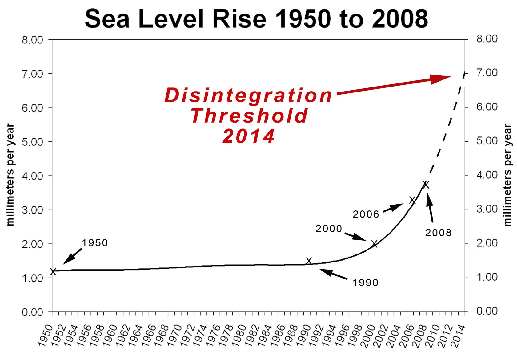
This 7 mm per year sea level rise threshold that the USGCRP warns us about is uncomfortably near and the numbers concerning sea level rise tell the story. In the graphic "Sea Level Rise 1950 to 2008," for the vast majority of the 20th century, sea level rise was between 1.2 and 1.5 mm per year. The around 1990 it jumped up to 2 mm per year then about 2000 it was 3 mm per year. The numbers for today vary between 2.8 mm per year averaged between 1992 and present, and 3.4 to 3.7 mm per year based on 2004 or 2009 data. The most often reported numbers in the media are between 2.5 and 3 mm per year. These numbers are averages and like the 2.8 mm per year of NOAA cited two sentences ago, do not reflect the most recent sea level rise rates.
The reason that the most often cited numbers is much lower than the most recent years is that there is a lot of variability in sea level rise rate from year to year, normally. Academic work; peer reviewed work and the like must show statistically robust results. We often hear that any one storm can not be blamed on climate change. Same smell with any one year of sea level rise. Until now at least.
We have seen numerous publications in the last three years that show hot temperature records and high and low precipitation records have now become so numerous that the statistics have become valid. Across the world, these record weather events are between 60 and 90 percent likely to have been caused by climate change, or they were made more extreme by climate change depending on what study and where the study looked (like the European, Moscow or Texas heat waves or precipitation extremes in the Southeastern U.S. etc.) In other words, if our climate had of not changed, these weather events would not have been as extreme as they actually were, or maybe even occurred at all.
Sea level rise is a bit different. We only get one data point per year for global sea level rise. It's like global temperature in this respect. We are still a ways off from both of these particular weather scorecards being proved likely to be caused by climate change because they each contain so few data points. But now we have "logical association." If heat and precipitation records have been shown to validly have a high likelihood of being caused by climate change, logical association says things highly associated with temperature and precipitation are also highly likely to be in the same boat.
The trend then is a rapid acceleration of sea level rise starting in about 1990 and getting faster and faster the later it gets. At the rate we are going we cross the 7 mm per year threshold before 2020 and our barrier islands begin to disintegrate and disappear. But that was before the National Oceanic and Atmospheric Administration (NOAA) came out with their new numbers.
In the graphic "Sea Level Rise: NOAA," there is a hiccup and a change in
trend rate in 2010 and 2011. First: the 2.8 mm per year average for 1992 to
2010 is NOAA's number. There are really more like three different trends in
this period that range from nearly 2 to nearly 4 mm per year. But it's not
1992 to 2010 that we need to be worried about.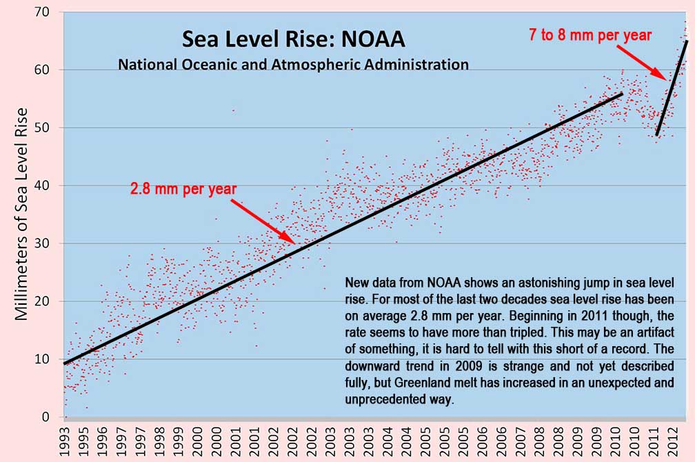
Something happened in 2010 and 2011. I am not quite sure I buy the explanation given. They say it's because of La Nina. The reason I am not sure I buy this explanation is that there was a huge El Nino in 1998, much larger in scale than the moderate to strong La Nina we had last year, and the 1998 El Nino is nowhere to be seen in this data. It looks like a change of technology shift that has yet to be corrected, but it may be something completely different, or it may be La Nina. Or it may be the melt from Greenland and the Antarctic--where mass balance continues to be decrease every year by greater and greater margins.
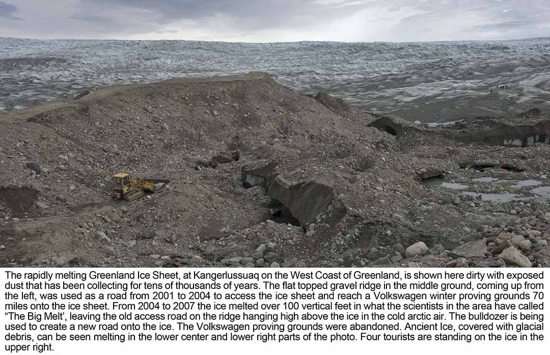
If there is something screwy with this data, we still have the fact that last year's Greenland melt was much greater than 2011, which was much greater than 2010, which was much greater than 2009 (see August 1, 2012 discussion "Greenland Melts--It's NOT About the Past.") Melt in Greenland has steadily increased since about the turn of the century and it is now a force to be reckoned with. (Right click on the image and choose view image to see a large version.)
 It was 2007 when I was
in Greenland and ice
scientists I talked with there surprised me with some anecdotal scientist
talk. They said that what they called "The Big Melt" started in 2004.
They said that too few years had elapsed since the big melt started to put
together robust statistics so there was little they could say about it in
their peer reviewed work. Damn.
It was 2007 when I was
in Greenland and ice
scientists I talked with there surprised me with some anecdotal scientist
talk. They said that what they called "The Big Melt" started in 2004.
They said that too few years had elapsed since the big melt started to put
together robust statistics so there was little they could say about it in
their peer reviewed work. Damn.
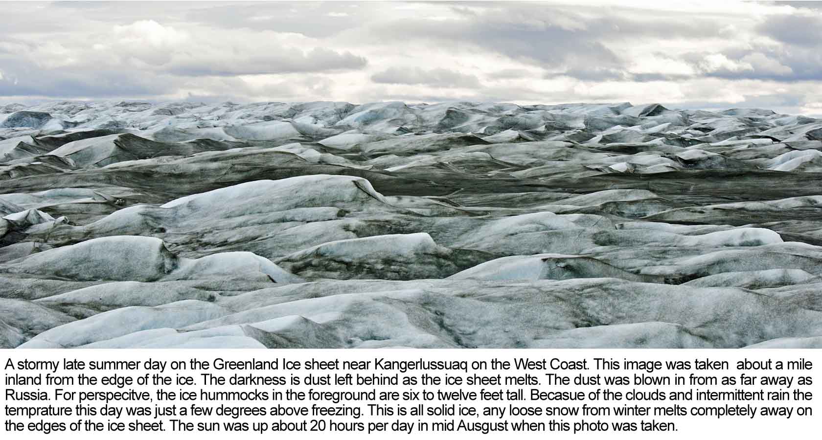
An example of The Big Melt can be seen in what the locals say and in my photography and reporting of other academic research about a place on the edge of the ice sheet called Point 660, near Kangerlussuq on the west coast of Greenland. In 2001, Volkswagen built a winter proving grounds 70 miles up on hte ice sheet. They asked the ice scientists if this area, normally frozen 12-months of the year, would begin to melt soon with global warming. The ice scientists said yes and that they should build much, much farther inland. Of course, Volkswagen built their proving grounds 70 miles inland...
They needed a road to transport everything, so they built one that first winter. Something not widely known about the ice sheet is that it is 100 to 200 feet tall at its edge and 11,000 feet tall in the middle, 350 miles away. So for Volkswagen to get their road up on top of the the edge of the ice sheet, they followed what is called an medial moraine. A moraine (a giant pile of rock, gravel and dirt) forms at the end of a glacier or edge of an ice sheet where the ice movement basically bulldozes up the mountains in its path and leaves them in a big pile at the edge of the ice. These moraines can also form between two flowing rivers of ice in the ice sheet. The ice sheet deposits rocks and sand in a long ridge between the rivers of ice. This particular medial moraine was a thousand feet long and was likely formed during the last ice age. Or at least this is what the academic work in this area says. (see Foreman et al below) it also says that the edge of the ice sheet has been in approximately the same place for 150 or more years--since the end of the Little Ice Age.
So what my guide told me in 2007, or more accurately, the driver of the
Toyota Land Cruiser ice sheet machine with the big tires that they used to
use to take tourist up on the ice sheet, is that 100 vertical feet of ice had
melted since 2004. The ice sheet image with the caption that starts "The
rapidly melting Greenland Ice Sheet..." shows this
melt. The road on the ridge once accessed the ice sheet that was 100
feet taller than it was when this photo was taken in 2007. Right click on
the image and choose "view image" for a larger view. then you can tell the
difference between the moraine and the ice sheet. The ice sheet is that
dirty looking thing that looks like ice covered with dirt. the dirt is dust,
collected over tens and tens of millenia and recently melted out of the ice. Also note the
little tourists on the ice off to the right.
Now lets. get iu[p to date. The melt that has happened in Greenland every year since about 2009 has been about the same amount of total melt that occurred between 2001 and 2008. (see again--August 1, 2012 discussion "Greenland Melts--It's NOT About the Past.") Things look to have really taken off in the last several years, and even if the new NOAA data is goofy, we are getting much closer to the disintegration threshold of 7 mm per year much faster than before.
Like so many things in climate these days, it seems we are reaching this threshold way ahead of schedule. Schedule? Maybe I just misspoke. There is no estimate of when our barrier islands will begin to disappear, unless you take my estimate as a valid projection. I am simply reporting the ever increasing rate of sea level rise and connecting the dots. Otherwise, this is something climate scientist generally do not approach. It is very much like the way that climate scientists approach dynamical ice sheet disintegration--they don't. There is simply not enough data to be throwing statistics at to mean anything to a peer review jury.
Sea level rise is one of those sleepers in climate change. There's lots of noise in the data and lots of littoral specialists (beach guys and girls) that say that sea level is not rising or that it's subsidence or sand starvation or dune migration that is causing shrinking beaches. And in a lot of cases they are correct. There's a lot of subsidence and even more sand starvation going on around the world. There are so few wild rivers delivering a natural sediment load to the ocean any longer that most beaches on the planet are sand starved. You see, sand goes away over time. It ends up being carried out to sea and deposited in the deep ocean and constant replenishment is needed from rivers or we get sand starvation. But almost every river on the planet is dammed now and these dams trap sediment unnaturally before it reaches the coast. It is this sediment that feeds our beaches and much of this beach food has been cut off. But sediment starvation nor subsidence nor dune migration explains all beach shrinkage in many places and Padre Island National Seashore (PINS) is one of these places.
PINS is my home beach. I have been there a gazillion times. I own one of those big ice-melting 4-wheel drive Suburbans with the lift kit and giant tires so I can drive the 60 miles of 4-wheel drive only beach. I once fished like there was no tomorrow and the best beach fishing was down PINS. Now I just enjoy. i've killed enough bait and poked too many holes in fishes mouths. So now I take pictures and shoot video and simply enjoy the beach, while we still have it. My photographic documentation of the beach goes back to 1984 and the story is plain to see in the one of the posters at the bottom of this discussion.
So given all of this, the imminent disintegration of our barrier islands and coastal wetlands is the best case scenario--and I need to qualify this scary-ass statement: It's the best-case scenario if we do not begin to suck carbon out of the sky like there is no tomorrow at some point in the next few to half dozen years. I have written a fair amount about how much easier it will be to fix our climate than is commonly understood from the message delivered by our media. Once we get moving, it will be easy and we will likely be able to avoid the most dangerous parts of climate change. But sea level rise is different. There are thermal thresholds that, once passed, are very difficult to recover from without going back into the deep freeze.
There is a property of ice called the heat of fusion
(enthalpy) that virtually assures that we are going to have a heck of a time
putting this genie back in the bottle. It takes 9 times more energy to melt
ice at 32 degrees into water at 33 degrees that it does to warm ice from 30
to 31 degrees (or 20 to 21degrees, -1 to 0 degrees, etc.). So once ice starts to melt, just to get back to even--just to
get the water frozen again--nine times more energy must be taken out of the
melted ice.
We still don't know what form the barrier island and wetlands disintegration will take, nor how long it will take for the wetlands and barrier islands to disappear. It seems logical that storms and hurricanes will breach the islands in places and these places will not be able to dynamically heal themselves as barrier islands are so good at doing naturally after storms. This is called littoral regeneration or something like that and extra sea level rise of just seven millimeters per year--a quarter of an inch per year, will prevent this natural healing from taking place.
From there the barrier island breaches will widen and more storms will create more breaches more easily as sea level rises more. How long will it take? We can only hope decades or generations. Maybe in this amount of time we can stop the warming and take some of that build up of heat out of the ice sheets to keep them from melting.
I have accumulated a lot of beach positioning, sea level, dune migration and subsidence publications for Padre Island National Seashore. This information, along with my repeat photography is the basis for my outreach campaign to help people understand the ongoing nature of sea level rise and the great risks to our global ecosystem because odf the imminent loss of our beaches and coastal wetlands. These references area shown in the following PowerPoint presentation: http://www.meltonengineering.com/Corpus%20101912.pptx One of the reasons that Padre is such a good indicator of sea level rise is the beach there is very stable, or at least it was until "the Big Melt" began.

Barrier island and coastal wetland regeneration
threshold of 7 mm per year…US Geological Survey, Environmental
Protection Agency, National Oceanic And Atmospheric Administration and
Department of Transportation Report, U.S. Climate Change Science Program,
Coastal Sensitivity to Sea Level Rise: A Focus on the Mid-Atlantic Region,
November 2009.
http://www.climatescience.gov/Library/sap/sap4-1/final-report/
Little Ice Age moraines at Kangerlussuaq’s Point 660: Foreman et al., Little Ice Age and neoglacial landforms at the Inland Ice margin, Isunguata Sermia, Kangerlussuaq, west Greenland, Boreas, Volume 36, Issue 4, pages 341–351, November 2007. http://dx.doi.org/10.1080/00173130601173301
October 1, 2012 SMASHED AGAIN! Arctic Sea Ice Extents AND My First Near-term
Climate Change Forecast:
Blizztastrophes,
Devicestation, Blizery and Snowtality -- Arctic sea ice has smashed
its last smashed record by a margin nearly as great as the
previous smashing. The minimum Arctic sea ice record set in 2007 was widely
believed to be a freak,
 caused by freak weather conditions. It shattered the
previous record by 22 percent. This year's record shattered the 2007
record by 18
percent. Bigger yet, this years record shattering comes after an "average"
summer and the Barents and Kara Seas temps were even cooler than normal.
Contrast this with 2007 when temps were much warmer than normal and wind
conditions bunched up the ice and pushed it out of the Arctic into the
Greenland Sea.
caused by freak weather conditions. It shattered the
previous record by 22 percent. This year's record shattered the 2007
record by 18
percent. Bigger yet, this years record shattering comes after an "average"
summer and the Barents and Kara Seas temps were even cooler than normal.
Contrast this with 2007 when temps were much warmer than normal and wind
conditions bunched up the ice and pushed it out of the Arctic into the
Greenland Sea.
Maslowski's prediction is coming true (see September 10, 2010). Arctic sea ice is
in a freefall and we will see ice free conditions in the summertime in the Arctic before 2020
(right click images for larger versions). In reality, summer sea ice in the Arctic is so rotten in mid summer now that
it is no impediment to shipping
 (see also September 10, 2010).
Avery important piece of climate science kicks in now that there is so much more open water in the Arctic. It's the open Arctic ocean feedback. What this does is it supercharges the winter atmosphere with moisture while the Arctic Ocean has yet to freeze over. And the lower the extents record in the fall, the longer the Arctic Ocean stays open into the following winter. Year before last it set the longest open water record extending into January before ice up--a full month longer than ever before recorded.
All of this energy in the form of heat and water vapor creates berserk weather patterns that shift Arctic weather further south on the jet stream as we saw in 2005/6, 2007/8 and 2009/10 and 2010/11. Even though warm for Arctic standard, theses blizzards are still way cold for us down here in the States. (See February 10, 2010 and December 10, 2010)
 So my first prediction for a near-term extreme climate change caused weather
event is (are) snowpocalypses and snowmeggedons blizardaroos and what was
it it--total devicestation. just wait till we get the big bad-ass ice storm
that puts the Canadian ice storm of 1998 when 5 inches accumulated in some
places. Expect the berserk winter weather in the U.S Northeast,
Northeast Canada and Northern and Central Europe. Freak winter
weather could show up anywhere, but these seem to be the preferred areas.
So my first prediction for a near-term extreme climate change caused weather
event is (are) snowpocalypses and snowmeggedons blizardaroos and what was
it it--total devicestation. just wait till we get the big bad-ass ice storm
that puts the Canadian ice storm of 1998 when 5 inches accumulated in some
places. Expect the berserk winter weather in the U.S Northeast,
Northeast Canada and Northern and Central Europe. Freak winter
weather could show up anywhere, but these seem to be the preferred areas.
So we had "normal" to colder than normal weather this summer with no abnormal winds pushing the ice around like crazy and we still smashed the previous record to smash all records. Why is this? It's because of the feedback. Normal winter conditions in the Arctic will grow about 6 feet of ice per winter. As the ice thickens, the relatively warm ocean below keeps it from getting much thicker faster. But every year it can add six feet if it does not melt. Here's the problem: lots of ice is melting every year, far more than normal.
Since just before the turn of the century we have been melting more ice every summer than can be replaced every winter. It's a chain reaction. Less sea ice in the summer means longer till freezeup in the winter, which allows less time to grow thick winter ice, which melts more rapidly every summer because it is thinner, which allows more heat to build up in the Arctic Ocean every winter, which further increases the time to freezeup and the dance continues in a replicating spiral that falls faster and faster every year until BOOM! It's all gone.
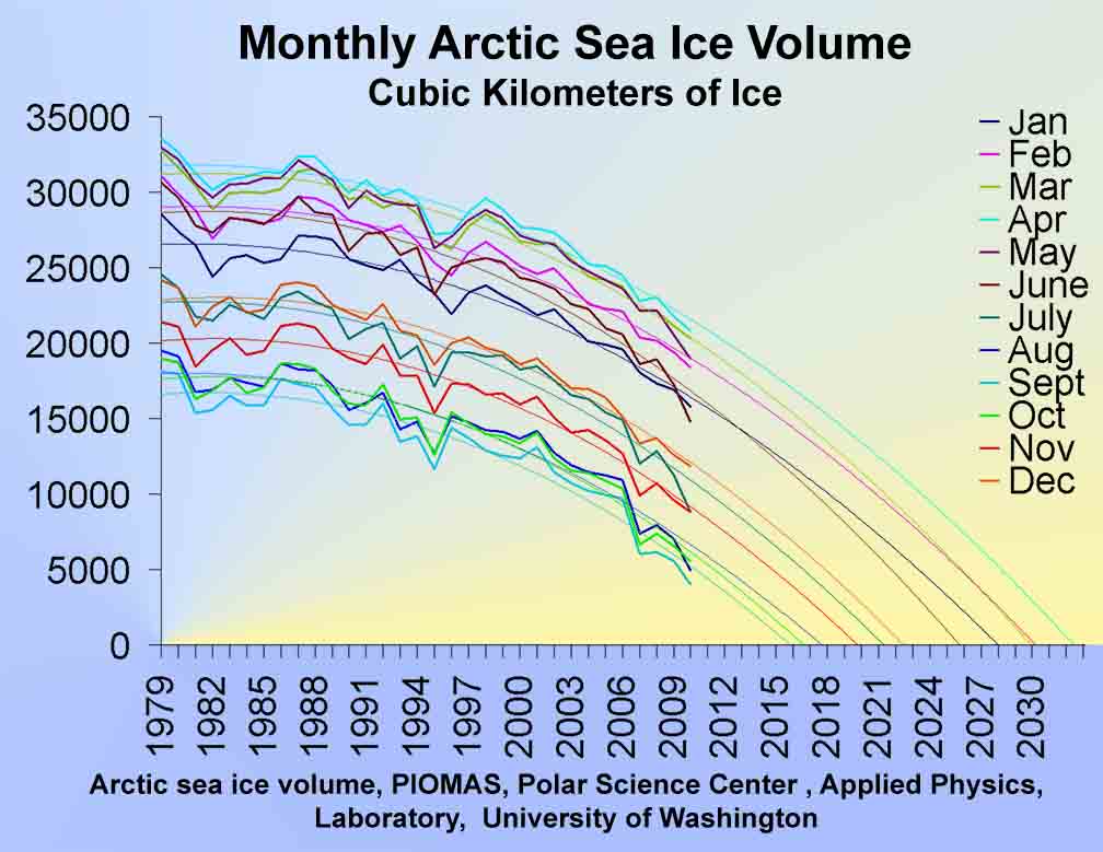
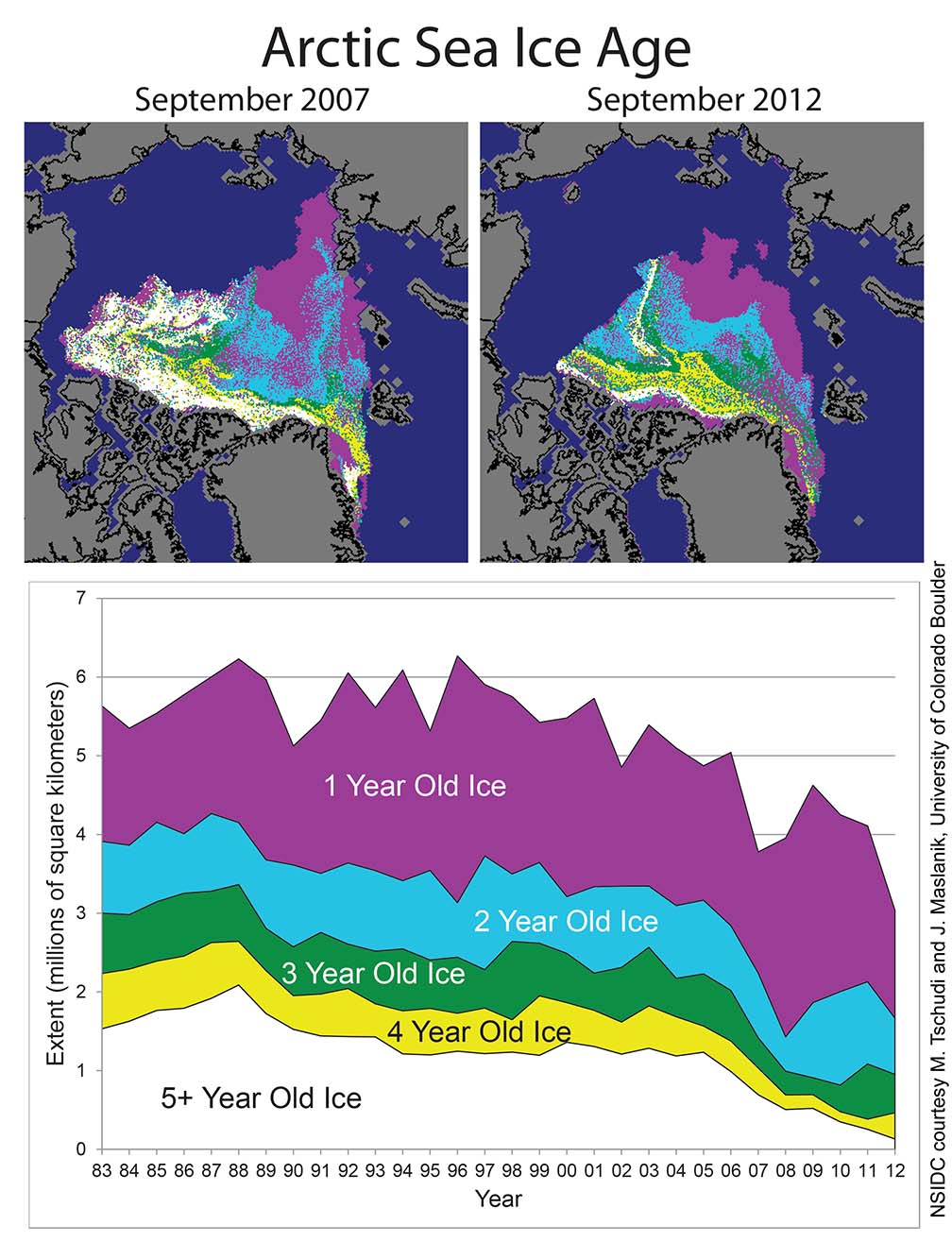
The results are that not only is Arctic sea ice coverage at an all-time low, but Arctic sea ice volume is at an all time low too. Look at the graphic titled Arctic Sea Ice Age. It's easy to see the domino effect in action here. Every year it get's warmer, or almost every year. The warming feeds back into less ice in winter which dominoes into a longer open water summer season which warms more ocean water pushing freezeup farther and farther into winter.
Looking at how strange these winters have been lately, we had a snowtastic year in 2004 in Texas when we saw a big snowstorm on the Texas coast. Eight inches of snow fell in my favorite place to get into the coastal Texas wilderness by boat: Port O'Connor. Victoria, about 40 miles north of Port O'Connor, had 18 inches. The year 2004 had the tenth lowest sea ice extents measured in the Arctic since record keeping began in 1979. 2002 was the ninth lowest. Every year since 2004 has seen a lower sea ice coverage than 2002. The year 2003 was only slightly higher than 2002 and 2004.
This storm was a rarity indeed. It was the first time in recorded history for almost every recording station on the Texas coast to have a white Christmas. In Victoria and Corpus, their 13 and 5.2 inch totals respectively were more than all previous snowfalls since the 19th century combined. Brownsville had 1.5 inches, more than any snow event there in 105 years.
If these extreme events were to never happen again the deniers and delayers would be correct: climate change would be a hoax. But the high temperature records continue to recur at a rate that is twice as frequent as low temperature records. Arctic sea ice continues its fall over the brink. Greenland's 97 percent surface melt may have been similar to events over the last 2,000 years that happen every 80 to 300 years, but now we have been told by some of the smartest people in the world that our climate has changed.
They have been telling us for 20 years that our climate would change if we did not reduce emissions, and the longer we delayed the quicker the changes would come, the more extreme would be those changes and the faster our would climate change in the future.
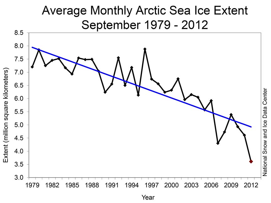
As just one example, Arctic sea ice is disappearing 70 years ahead of
schedule and the list of other climate change impacts already happening far
ahead of schedule is long and wearisome.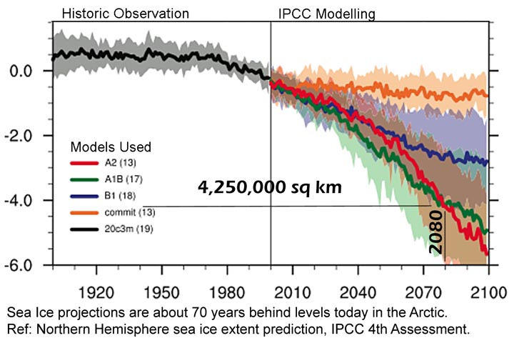 The image below is based on the 2007 record. This years record was 3.61
million square kilometers. On the graph below this is 4.89 million square
kilometers below the 0.0 arbitrary baseline.
The image below is based on the 2007 record. This years record was 3.61
million square kilometers. On the graph below this is 4.89 million square
kilometers below the 0.0 arbitrary baseline.
And as a corollary-Antarctic Sea Ice; this year we again saw a record in Antarctic sea ice only it's another maximum sea ice record. What you say? Shouldn't Antarctic sea ice be shrinking on a warmer planet? I've written about this several times. Because the Antarctic is land surrounded by sea vs. sea surrounded by land at the North Pole, climate change affects the South Pole differently. Temperatures down there are stable to slightly rising, nowhere near approaching melt across such a large area as Greenland saw this year, but other aspects of the climate down there have changed.
The winds have increased and changed in direction somewhat. amoung many other things, this spreads the ice out farther, increasing sea ice coverage--even on a warmer planet. It's just that Antarctica is soooo dang cold, a little warming doesn't mean much. BUT! The higher winds are is mixing more warmer water with the frigid Southern Ocean water. Ice loss in Antarctica has caught up with that in Greenland simply because the oceans are warmer down there now. Much of the ice loss in the Antarctic is now coming from the bottom of ice shelves that are much more numerous down yonder than at the North Pole. In the 2007 IPCC though, Antarctica was not supposed to start losing ice until beyond the end of the 21st century. Snowfall on the interior of Antarctica (on a warmer planet--remember that warmer air holds more moisture) was supposed to counteract melting around the edges caused by warming. But this has not happened. The melt from below the ice is strong. Antarctica wasn't even supposed to start losing ice until after 2100. Unbelievable!
See
Previous Discussions
October 7, 2011--Unprecedented Arctic Ozone
Destruction (bottom of this page)
(In the archives at the bottom of this page)
July 15, 2010 Five Big All-time
Global Climate Records Broken in June and
December 2, 2009 Antarctic Melt Increases While the Ozone Hole Keeps it Cool
National Snow and Ice Data Center: http://nsidc.org/arcticseaicenews/
September 20, 2012: Expect the Unexpected Say Climate Scientists -- Just a quick note. One of the continuous warnings from climate scientists is not continuous drought, warming that makes Minnesota like Texas, floods that rival Noah's, melting permafrost, loss of Arctic sea ice, global economic crippling sea level rise, ocean acidification or any of dozens more; it's "expect the unexpected." One of the biggest examples so far has been the increase in record snowtatstrophes across the U.S. northeast, northern Europe, the British Isles and China. When these things started in 2005 (ish--I think the big Chinese snowpocalypse was a few years earlier) they were widely regarded by the D&D crowd (deniers and delayers) as "the end of global warming." Climate scientists of course new better. Less sea ice in the Arctic meant warmer Arctic storms early in the winter, transferring more energy to the jet stream, pushing these storms farther south as the jet stream buckles increased in size. It took a few years for the science to be done to confirm, but by about 2008, the outreach had been done, and the extremeness of these snowmeggedons had impressed upon the general public this fundamental thing about climate change; "expect the unexpected."
Do climate scientists have any ideas about more of these unexpected things happening--no. Hence, the reason for the statement "expect the unexpected." But I have had a few ideas. Beyond the climate change impacts already happening generations to a century or more ahead of schedule, the Arctic ozone hole is one of these. We have had two significant Arctic ozone loss events in the last five years--expect more, or at least expect the unexpected. Other things? A partial collapse of the West Antarctic Ice Sheet tops the list. It's happened before when the global temp was similar or just a wee bit warmer than today. The consequences of course will be globally crippling economic trouble.
Others? Insect infestation and disease: Not in humans, at least not that affect you and me. Maybe in developing nations or or third world countries. But the infestations and diseases I am talking about are already evident in our forests across the planet. The pine beetle pandemic which I report about in my documentary What Have We Done, is a prime example. The previous discussion (September 12, 2012) about forest mortality is another. The evaluations of forest mortality across the Rockies of North America do not include tree death because of the pine beetle. They include everything else though--other insect infestations and tree diseases that are now running rampant on a warmer planet. Why are they running rampant? The pine beetle pandemic tells us again. These bark beetle that are the attacker in this pandemic are killed by extreme cold. One of the casualties of global warming is extreme cold at altitude and in northern latitudes. We no longer have the kind of extreme cold that kills these beetles. Combine this with drought, that can be perpetuated even during periods of normal or above normal rainfall because a warmer climate gives us so much more evaporation, and you get heat stress. Stressed trees, just like stressed humans, are more susceptible to disease and infestation. So another great and unexpected thing that we will almost certainly see happening in the very near future is the migration of the mountain pine beetle into areas of eastern Canada, the northeastern U.S. and even the southeastern U.S. These areas have never before seen this beetle and there are no natural defenses against its attack.
What Have We Done a documentary about the 62 million acre pine beetle pandemic in the Rockies of North America.
September 12, 2012 Canadian Boreal Forest Mortality is Already Ten Times
Higher than Normal, In a similar study in the Rockies, Four to Five Times
Higher Mortality than Normal: The Canadian boreal forest is that
northern area of Canada where almost nobody lives. It extends north through
some of the wildest lands ever known to the arctic tundra. Under traditional
warming scenarios, the boreal forest, and most forests of the world are
"fertilized" by extra carbon dioxide and grow faster. This CO2 fertilization
effect was supposed to last far into the 21st century or even beyond before
warming creates a hostile environment that overwhelms the CO2 fertilization
effect and begins to harm forests. The Canadian boreal forest contains 30
percent of the world's boreal forests and is larger than the remaining
Amazon rain forest.
The boreal forest or taiga covers ten percent of Earth's land area and is 29 percent of Earth's total forest cover. It contains almost twice the carbon of tropical forests and almost six times the carbon of temperate forests. It surrounds the north pole across Canada, Russia and Scandinavia in an 800 mile wide band of green. It is clearly, relative to climate change, the most important ecosystem on Earth counter to the popular understanding that that the Amazon, or the rain forests are most important. (Not to dis' tropical forests diversity--we are talking about carbon and climate.)
This study was done by researchers at the University of Quebec, Montreal and published in November 2011. The research looked at 96 long term forest study plots all across Canada. Only undisturbed forest plots were evaluated where no logging or forestry practices had ever been undertaken. The minimum forest age was 80 years. None of the forest plots showed any signs of the unprecedented bark beetle infestations now taking place across Canada nor any other of the dozens of maladies present in Canada's forests that have been enhanced by a warming climate. The scientists tracked 22,425 living trees; and their data included a total of 74,556 observations.
The mortality rate was ten times greater in the west beginning at 0.25% per year in 1960, and doubling in twenty years (1980), then increasing five times more in the next 30 years (2010). In the east the mortality rate only doubled between 1970 and 2010. Counter intuitively, it was the mid elevation forests that are dying the fastest. Logic (and computer modeling) tells us the highest elevation forests, because they warm more than lower elevations, will experience more stress and thus mortality will increase faster.
Somewhat more predictably however, lower latitude forests are dying faster than higher latitude forests. The reason is likely that those trees further north are already existing on the ragged edge where the Arctic rules. As these climates warm it becomes more habitable, which still does not make much sense because there should then be less mortality; until one recognizes that these forests on the ragged edge exist in a very shallow layer of active soil that thaws for a few months every summer. Beneath is permafrost. With warming the permafrost is melting, but much of the melt is trapped on top of more permafrost. This creates a bog, not a forest and the trees stress and die, even as the temperature becomes more hospitable. So mortality, while increasing, is less than further south, confirming the logic.
So now this is happening generations or even a century ahead of schedule. The same thing is going on in the American West. In a study done by the U.S geologic Society, the U.S. Forest Service, the Universities of British Columbia, Washington, Arizona, Oregon State, Colorado at Boulder and Penn State, published in the journal Science in January 2009.
These researchers found an average increase in mortality of fourth to five times from "normal" in the 1960s. They looked at 58,736 living trees over the study period, and 11,095 died. Seventy-six plots of old growth forest were studied with the minimum tree age of 200 years from all across the American West.
The researchers ruled out beetle infestation and the other maladies enhancing mortality because of warming. They also ruled out fire, successional dynamics where shade tolerant species dominate, increasing forest density from fire suppression, and something called the "majestic forest syndrome." This is where really ancient trees, possibly allowed to become over ancient because of forest fire suppress, fall on younger trees causing their deaths.
Regrettably, recruitment rate is failing as well. Normally when a tree dies in the forest, dozens of new trees pop up to replace it. This is happening in only half of the forest plots studied today. The researchers conclude that warming stresses are responsible. As our climate changes, forests are simply evolving to something different from the way they originally evolved in our old climate.
This pervasive increase in mortality dramatically reduces stored carbon. In twenty years, standing carbon is reduced by 50 percent. In thirty years it is reduced by 80 percent. this bodes poorly for the carbon sequestration ability of our world's forests in the short-term.
Peng et al., A drought induced pervasive increase in tree mortality across Canada's boreal forests, Nature Climate Change, Dec_2011.pdf
Mantgem et al., Widespread Increase of Tree Mortality Rates in the Western United States Science Jan 2009.pdf
August 18, 2012 Global Warming Caused Landslide in Alaska? If your read my reporting on mega-tsunamis from March 13, 2011, you know that evidence of astronomically landslides has been recorded in Hawaii and evidence exists around the world of similar events. The evidence shows tsunami debris 1,200 feet above sea level from the last interglacial period 120,000 years ago that was as warm or only about a degree or two warmer than it is today. Modeled tsunami heights reach 2,500 feet.
Marten Geertsema of the ministry of Forests, Lands and Natural Resources in Prince George, British Columbia, Canada, submitted a report of the incident to the first meeting of the Cold Regions Landslides Network in Harbin China that met July 23-27.
The cause for this one in Alaska, that did not reach sea level and caused no tsunami, was not changing sea level as is likely from Hawaii. The cause of this one, and another one similar a few weeks prior, was possibly permafrost melt.
It happened about half way down the panhandle in southeast Alaska, about 75 miles west northwest from Juneau, on the eastern flank of Lituya Mountain in the Glacier Bay National Park and Wilderness Area on June 11. The event was identified by seismic signals of up to 3.7 on the Richter scale, but the slide itself, because of the remoteness of the region, was not seen until July 9. This is when the photos in this report were taken.
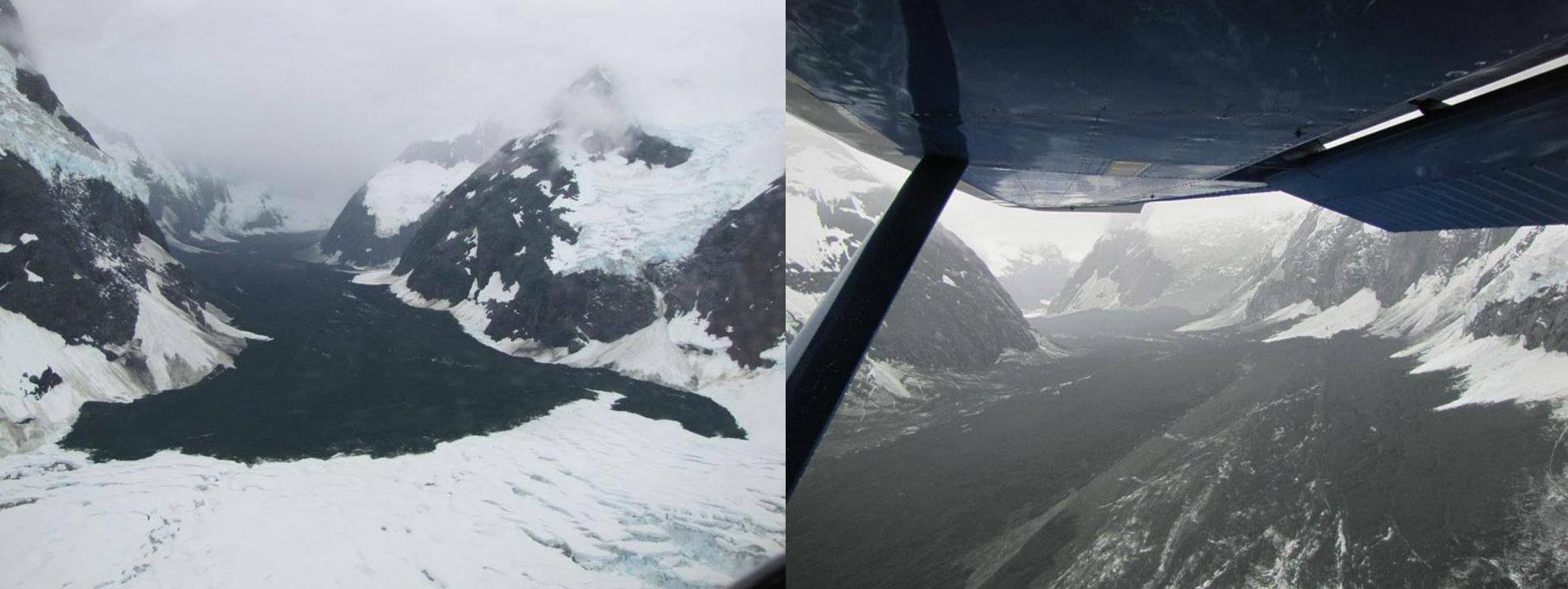
The slide started at about 10,500 feet, fell over a mile and ran out five and a half miles on the Hopkins Glacier. The image on the left shows the slide debris on top of the Hopkins glacier. The image on the right is from the photographers airplane (Drake Olson). The slide travelled a mile and a half down the steep mountainside then ran out along the Hopkins Glacier another four miles before coming to a halt. Debris from the slide was scattered 200 feet above the level of the slide deposition zone and included gravel up to 15 inches in diameter, dust up to 1500 feet above the slide zone and fist sized rocks "peppered" in a wide area even higher than this. The flow had such a high velocity that it super elevated the outside of the curves up to 100 feet above the inside.
In the image on the right, on the right hand side of the valley, several (or more) snow slides were triggered by the landslide. Evidence of these snow slides is obvious from the fresh slide fields of snow and ice deposited on top of the landslide debris zone.
We know that the slide originated in a permafrost zone, and we know that high altitude slides are increasing around the world. We know that permafrost melt can be responsible for slides like this. We also know that heavy snowpacks melting rapidly can cause slides like this. And indeed, this year the Glacier Bay area saw heavy snowfall and a rapid melt.
Report: http://www.nps.gov/glba/parknews/upload/2012-Landslide-Report.pdf
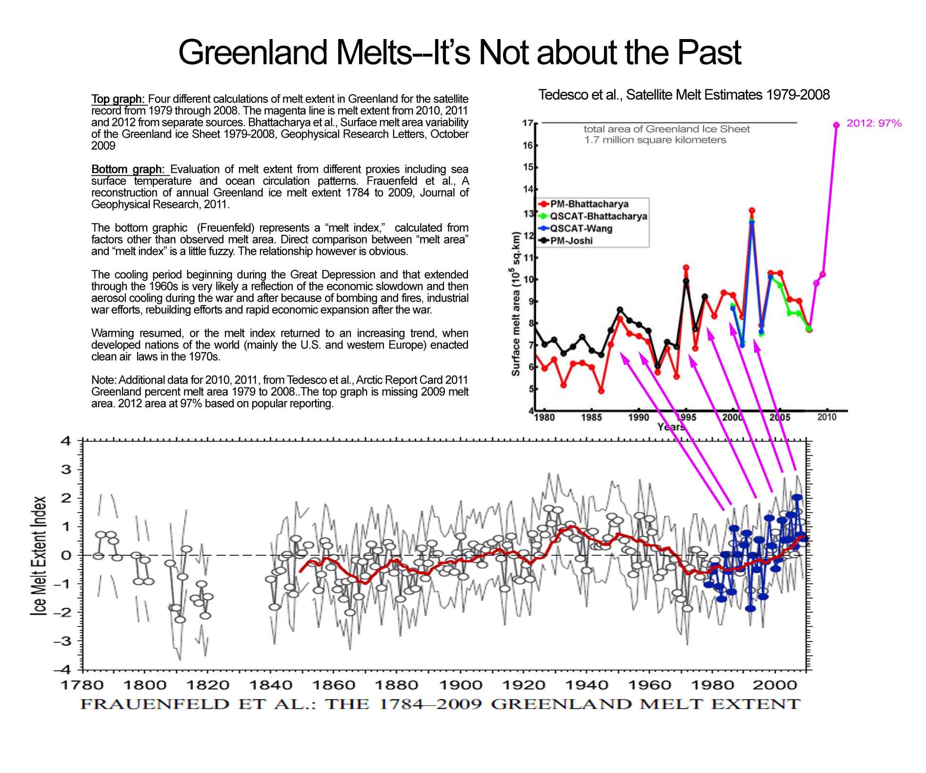
August 1, 2012 Greenland Melts--It's NOT About the Past: It is time we stopped comparing climate change caused weather events with similar events in the past. Our country is suffering through a second year in a row of drought as bad as or worse than the Dust Bowl. Climate scientists say that Dust Bowl drought and heat will be the average condition while you and I are still alive. This means that weather events like the Dust Bowl will become 50 to 100 times more frequent, while you and I are still alive. Considering that a Dust Bowl drought is about a one in a hundred year occurrence, to go from a once in a hundred year thing to a thing that happens every year or two within the time span of several decades, this means, like I have said before--if this is not climate change happening right now, this is exactly what climate change will be like in the very near future.
Over four days in July, satellites observations showed what would normally be called a freak event in Greenland. The entire surface of the Greenland Ice Sheet melted, or more accurately, satellite observations tell us that 97 percent of the surface of the Greenland Ice Sheet melted. Normally only 25 to 50 percent of the surface melts every year, but three times in the last fifteen years we have seen extraordinary melt events during the summer. Things have changed in Greenland.
When I was there in 2007, the climate scientists on the ice were talking about "The Big Melt." It began in 2002 with a 76 percent melt and continued in 2004, 5, 6 and 7, with two 58 percent melts and two 53 percent melts--all greater than anything else recorded. Twelve of the last 17 years have seen melt greater than anything in the previous 16 years. The record only goes back to 1979, but a much longer recreation of melt in Greenland can be seen below in the graphic "Greenland Melts-It's Not About the Past."
What the long term melt record in Greenland shows is steady warming since the end of the Little Ice Age punctuated by a cooling that begins and ends identically to the global temperature record cooling event between 1938 and 1977. The cessation of warming was caused by the Great Depression, WWII and the ensuing massive industrialization both for the war and after the war. First, the Great Depression decreased emissions which decreased warming. Then, aerosols and smoke from the building and detonation of weapons and from the fires of war created a cooling blanket of smoke (aerosols) that wrapped the earth. After the war, aerosols emitted from smokestacks, machinery and the industrial machine feeding post-war prosperity continued the creation of the veil of smoke (smog) that cooled the earth. Finally we realized we were poisoning ourselves through our atmosphere and enacted air pollution laws in the developed nations in the 1970s which put an end to the missions of cooling pollutants from the industrial machine.
This massive melt event has even made the news like the extraordinary climate change event that it is, only there is a problem with the reporting. This problem is widespread and pervasive and it is not just a problem with the media, it's a problem with some climate scientists too, or at least their press release writers. The problem is that we (this is the royal "we") are still treating these extraordinary events as a part of our old climate. In this case, this event is being reported as being similar to events that have happened about every 150 years over the last 10,000 years in Greenland, the last one in 1889. This is a nice safe comparison for a scientist, and just in case... it always ends with "we can't say for sure." The implication is that it has happened before so there is nothing unusual going on. We have the same challenge with a paper by Bjork et al in 2012 that talks about these episodic melts, he says the last one was in 1939.
It's not that anything these good folks are saying is invalid. If our
climate had not of already changed, what they say would be completely valid.
 Unfortunately,
our climate has changed. Extreme weather events are happening much more
frequently now than during our past climate of the 20th century. High
temperature records are now being set twice as fast as low temperature
records and we are just getting started with the warming.
So comparing this recent extraordinary melt, part of a series of melt
events that started in 1995, to the rest of the 20th century, just ain't
right.
Unfortunately,
our climate has changed. Extreme weather events are happening much more
frequently now than during our past climate of the 20th century. High
temperature records are now being set twice as fast as low temperature
records and we are just getting started with the warming.
So comparing this recent extraordinary melt, part of a series of melt
events that started in 1995, to the rest of the 20th century, just ain't
right.
We simply cannot compare what is happening now to anything in the past. Comparing now, or back then, to the future, when the extremes will be even more extreme and more frequent, is even more inappropriate.
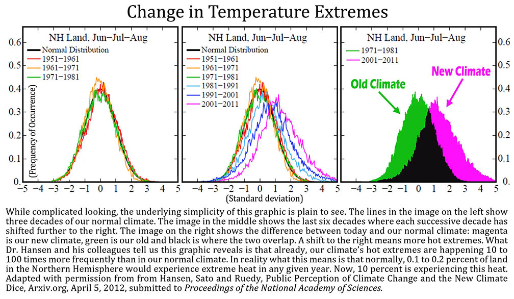
James Hansen, Director of the NASA Goddard Institute for Space Studies, the United States' main government climate modeling agency, tells us that these kind of events are so prevalent in our newly changed climate that statistically it is much more likely that they are caused by climate change instead of the other way around. Hansen looked at temperature departure from normal in his most recent paper Perception of Climate Change, PNAS, August 2012 (see the graphic "Change in Temperature Extremes"). The green and magenta image is the one that most blatantly tells the story. When I realized how imposing an image I could create by coloring in the decade of the 50s and the decade of the 2000s to show the great departure of our climate today from our normal climate, I immediately asked Dr. Hansen if I could "color" in his figure. With his permission I present this eye-popper "Change in Temperature Extremes."
The green is our old climate, represented by the decade of 1951 to 1961. The magenta is our new climate showing the decade 2001 to 2011 and it is shifted far to the warm side. What Dr. Hansen and his colleagues tell us this graphic reveals is that already, the hot extremes in the Northern Hemisphere are happening 10 to 100 times more frequently than in our normal climate. Normally, 0.1 to 0.2 percent of land in the Northern Hemisphere would experience extreme heat in any given year. Now, 10 percent is experiencing this heat every year, or 10 to 100 times more.
Even more telling though is the shift in the averages. Each decade since 1971 has been warmer than the last and looking closely, one can see the shift is increasing in size. In other words, warming is accelerating non-linearly. It's like a Saturn V rocket taking off--ever so slowly at first.
This is much more serious than it appears to most. A few more heat waves are
only a curiosity to most of us. We shuffle
 from
the office to the car to the house in one swift air conditioned ballet. We
don't sweat except for 50 minutes every week when we mow the yard. We
simply bill-pay
more for the extra electricity to keep our homes the same temperature all the
time. And each dollar we pay sends more greenhouse
gases into the sky to warm us more so that we can use even more energy to
keep our homes comfortable.
from
the office to the car to the house in one swift air conditioned ballet. We
don't sweat except for 50 minutes every week when we mow the yard. We
simply bill-pay
more for the extra electricity to keep our homes the same temperature all the
time. And each dollar we pay sends more greenhouse
gases into the sky to warm us more so that we can use even more energy to
keep our homes comfortable.
But ask the corn farmers in the Midwest about once a century heat waves. Then tell them they are going to have one of these every three to five years starting this year as Diffenbaugh and Ashfaq tell us in Intensification of hot extremes in the United States, in Geophysical Research Letters, 2010 (see entry for July 8, 2010). Then tell them that these two scholars from Stanford and Purdue tell us that beginning in 2020 we will see Dust Bowl drought 3 to 4 times per decade across most of the country. Then, by the time their kids are taking over the plowing, will see a heat wave like the one they had this summer that comes around every other year. To have a major crop failure caused by major drought once every 50 years is normal, maybe even once a generation. But every three years? Starting in ten years? or every other year while we are still alive? This will create global catastrophe. When it gets so hot that that the crops fail time after time, how do we go on?
In Austin last year it was so hot and dry that trees started dying across the region. the Texas Forest Service estimated that 500 million trees were killed. Across the American West trees are dying at quadruple the rate of the 1960s, and in the boreal forest of Canada natural tree mortality has increased ten-fold (1,000%). Neither of these studies took wildfires or the great pine beetle pandemic into consideration nor any of the other dozens of heat inspired insect infestations and disease outbreaks of the last decade or two. What happens in twenty years when most of the old trees are dead?
Beginning in just twenty years we will have an extreme 100-year heat wave every one to three years. How hot will the hottest heat waves in twenty years be? In other words, the drought of the century, the all-time record high temperature, will happen about every other year, not every 100 years. Every five years we will have a drought that is worse. Ever ten years, we will have a drought worse than the one every five years and every twenty years--same smell. It goes on and on and never stops.
Ganguly et al 2009, tell us that because we are on the worst-case scenario emissions path according to the 2007 IPCC and can expect 14.4 degrees of warming over land by 2050 (see entry for July 13, 2012). What you say? You thought it was only 2 to 3 degrees C of warming by 2100? Not any more. The 2 to 3 degrees C of warming was the story for the last twenty years. This was the Kyoto story. The Kyoto path was what we were sold on if we began to reduce emissions according to the Kyoto protocol. If we did as the climate scientists suggested, we would limit warming to less than the dangerous 2 degrees C threshold.
Now the Climate Change Generation has arrived, and the leaders of their parents did not do as the climate scientists suggested. Things are different now because of this. Our climate has changed. Now we will see 14.4 degrees F of warming over land. But this is not new science, it is the worst-case scenario of the old 2007 IPCC. We did not reduce emissions like we were told was prudent by some of the smartest people in the world and now we pay. Fixing climate pollution will be harder and the risks of really bad things happening before we get the problem under control are much greater.
For twenty years we have assumed we were going to deal with our ongoing greenhouse gas emissions and dangerous climate change would be held at bay. The path that we thought we were on was the middle of the road emissions scenario called A1B. This scenario included an equal mix of fossil fuels and alternative energy. No specific greenhouse gas emissions reductions were included in any of the emissions scenarios, but because A1B had an equal mix of fossil fuels and alternative energy, emissions were such that dangerous climate change would be averted.
But that was then and then is not now. We did nothing (or virtually nothing) to limit greenhouse gas emissions, to diversify our mix of energy sources, to increase energy efficiency and bring third world agriculture into the latter part of the 20th century. Now dangerous climate change is here. Extremely dangerous climate change is right around the corner.
Two researchers from the Universities of Manchester and East Anglia (Anderson and Bows) published a paper in the oldest scientific journal in world, the Philosophical Transactions of the Royal Society (1665), about the current state of our climate relative to how we thought our climate was. They tell us that because emissions are so much greater today than they should have been under the vision for the A1B scenario, climate change impacts are now much greater than they should have been at this time. In their words: "There is now little to no chance of maintaining the global mean surface temperature at or below 2 degrees C. Moreover, the impacts associated with 2 degrees C have been revised upwards, sufficiently so that 2 degrees C now more appropriately represents the threshold between ‘dangerous’ and ‘extremely dangerous’ climate change." The authors even ask if 1 degree C should now be considered the threshold for simple "dangerous" climate change.
What this all means is that we are now on the worst-case scenario emissions path as imagined by the IPCC. Ganguly et al 2009 tells us: "Recent observations of global-average emissions show higher trajectories than the worst-case A1FI scenario reported in IPCC AR4." What these authors from Oakridge National Labs, Notre Dame and the Center for Atmospheric research tell us is that in Austin we will see our average August temperature skyrocket to somewhere around 100 degrees in just 38 years (see entry for June 13, 2012). The Sonoran Desert Research Station in Arizona, the one with the giant saguaro cactus, averages only 98 degrees in August.
So in Austin in August in 2050, the average high temperature will be hotter
 than it is in the heart of the Arizona desert
during the 20th century. During
heat waves on our new hotter planet, it will not just be 6 degrees warmer than
average like it was in our unprecedented heat wave in Austin last year, it
will be much hotter. At least this is what the
models say and they have been pretty much on the mark so far. The heat waves
in the future will be even bigger and badder. So if the average Austin
August temperature in 2050 is 100 degrees, figure an
average August temp of 106 to 110 during heat waves. The average
high temperature will be 10 or 15 degrees warmer
than this, or 120 to 125 degrees. (You notice I am adding everything to the
high end of the range. This is because our emissions are on the
worst-case scenario emissions path and there is so little time to make an impact with the
mindset of our society today. See my article on the RagBlog about this topic
http://theragblog.blogspot.com/2012/08/bruce-melton-biggest-misunderstanding.html
)
than it is in the heart of the Arizona desert
during the 20th century. During
heat waves on our new hotter planet, it will not just be 6 degrees warmer than
average like it was in our unprecedented heat wave in Austin last year, it
will be much hotter. At least this is what the
models say and they have been pretty much on the mark so far. The heat waves
in the future will be even bigger and badder. So if the average Austin
August temperature in 2050 is 100 degrees, figure an
average August temp of 106 to 110 during heat waves. The average
high temperature will be 10 or 15 degrees warmer
than this, or 120 to 125 degrees. (You notice I am adding everything to the
high end of the range. This is because our emissions are on the
worst-case scenario emissions path and there is so little time to make an impact with the
mindset of our society today. See my article on the RagBlog about this topic
http://theragblog.blogspot.com/2012/08/bruce-melton-biggest-misunderstanding.html
)
Hotter yet: Heat waves have spikes in temperature. The hottest day is about 5 degrees warmer than the average heat wave high temperature. This puts us, in just 38 years when most of us are still alive, around 130 degrees (plus a little for the heat island effect) for an all-time record high. The hottest temperature ever recorded on Earth was in Libya at 136 degrees. In Death Valley it was 134 degrees.
By 2020, the average temperature in Austin in August will be exactly like it was last year when we had 90 days of 100 degree or hotter heat.
Look at the graphic titled "Tedesco et al, Satellite Melt Extremes 1979-2008" in the graphic "Greenland Melts-It's Not About the Past." There have been three extreme melt pulses since 1995, each one more extreme than the next. These have been punctuated by eight much smaller melt pulses that have each been larger than any melt event in the record.
Our climate change future is not about our climate past. You have seen the projections. You have seen the graphs of warming where the temperature line shoots up into blank space like a rocket. Look at the graphs under "Greenland Melts." Tedesco has a really short record, but the base of the rocket launch is now visible.
Frauenfeld et al., shows the base of the rocket ramp as well. But in Frauenfeld, the base of the rocket ramp looks like the warming period from 1880 to 1930. And remember, the cooling spell in Greenland from 1938 to 1977 is identical to the cooling spell in the temperature record. More accurately, it's a cessation of warming in the temperature record, but both events were caused by The Great Depression, WWII and wartime and post-war industrialization. The cooling was caused by pollution and it disappeared with pollution control laws passed in the 1970s.
How do we know that this time is different?
Among dozens of different and very robust findings about our changing climate, climate scientists have been telling us for twenty years that if we did not begin to immediately reduce emissions this would happen. We did not and it did. Now the warnings are more dire. The risks now are classified as "extremely dangerous climate change," not just "dangerous climate change."
On to albedo. An ice sheet survives based on albedo. Albedo is whiteness or reflectivity, meaning the whiter something is the more sunlight it reflects. Because absorbed sunlight is what turns into heat, reflected sunlight carries its heat harmlessly back into space. This is one of the reasons why the northland and ice sheets are so darned cold. There is nothing up there to heat up for a large portion of the year because everything is covered by snow and ice.
As it warms, snow changes, even if it is below freezing. Warming creates larger ice crystals that have a lower albedo (reflect less). These changes in the snow crystals make the snow less white, or less reflective, so warmer snow is able to absorb more sunlight which changes to heat as it is absorbed. This is called the ice albedo feedback. A little bit of extra warming means a lot of extra melt.
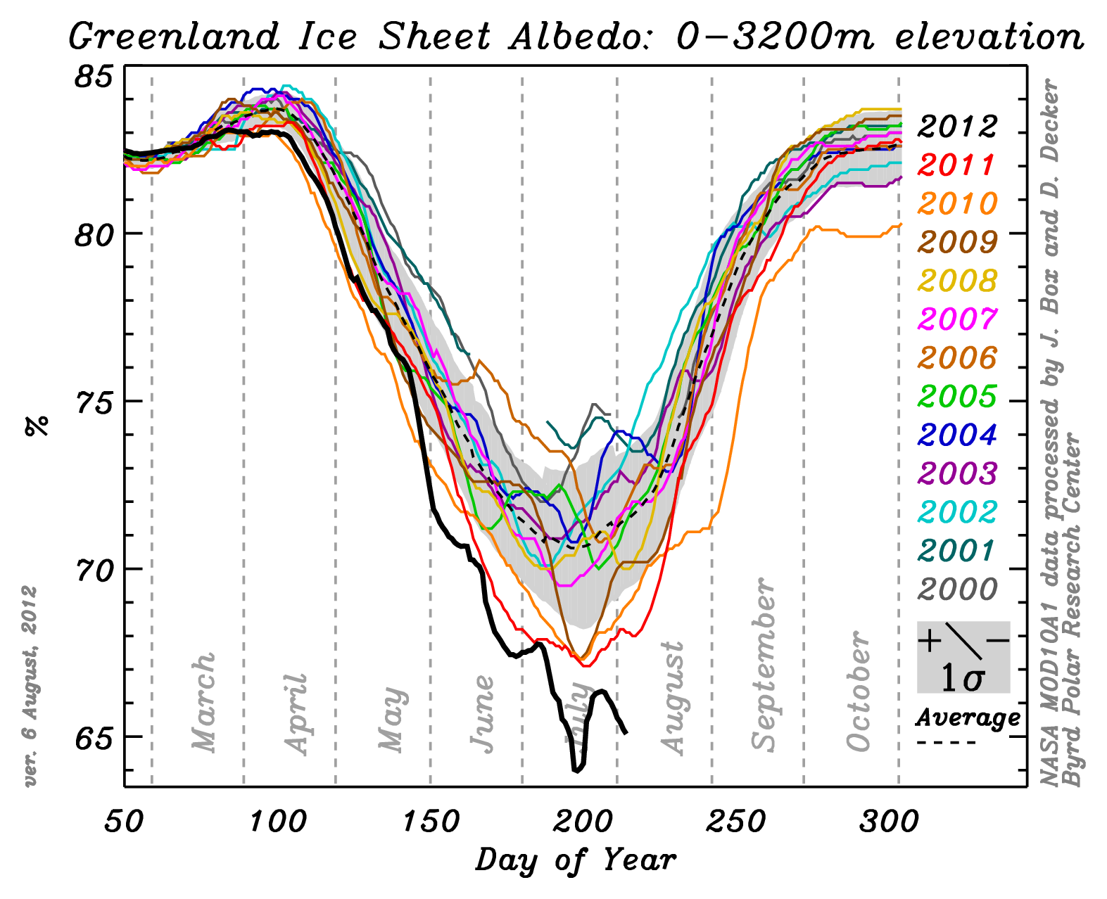
Albedo of the Greenland Ice Sheet is at an all time high this year as seen in the graphic "Greenland Ice Sheet Albedo." As the snow begins to melt, the wet snow has an even lower albedo increasing the melt further as even more heat is absorbed. Once all of the snow has melted off of the ice sheet, all that remains is the ancient solid solidified ice (compressed snow). Its albedo is even lower than that of wet snow.
The meltwater leaves behind a lot of the dust that has been accumulating for eons on the ice sheet. Yes, even the ice sheet collects dust and the amount is amazing. Dust has a much lower albedo than ice or snow so it absorbs much more heat, melting even more ice. Not only is it visible in places where melt has been high recently, but scientists use ice sheet dust to date ice. Colder times are drier and windier, and they create dustier snow layers. And surprisingly most of the dust on the Greenland ice sheet comes from Siberia.
Jason Box is a professor at the Ohio State University
Byrd Polar Research Center.
He has made 23 expeditions to Greenland since 1994 and his time camping on
the inland ice exceeds 1 year.
He has authored or co-authored 53 peer-reviewed publications related to
cryosphere-climate interactions and was a contributing author to the Nobel
Peace Prize-winning Intergovernmental Panel on Climate Change 2007 4th
Assessment Report. In a submitted paper, Professor Box has updated his
2009 Journal of Climate publication
"Greenland Ice Sheet Surface Temperature Variability: 1840 to 2007." The 2009
paper draws on weather data in Greenland from the late 1700s, but the really
interesting part is the additional 4 years of data (to 2011) in his new
paper.
Box tells us on his blog Meltfactor.org:
"It seems little doubt that recent summer air
temperatures
for Greenland ice are the highest in at least 172 years. Summer temperatures
in the late 2000s are roughly 0.5 C warmer than in the 1930s and even warmer
than at any time since at least the 1840s. Because the reconstruction
captures the end of the Little Ice Age, it is further reasonable to think
that Greenland probably hasn’t been as warm in summer than since the time
the Norse colonized Greenland beginning in 982." The graphic from Box's
submitted paper showing the latest four years of warming and it shows an all too
familiar pattern.
(See the graphic: Greenland ice sheet summer near surface air temperature
1840 to 2011.)
Look at how much warmer it has been since
1889, and specifically the last decade. (The baseline
of 0 is arbitrary.) The coldest place in Greenland is
Summit, a research station at the top of the 10,552 foot high Greenland Ice
Sheet, 415 miles north of the Arctic Circle. Between 2000 and 2011, the
temperature at Summit had risen above the freezing mark four times. But in
mid-July 2012, temperatures eclipsed the freezing mark on five days,
including four days in a row from July 11 - 14 at 34 to 36 degrees F.
Compare this to the average Northern Hemisphere temperature from GISS in the
image below in chartreuse. Isn't that fit remarkable?! And remember, the massive 97 percent melt this July is not
included in this record!
Now let's take a look at just a few of the unprecedented weather
patters this year.
Jeff Masters, Chief Meteorologist at the Weather Underground tells us about record early snow melt in the Austrian
Alps: "One of the longest meteorological data records at high altitude comes
from Sonnblick, Austria, on a mountaintop in the Alps with an elevation of
3106 meters (10,200 feet.) The observatory typically sees maximum snow
depths of 3 - 4 meters (10 - 13 feet) during winter. According to weather
records ... the snow had never completely melted at Sonnblick until the
summer of 1992. Complete snow melt did not happen again until August 12,
2003, and has happened an average of once every two years since then--but
always in September. Yesterday, on July 31, the snow completely melted at
Sonnblick, the earliest melting since record keeping began in 1886. It's
been an exceptionally hot summer in Austria, which experienced its 6th
warmest June since record keeping began in 1767. Sonnblick
Observatory
recorded its all-time warmest temperature of 15.3°C (60°F) on June 30.
Vienna hit 37.7°C (100°F) that day--the hottest temperature ever measured in
June in Austria. Note that the two mountains in the Alps with long climate
records, Saentis in Switzerland and Zugspitze in Germany, beat their records
for earliest melting last year in 2011 (Saentis beat the previous record of
2003, and Zugspitze tied the record set in 2003.) "
The myths are starting to fall. America's awareness of climate change issues
is on the increase once again. For almost a decade during the Bush
Administration, we were
given permission to ignore. When former president George W. Bush reneged on
his campaign promise to enact
Cap and Trade, and then announced that the U.S. would not be ratifying the
Kyoto Protocol, the playing field was set. Awareness plummeted. But the
last five or six years of extreme and unprecedented weather events have
demanded our attention. Beginning
two to three years ago, awareness began to rise again. And now the myths are
beginning to fall in a big way.
Dr. Richard Muller: The Berkeley
Earth Surface Temperature (BEST) group is that Koch Brothers consultant
hired last a couple of years ago to debunk the global temperature record.
The Koch Brothers thought they had a sure thing because Muller has been a
long-time outspoken skeptic of
the global temperature record. Dr. Muller wrote an op-ed in the New
York Times last Sunday. The piece started off:
The Charles G. Koch Foundation gave
$150,000 to the Berkeley Earth Surface Temperature (BEST) study in 2011.
Two years ago, a Greenpeace report, Koch Industries, Secretly Funding the
Climate Denial Machine (2010) found that the Koch brothers outspent Exxon
Mobile in science disinformation at a whopping $48.5 million since 1997.
Updated on June 20 2012, since 1997 the billionaire oil brothers Charles and
David Koch have contributed $61.3 million to the climate change denial
machine.
So, why are we talking about these weather events from our old climate.
Because the Koch brothers and others like them assure us that these recent
extreme events are no different? Not at all.
Well maybe this is part of it. But they tell us this because is intuitive
to us to start with. It makes sense. When we talk about weather we always
talk about this storm or that, or this cold snap or that summer heat wave,
or the flood back in the day, the blizzard, the hurricane. Our time is
punctuated by extreme weather. Our lives are lived in comparing our most
recent weather event to something like it in the past.
But now our climate has changed. Weather patterns are different. Extremes
of yesteryear are much more common today. A new class of super extremes has
taken the place of the old extremes. We can no longer compare the old patterns to today.
This 150 year melt event spoken of so frequently in the media in stories
about the recent Greenland melt is an excellent example.
This is an event that happens basically once every 150 years. The last time
it happened was in 1889 and this time is right on schedule. In reality those
ancient melt events occurred from 80 to 300 years apart and it's only the
average time period that is 150 years. But things are different now.
What Hansen tells us, is that the extremes are
now happening 10 to 100 times more frequently. This means that this 150 year
melt event is now a 15 year event or even an every other year melt event. So the rare
events, that in our normal climate happened once in 150 years now happens in
our changed climate once in 15 years to once every other year. and this is
well seen in Tedesco's work where 13 out of the last 17 years have seen more
melt in Greenland than the entire rest of the record back to 1979.
Our climate has changed significantly already and we
are just getting started with the changes. But it is going to be easy to fix this thing if we
just get started. I talk a lot about the famous ice scientists Richard Alley
and his climate pollution solution analogy from his book
Earth: The
Operators' Manual.
He tells us that nearly 100 economic evaluations of
the solutions are focusing on 1 percent of global GDP as the costs of the
solutions.
The finest thing about what Dr. Alley tells us though
is that 1 percent of GDP is the same amount we have spent every year for the
last 100 years on clean drinking water across the planet. The solutions use
existing technologies and as is almost always the case, once industry learns
that there is money to be made removing carbon from our atmosphere, costs
will plummet. In the meantime, tipping points, thresholds, irreversible
changes and abrupt changes are the threat.
The problem is, we have a really tough time modeling those abrupt changes,
thresholds and tipping points. Now
don't get the wrong idea, climate modeling on the whole has been quite
accurate for thirty years. There's a myth out there, promoted by the
denying and delaying crowd (D&D
crowd), that climate models are no better than weather models. It follows the
logic that if weather models can't get the five-day forecast correct, what
do we expect from climate models? This
propaganda, besides being embarrassingly wrong, enhances one of our
inappropriate societal beliefs about the
weather and climate.
Let me 'splain Lucy:
The broad understanding that the public has about
climate models is that they can somehow be compared with weather forecasting
models. The resulting mental leap allows us to think that, like weather
models, climate models cannot forecast their way out of a wet paper bag.
Much of this myth comes from the D&D gangs' twisting of a real
fact, but much of it
also comes from the nightly television weather forecast. Let me repeat something. Climate models have been remarkably accurate and consistent for thirty years—even the old simple models. That the
models do not reflect, even attempt to model those difficult abrupt changes is not
important to the propagandamaster. They take these little facts and twist
them out of context to create a reality that is completely false. So then, how are climate models so much better
than weather models? Meteorologists load up all of the current weather data
from across the planet or a continental region into their weather models and
then they run them into the future for a week or two. The results are, as
you and I know, quite variable after three to five days. Climate modelers do something entirely different. The
do not load the models up with the current weather conditions. They start
with any old typical batch of weather data and run the model. Then they
blindly change the weather data in the model to represent any other typical
weather from that same time frame.
Like on May 30th in Chicago it might be 88 degrees and
sunny; another May 30th might be 67 degrees and rainy, another
might be 79 degrees and partly cloudy. They make up dozens and scores of
these simulations and run them all off into the future. They start their
climate models hundreds and even thousands of years in the past and run them
hundreds and hundreds of years into the future. Backing up the clock to
some ancient time in the past helps confirm the models as they recreate our past
climate inside the computer. The climate modelers then have scores of results that,
like the television weatherpersons’ seven-day outlooks, are all different.
Of course
all of the weathercaster’s models are not different,
only the last few days of each are goofy, but you get the picture. So what do the climate modelers do with all of these
goofy forecasts based on imagined weather? They average them all together of
course. This is what climate is. It’s the average weather. Climate is not about the
specific conditions on any individual day. It's not about what temperature
it will be tomorrow, or how much it will rain tomorrow. That is
called weather. It’s not climate.
The disconcerting reality is that either the brevity of today's reporting,
Why did this press release writer make the remarks he did about Greenland
ice loss? I see this a lot. The press release writers are in the
public relations program. The are not scientists. The complaints about
these PR folks ability to comprehend and write about science are endless. I
was even recently asked by a Harvard professor if I would consider
freelancing press release writing because of, I presume, similar
experience(s).
Now a quick word about Antarctica and the general conservative nature of
the climate science consensus. The 2007 IPCC report said that Antarctica was
not supposed to start losing ice until after 2100. Yet from Velicogna 2009,
and the graphic Rapidly Increasing Polar Ice Loss, Antarctica is not only
losing ice, but it has caught up with Greenland--already! How can this
be? The reason the IPCC is so far
off, is the rate that our climate is actually changing today and the IPCC process.
The rate has sped up a lot, but the IPCC is a significantly dated voice. They stopped taking papers for their 2007 report in 2005.
The
academic work in those 2005 reports was done prior to 2003, so the IPCC 2007
report is a decade old. A lot of science has gone under the bridge in ten
years.
This is an extremely big deal and the media, and many climate scientists
simply tell us that we cannot blame any one event on climate change as if
this was still the 20th century. What is probably happening is that, like
climate scientists have been warning us for twenty years, if we did not
significantly reduce greenhouse gas emissions we would cross a climate
change threshold where all of the sudden our climate would begin to change
much more rapidly than before.
This graph from the Arctic Report Card shows this little threshold we have
probably crossed.
Now we have started down the path of increasing impacts due to climate
change. This is no longer a simple natural climate variation. It will not
swing back to normal. We are increasing the carbon dioxide concentration of
our atmosphere 14,000 times faster than anything normal in the last 610,000
years. We are on the worst-case scenario emissions path of the 2007 IPCC
process, not the middle of the road
scenario like we have been told for twenty years. Things are happening much faster than projected.
The have accelerated because we did not begin to reduce emissions 20 years
ago like was suggested prudent by some of the smartest people in the world.
To
avoid dangerous climate change we were supposed to have reduced emissions to
7 percent below 1990 levels by this year--2012--under the Kyoto Protocol.
The U.S., Afghanistan and South Sudan were the only countries in the world
to not ratify Kyoto. Since 1990 we have not only not
reduced emissions, we are now emitting 50
percent more than we did in 1990. As we have been told by climate scientists
for nearly two decades now, the longer we delay, the faster and more extreme
will be the changes.
What is happening in Greenland now is anything but a normal cycle. It is
climate change pure and simple. It is the beginning of an abrupt climate
change that will surprise even the scientists who are suspecting the worst. If this were to have happened ten years ago,
maybe we could rely on that old maxim "we cannot blame any one weather event on
climate change." But today is not ten years ago. And this is not one
weather event.
In an interview with the Guardian, Box said; "This is now the seventh summer
in a row with this pattern of warm air being lifted up onto the ice sheet on
the summer months," he said. "What is surprising is just how persistent this
circulation anomaly is. Here it is back again for the seventh year in a row
in the summer bringing hot, warm air onto the ice sheet." On his blog on the
15th of August he had this comment about the current extreme Greenland melt:
"...is due to extensive increased melting occurring all over Greenland,
especially at high elevations where melting lasted up to 50-60 days longer
than the average. This means that some of the areas at high elevations in
south Greenland are generally subject to a few days of melting (if it
happens at all) and this year they underwent melting for more than 2 months
(so far)."
Looking at the "Greenland Melt Equilibrium Line" graphic we can see another
aspect of how the abrupt climate change has begun. Jason Box's work
about how much faster Greenland is melting and James Hansen's work about how
much more extreme heat events have become are both conservative. As-in,
climate change is even worse than what these two researchers say.
They tell us that their work evaluates the average for the period 2000 to
2010. Things have steadily become warmer over this ten year period so the
average reflects sometime around 2005, not 2010. The years 2011 and
2012 were both more extreme in Greenland than 2010. The melting feedback has
begun.
Review: The past is not now. Our climate has changed already and will
continue to change faster in the future for time frames that matter.
Extreme heat events that, in our 20th century climate happened across 0.1 to
0.2 percent of Earth's land surface, are now happening (2000 to 2010
average) across 10 percent of Earth's land surface. Comparing today to the
past, at any point in the past, is scientifically inappropriate.
The last thing I want to leave behind is another inappropriate thing that a
lot of climate scientists are saying trying to cover their tracks. They do
this regardless and they find themselves getting burned more and more. They
say "if we see this happening again soon..." last year they said it with the
big drought and heat wave across the south central United States, and guess what
happened this year? They are saying the same thing again about the
unprecedented drought in the Midwest and they are saying it about Greenland
too. All this spurious discussion leaves a false and dangerous sense of
normalcy.
There are also scientist out there who are thinking out of their
cubicles. There is acknowledgement that melt in Greenland is speeding up ice
flow and that something called dynamical ice sheet disintegration exists.
But the facts around dynamical ice sheet disintegration are few and the IPCC
makes a concerted effort to tell us that their report in no way includes
any possible impacts from DISD.
Now we have acknowledgement
that meltwater in Greenland could do something unexpected.
We have already seen how increased meltwater is causing icequakes 1,000 time
more powerful than anything ever recorded before (5.4 Richter scale). And we
have seen how melt water can penetrate to the bottom of the ice sheet and
lubricate ice sheet flow. This is one of the ways that these gargantuan
icequakes occur. Areas of the ice sheet miles across can slip and when they
stop slipping the icequake occurs.
When I was in Ilulissat Greenland several scientists were at the Hvide Faulk
Hotel waiting for the weather to clear so they could catch helicopter ride
up to Swiss Camp on the ice sheet. Dr. Russell Huff,
then of the Cooperative Institute for Environmental Science
(CIRES) Melt water can even accumulate to a depth
that causes the entire ice sheet up to 4,000 feet thick, to float
six inches off bedrock.
It appears now that the cryologists (ice scientists) are concerned. As we
continue to warm the Arctic rapidly, these melt events will obviously
increase rapidly. We have seen Greenland change its average temperature 20
to 30 degrees F in the past 100,000 years, maybe a dozen or more times.
Today however we are pushing our climate much more dramatically than has
been the case in the past. So much more that our CO2 concentration is
likely increasing as fast as any time since the giant asteroid struck
the Yucatan Peninsula and the dinosaurs went extinct 65 million years ago
(Zeebe and Caldeira 2008--14,000 times faster).
Past Greenland melt, when these icequakes started happening, was on average 20
to 30 percent of the ice sheet. By 2011 this melt had increased
dramatically to 60 to 70 percent of the ice sheet and now we have this
amazing
new record. Warming coming over then next 20 to 40 years will be ten times
more than we have seen across the globe already. Melt will not increase
linearly; remember the ice albedo feedback.
Now, this is scary enough, but there is an important piece of physics that
needs to be understood about ice melting. It takes 9 time more energy to
raise the temperature of ice from a frozen 31 degrees to the melting point
of 32 degrees than it does to raise it from a melted 33 degrees to 34
degrees. The
reason is called the heat of fusion and it is responsible for turning a
liquid substance into a solid one or vice versa. We have been putting more
and more heat into the Greenland Ice sheet for a couple of decades or more
now, and it is starting to respond. The ice is getting warmer. Much less
heat is now required to cross the threshold from 32 to 33 degrees.
It is so manifestly true that climate change has begun and that this melt in
Greenland, along with all of the other
unprecedentedly extreme weather events lately are caused by climate
change.
The quantity of melt will increase rapidly from here on. This could mean
unexpected things for the relationship between the ice sheet and the
lubrication of meltwater that finds it's way to bedrock through crevasses.
And if climate change so far is any indicator, we should expect the
unexpected, and we should expect it sooner rather than later.
A recent article in
the
journal Science, tells us that that most of the ice loss happened in two
periods – 1985-1993 and 2005-10 – with relative stability in between.
doesn't mean much in the long term picture, rare,
Episodic melt 1930s: Bjork, An aerial view of 80 years
of climate-related glacier fluctuations in southeast Greenland, Nature
Geoscience May 2012.
http://www.nature.com/ngeo/journal/vaop/ncurrent/full/ngeo1481.html
Extremes are happening 10 to 100 times more often:
Hansen, Sato and Ruedy, Public Perception of Climate Change and the New
Climate Dice, Arxiv.org April 5, 2012, submitted PNAS.
http://arxiv.org/ftp/arxiv/papers/1204/1204.1286.pdf
Dust Bowl Drought 3 to 5 times per decade beginning in 2030:
Diffenbaugh and Ashfaq, Intensification of hot extremes in the United
States, Geophysical Research Letters, July 2010. (link)
Tree mortality in the Western U.S. quadrupled since 1960s:
Mantgem et al. Widespread Increase of Tree
Mortality Rates in the Western United States, Science, Jan 2009.
Ten-fold increase (1000%) in tree mortality in the Canadian West
since 1960: Peng et al., A drought induced pervasive increase in
tree mortality across Canada's boreal forests, Nature Climate Change,
December 2011.
http://www.nature.com/nclimate/journal/v1/n9/pdf/nclimate1293.pdf?WT.ec_id=NCLIMATE-201112
Extremely Dangerous Climate Change 1 degrees C not 2 degrees C:
Anderson and Bows, Beyond dangerous climate change: Emission scenarios for a
new world, Philosophical Transactions of the Royal Society, January 13,
2011. http://rsta.royalsocietypublishing.org/content/369/1934/20.full.pdf+html
14.4 degrees F of warming on land by
2050: Ganguly et al., Higher trends but larger uncertainty and
geographic variability in 21st century temperature and heat waves, PNAS,
September 2009.
Austin's average August temperature be 100 degrees in 2050 based
on the 2007 IPCC worst-case scenario path that we are now upon:
Ganguly et al., Higher trends but larger uncertainty and geographic
variability in 21st century temperature and heat waves, PNAS, September
2009.
http://www.pnas.org/content/106/37/15555.full
Jason Box's Meltfactor:
http://www.meltfactor.org/blog/?page_id=9, July 25, 2012
Jeff Masters:
http://www.wunderground.com/blog/JeffMasters/comment.html?entrynum=2160
Dr. Richard Muller: The Berkeley
Earth Surface Temperature (BEST) Group,
http://berkeleyearth.org
Greenland Melt 97 Percent:
NASA Jet Propulsion Lab Press Release:
http://www.nasa.gov/topics/earth/features/greenland-melt.html
Arctic Report Card 2011:
Greenland Mass Balance (NASA): Richter-Menge, J., M. O. Jeffries and J. E.
Overland, Eds., 2011,
http://www.arctic.noaa.gov/reportcard.
Rapidly Increasing Polar Ice Loss: Velicogna, Increasing
rates of ice mass loss from the Greenland and Antarctic ice sheets revealed b
y GRACE, Geophysical Research Letters, October 2009.
http://ess.uci.edu/researchgrp/velicogna/files/increasing_rates_of_ice_mass_loss_from_the_greenland__and_antarctic_ice_sheets_revealed_by_grace.pdf
Antarctica not supposed to begin losing ice until 2100:
Intergovernmental Panel on Climate Change, Fourth Assessment Report, Climate
Change 2001: Climate Change 2007: Working Group I: The Physical Science
Basis, 10.6.5 Projections of Global Average Sea Level Change for the 21st
Century, Table 10.7. Also see 10.6.4.1, Surface Mass Balance, “All studies
for the 21st century project that Antarctic SMB changes will contribute
negatively to sea level, owing to increasing accumulation exceeding any
ablation increase.” Also see Executive Summary, Sea Level.
http://www.grida.no/publications/other/ipcc_tar/
CO2 is changing
14,000 times faster than the long-term average for the last 610,000 million
years: Zeebe and Caldeira, Close mass balance of long-term carbon fluxes
from ice-core CO2 and ocean chemistry records,
Nature Geoscience, Advance Online
Publication, April 27, 2008. CO2 emissions
are worse than the worst-case scenario developed by the IPCC: Synthesis
Report, Climate Change, Global Risks, Challenges and Decisions, Climate
Change Congress, International Alliance of Research Universities, University
of Copenhagen, March 2009.
http://climatecongress.ku.dk/pdf/synthesisreport
Icequakes releasing 100,000 times more energy
than anything before seen have started happening in Greenland… (Harvard), Tsai and Ekstrom, Analysis of Glacial
Earthquakes, Journal of Geophysical Research, V112 April 2007.
http://www.agu.org/pubs/crossref/2007.../2006JF000596.shtml
http://people.seas.harvard.edu/~vtsai/files/GlacialEarthquakesPreprint.pdf
Greenland melt Ice sheet float 6 inches:
Jay Zwally interview -- Program Two: Global Warming on Greenland & Risk of
Gulf Stream Collapse
http://old.globalpublicmedia.com/transcripts/458 Also a personal
conversation with Dr. Russell Huff while
awaiting a helicopter ride to Swiss Camp at the Hotel Hvide Faulk, Ilulissat
Greenland
Guardian Article:
http://www.guardian.co.uk/environment/2012/jul/24/greenland-ice-sheet-thaw-nasa
NASA Press Release:
http://www.nasa.gov/topics/earth/features/greenland-melt.html
Press Release - City College of New York:
http://www2.ccny.cuny.edu/advancement/news/Greenland-Melting-Breaks-Record-Four-Weeks-Before-Seasons-End.cfm
Professor Marco Tedesco's Blog:
http://www.greenlandmelting.com/
July 20, 2012 HMS Challenger Expedition (1872 to 1876) -- The
Greatest Scientific Venture of
The expedition sailed nearly 70,000 miles around the world, cataloged over
4,700 previously unknown species, made 133 bottom dredges, 151 open water
trawls, 263 serial water temperature observations and 492 deep sea
soundings. It was those 263 serial water temperature observations, where
they sampled ocean temperature at multiple depths, that are so important.
The authors of this paper from the Scripps Oceanography Institute and the
National Oceanography Centre in Southampton UK, have compared the modern
Argo ocean sensing program data with the Challenger data that is now 135
years old.
The Argo system is made up of about 3,000 free floating autonomous oceans
sensors. These little floating robot sensors spend five years bobbing up and
down in the ocean, taking its temperature and measuring its salinity then
bobbing to the surface and uploading to a satellite.
Because the oceans are riddled with the Argo floats, it is easy to compare
the circuitous route of the Challenger as it traversed the world's oceans to
any number of Argo floats. This is a really clever thing to be doing today
too because, as the authors of this paper remind us: "Since the 1960s about
90% of the excess heat added to the Earth’s climate system has been stored
in the oceans. The ocean’s dominant role over the atmosphere, land, or
cryosphere comes from its high heat capacity and ability to remove heat from
the sea surface by currents and mixing."
The results of the comparison shows a surface warming of 0.59 degrees C, and
warming is widespread down to 5,900 feet below the surface. Warming is
greater in the Atlantic (1 degree C) than the Pacific (0.41 degrees C).
Other work has shown that our oceans cooled slightly at the end of the 19th
century, so the warming identified in this work is estimated to start in
about 1910.
Among other interesting and possibly useful things this evaluation has found
is the Gulf Stream is farther north today than it was during the
Challenger Expedition.
The route of the 1872 to 1876
Challenger Expedition (red and blue dots):
The HMS Challenger (William Frederick Mitchel):
Roemmich,135 years of global ocean warming between the Challenger
expedition and the Argo Programme, Nature Climate Change, April 2012.
http://www.nature.com/nclimate/journal/v2/n6/full/nclimate1461.html?WT.ec_id=NCLIMATE-201206
http://www.nature.com/nclimate/journal/v2/n6/fig_tab/nclimate1461_F2.html
July 4, 2012 Wildland Fires and Terra Preta --
The question about range and forest fires and prehistory is an excellent
example of one of the most important things about climate change that is so
poorly understood by the public. Doing something to an ecosystem like
burning it or chopping it down, only has a significant impact on our climate
if that ecosystem does not grow back the same as it was, or we chop or burn
much, much more of it than normal every year. If we change a
forest to cropland, or pasture and grow cows, we lose biomass. It goes into the atmosphere and stays
there as CO2 for time frames much longer than it takes the ecosystem to grow
back. When it grows back, it takes about the same amount
of carbon back out of the atmosphere that was lost to burning or
decomposition. The carbon dioxide and the other
greenhouse gases are cycled back into the environment and there is no net
increase of greenhouse gases.
The reason there is no net change is that half of carbon dioxide stays in the atmosphere for greater than 300 years. A
quarter of CO2 stays there for greater than ten thousand years. So
repeated forest and range fires caused by lightning have little
effect on climate. Those burned ecosystems grow back and the carbon cycle
continues. The same goes for man-caused forest and range fires, as well as
forest product harvesting.
A particularity bad fire year may even have a cooling effect on climate
because of the other pollutants (nitrogen oxides and sulfates in smoke) that
reflect the sun's radiation back into space without it warming the planet
through the greenhouse effect. This cooling is very short lived however
because those pollutants stay in the atmosphere for only days, months or in
the case of volcanic emissions that extend into the upper atmosphere, a
couple of years--no more.
The Terra Preta Conundrum -- Biochar: Pre-Columbian disposal of spent ash and coals
from cooking fires was done over thousands of years. Waste ash was also
placed in pre-Columbian peoples growing plots to sweeten the acidic soil, a
practice still
done today across the planet. This sweetening allowed plants to utilize
fertilizer better (manure) and it works with organic techniques as well as
chemical fertilizers. This process, over dozens of generations, resulted in
a carbon rich soil of a quality not normally found anywhere else. To have
this kind of agricultural impact by
charring and burying organic material, and to sequester carbon in the process
is the goal of the modern biochar technique. Carbon placed in the soil as
such largely stays there for time frames that matter with our society and
climate change (hundreds to several thousand years).
To demonstrate the scope of a global biochar carbon sequestration effort
that would make a significant difference I will use the example of charring
all of the plants on the face of Earth and burying them. I am definitely not
suggesting anything of the sort, but using the scale of such a suggestion
to make a point. The carbon mass of all plant life on Earth is about 500
gigatons. Earth can produce this amount of carbon every 50 or 100 years or
at the rate of about 5 or 10 gigatons per year. If we cleared all the
forests on the planet and replaced them with fast growing short-lived tree
species maybe we could cut this down to 25 years.
The charring process is only about 50 percent efficient. Half of the biomass
is converted to biochar, the rest to gases that are emitted into the
environment or need to be captured and sequestered like greenhouse gas
emissions from coal electricity generation leaving us with 2 to 5 gigatons
of carbon to mix into the top 6 or 12 inches of Earth's soil.
We emit close
to ten gigatons of carbon as carbon dioxide alone every year, not counting
other greenhouse gases. So charring and burying every plant on earth would
not come close to breaking even. Considering the process is only
50 percent efficient, . the net impact of burning all plants on Earth is
down to 2.5 to 5 gigatons per year before other inefficiencies are added in.
Altogether, biochar is certainly not a major player in carbon sequestration,
but it could likely help. Especially using agricultural waste from
cellulosic
alcohol production or the like.
The best evaluation I found of the total philosophy of biochar/ bio-oil
production, use, cogeneration and carbon emission avoidance from enhanced
soil fertility was published in Nature Communications in August 2010.
This research looks at the sustainable use of this technique to sequester
carbon on a global basis. By a sustainable basis, what is meant is that the
biochar process is accomplished without endangering food security, habitat
or soil conservation. The bottom line is that a half gigaton of carbon
sequestration annually is possible if biochar techniques were put into
effect in a sustainable way in every possible place on the planet. large
scale cellulosic carbon production in the form or fast growing trees
species, switchgrass, algae and such are not really considered because of
their large natural resource requirements that make them relatively
unsustainable.
Implementing this technology would be something that we could do on a
scale relative to that which we as a global society implemented the use of
something like indoor plumbing. It will take 100 years, but in the end the
sequestration and emissions avoidance will be meaningful, as will the
enhanced fertility of our agricultural lands.
But we can't wait a hundred years for techniques like this to be
implemented. The challenge we have is to
reduce the atmospheric load of carbon. This load of carbon in the sky is equal to about half of all of
the greenhouse gases ever emitted. It's a big, big deal. But the voices of
institute's like the Heartland Institute, the same voices that tell us that
climate change is not real, a conspiracy, a natural cycle or that it is good
for us: these are the same voices that tell us the solutions will ruin our
economies. The vast majority of climate specialist say nothing of the sort.
The solutions to climate change will cost one percent of global GDP per year
for 100 years. This is very similar money to what we have spent for the last
100 years installing toilets and water treatment systems across the planet
for the last 100 years. It is very similar to the U.S. annual military
budget, or the amount of money we spend across the globe every year on
advertising, or the amount of agricultural damages from normal weather every
year in the U.S. alone. It is five times less than what we spend in the U.S.
alone, on health care.
Biochar is one little piece of the total solution. But because we did not
begin to reduce emissions twenty years ago when suggested prudent, reducing
emissions alone will likely no longer be enough. We need to implement
alternative energy far faster than we have been. We also must stop emitting
greenhouse gases from the production of energy from fossil fuels. We need to
reduce consumption, increase efficiency and develop atmospheric carbon
removal processes already in the field proving stages. The latest science is
beginning to tell us that reducing emissions to
zero will not get the job done. If we had of started reducing emission
twenty years ago, it would have been possible. Since then, we have increased
our emissions by 50 percent. As a consequence, it is very likely that we
will have to reduce atmospheric greenhouse gases below their present values.
This Herculean task needs to be accomplished in about the next twenty years.
The previous projections of 2100 was fine twenty years ago, and the most
recent projections of 90 percent emissions reductions by 2050 are likely to
fall by the wayside just as did the 2100 projections from the Kyoto Protocol
era.
Woolf et al., Sustainable biochar to mitigate global climate change, Nature
Communications, August 2010.
June 24, 2012 Organic Gardeners Rejoice! Methane From Compost is OK
-- Methane: so much news. First, methane from the
decomposition of recently grown organic stuff is not really a problem. How
'bout that. It's fossil methane that's a problem. Recently grown
organic material cycles through the growth/decay process rapidly relative to
climate change's semi-geologic timescale. So it's factored in to the
equation. Burning fossil fuels releases fossil methane that has been stored
for hundreds of millions of years and is considered a 100 percent addition
(anthropogenic) to the atmospheric load. But methane from recently dead
plants decomposing is not a problem. It's only the fossil methane that adds
top the global imbalance.
That said, if all the plants die at the same time like when we have a forest
die-off, their organic material decomposes all at the same time creating a
problem. Last year the forest die-off in Austin was not
too bad, but last year was just a preview. The Teas Forest Service says 500
million trees died. If each tree has 1,000 pounds of carbon, this is 0.250
gigatons of carbon alone. Globally we emit less than 10 gigatons of carbon a
year, so this is a lot of carbon. It's impact on th4 atmosphere is not as
extreme as it would appear however because it takes generations or longer
for all of the dead wood to decay. More decays sooner rather than later, so
it is still a big problem.
Permafrost melt is another good thing talk about while on this subject. Most permafrost has not melted in
the last 3 million years. Most permafrost is half organic material or more,
deep frozen in a partially decomposed state. It's a mixture of naturally frozen
partially decomposed compost and ice,
saved in the freezer for millions of years. If you have never seen
permafrost, it forms beneath the "active" layer of soil/living material. In
the tundra, this active layer has very little soil, but a foot or two (!) of
mosses and lichen. The bottom of the active layer is dead and slowly decomposes as it thaws out
every summer for a few weeks. As the tundra above slowly grows, the bottom layers slowly
thaws out less and less until they are 100 percent entombed in ice. This
is permafrost.
Permafrost can be thousands of feet thick. Because it is rapidly melting
now due to global heating, it's causing problems as the
partially decomposed organic material is defrosted. This is basically fossil
organic material and it is all decomposing and releasing it's methane (and
carbon dioxide) at one time.
There is as much methane in permafrost as there is in fossil fuels, already
burned and still in the ground. Frozen methane on the ocean floor is even
more fantastic. As organic material dies in the ocean (mostly plankton,
algae, diatoms and other microscopic sized or very small plants and
animals), it sinks to the ocean floor and decomposes. The
methane released in the decomposition process then rapidly freezes because of the great pressure there.
All of this partially decomposed fossil organic material counts because it's
not in the organic material cycle. it has been left out of the loop in the
deep freeze for fossil lengths of time. When it thaws it adds to the load in
the sky that makes it warmer.
Methane is peculiar substance. On the surface, methane freezes at minus (-) 296 F.
Beneath about 1,000 feet of water, at greater than 500 psi, the freezing point rises to
near
+ 40 degrees F as methane forms an ice composite with water called methane
clathrate. Because water temperatures across the globe at this
depth are almost always in the low thirties, the methane freezes.
There is enough frozen methane on the ocean floor to equal two or three times all the fossil fuels in
existence and already burned.
In the ancient past, a few warm
periods similar to today, or what we can expect in a decade or two, have
seen oceans warm enough to release massive amounts of methane. In the Laptev
Sea right now, north of Siberia, the Arctic Ocean has warmed enough to vent
methane (that was actually created in permafrost drowned under a rising
ocean after the last ice age) that amounts to more than all of the rest of
the current methane venting from all of the rest of the worlds oceans combined.
Methane is a very dangerous greenhouse gas. And even though it has a
life in the atmosphere that is twenty or thirty times less than CO2, it can
cause a lot of trouble. Twentieth century wisdom about methane's global
warming potential was that it was 25 times more potent than carbon dioxide
based on a standard global warming potential scale of 100 years. Today, more
knowledge has allowed us to understand that it's more like 33 times more
potent. But this is based on a 100-year time frame.
The most important time
frame in our global warming future is the short-term climate time frame.
This is the next 20 to 40 years, not the standard 100-year time frame
normally used for global warming potential measurements. The reason is because of irreversible
abrupt climate changes. We have seen these things happen 23 times in the
last 100,000 years where Earth's average global temperature changed 10
degrees F in a decade or two, or even crazier; when dynamics were "pushing"
the atmosphere at it's greatest, we saw 10 degrees of change across the
planet in just a few years.
And remember, 10 degrees is average across the globe. Over land it's more
like 20 degrees. This is because warming is much less over the oceans and the
oceans cover 70 percent of Earth's surface. So the reason that the short
climate time-frame is so important is that we quite possibly dangerously
close to climate tipping points. Certainly we are far closer than we were
twenty years ago when we were supposed to have started reducing emissions.
And the faster climate has changed naturally in the past, the stronger these
climate tipping points appear to have been.
Today we are pushing our atmosphere 14,000 times
faster than at any time for certain in the last 610,000 years and possibly
as fast as when the giant asteroid struck the Yucatan Peninsula and the
dinosaurs went extinct 65 million years ago. We are highly poised for an abrupt climate change.
There's another reason why the short term climate time frame is important.
Methane reacts with different things in our atmosphere and creates
byproducts. Hydroxyls are a good example of things that react with
methane. Hydroxyls are considered our
atmosphere's cleaning machines. They react with pollutants and create inert
materials that rain out of the sky. When hydroxyls react with methane, other
global warming gases are formed like more CO2, or nitrous oxide or any
number of other things. These global warming gases have indirect effects
that also warm the atmosphere. Also, when the short term time-frame is
considered. Methane has much more of a warming potential in the short term than in the
100-year time frame because after a dozen years, half or more of methane has itself
decomposed and warms no more. So the 100-year average reflects this and
artificially lowers methane's global warming potential relative to the
short-term. So the final word about methane, when all of the complicated math
is done, it is 183 times more potent at warming than carbon dioxide in the
short-term climate time frame (20 to 40 years).
It is very important that we understand what we need
to do and what we don't need to do. Because a lot of simple things like
methane from compost do not impact climate change, where we understood before that they
were important, we need to take that energy that we would have willingly put
into saving the planet from methane from decomposition of organic material
and apply it to our will to elect leaders who are willing to do something
about the problem, OR, to influence Conservative leaders who think climate
change is rabbit poo. Teddy Roosevelt, a Republican, was likely the greatest
environmental conservationist that ever was. Even Nixon, another Republican, was a great
conservationist. He created the Clean Water Act, the Clean Air Act, the
Pesticide Reform Act, the Endangered Species Act and the EPA.
It can be
done by Conservatives. The environment is only recently the exclusive domain
of Liberals. It can be done and it will be no more expensive than installing
toilets across the planet for the last 100 years, or than the amount that us
American's spend on our military every year not counting wars, or that we
spend on advertising across the planet every year. It will be four to five
times less expensive than us American's alone spend on health care every
year.
June 13, 2012 The Biggest Misunderstanding in Climate Change:
Warming Over Land will be Twice the Global Average because of Cool Ocean Water
-- This one came out in September 2009. I've written about it
several times and referenced it more. But it was just recently that I
realized the enormity of these projections and the wording in this work.
maybe it was the great heat wave we had in Austin last year. August was six
degrees warmer than average, just six degrees, but we shattered records like
they were glass art in a hailstorm.
What this study shows is the upper bounds of the A1FI scenario, most often
known as the worst-case scenario. The IPCC developed five family lines of
scenarios and each scenario had six or more individual scenarios. The
families are all averaged together to give us the climate change results we
are all familiar with. But the IPCC did look at A1FI in as much detail as
the middle of the road scenarios. In 2003/4 time when they were setting the
goals and criteria that the latest science would be evaluated upon,
they thought that the worst middle of the road scenario would be as bad as
thing could possibly get.
But as Ganguly says in the abstract of this paper "Recent observations of
global-average emissions show higher trajectories than the worst-case A1FI
scenario reported in IPCC AR4." In other words, our emissions are worse than
the worst-case scenario. So this team has looked in detail at subcontinent
warming from the A1FI scenario. In addition, they have provided graphic
displays of the upper limits of the worst-case scenario. Remember, each
scenario family is composed of separate sub-families that each represents
different tweaks to the scenario. As an example, the difference between
the A2 and the A1FI scenario is mainly in mid century temperature. By the end of the
century, both scenarios are about the same,. This is
because A1FI is fossil fuel intensive is
(the "I" in A1FI), whereas the A2 family has a greater alternative
energy mix but a higher end-of-century population.
Seeing that our emissions are worse than the worst-case scenario, we should look
at the high end of the worst-case scenario to see where our temperature is
going. This can be seen in Ganguly's work in the image on the right Upper
Bound 2050-2000. Over a very large part of the U.S. we can expect to see 5
to 8 degrees C of warming and again, because our emissions are as bad as or
worse than the worst-case scenario, we should be looking on the high side of
the suggested range. this means that 8 degrees C of warming, 14.4 degrees F
will be the average amount of warming. And don't forget, this is the land
component of the global average. The global average warming is still 5 to 6
degrees C by 2100. Look how much cooler the oceans are and how vastly much
more area the oceans cover. A lot of heat on a small amount of land can be
averaged out with a large ocean and a small amount of warming.
The most important thing though, is that unless we truly get a handle
on our emissions, and even begin to remove some of the excess CO2 loading
that is already in our atmosphere (yes, removing more CO2 than we are putting
in every year) we are likely locked into warming for the 2050 time frame.
Why is this?
The climate lag, or climate delay, is 30 years. Because of the great heat
absorption capacity of our oceans, it takes our climate 30 years to reflect
the warming in the actual greenhouse gas concentration in the sky. This
means that today, we are operating on CO2 concentrations in our
atmosphere from the early 1980s. Our climate is responding to greenhouse gas
concentrations in our atmosphere from the way it was in 1982. In 1982 we had
only emitted half of the greenhouse gases--since the industrial revolution--
as we have emitted today. In 30 years our climate will reflect the fact that
we have doubled our atmospheric load of greenhouse gases, not the emission
rate, but doubled the entire load in the sky. That is of course unless
we seriously begin to reduce emissions and start to reduce the load in
the sky, during the next eight years.
The simple reality is that many of us are dangerously close to seeing more than 14
degrees F of warming in 38 years. Heat waves are bonus degrees. Last
August it was 6 degrees above average in Austin. Like the increasingly
unprecedented weather extremes today, climate scientists tell us in the
future, these extremes will be even more extreme.
In the middle of the last century, Austin's average August temperature was
84 degrees and it had changed very little up until the beginning of the 21st
century. But by 2010 it had risen to 87 degrees. In the great heat wave,
during August 2012 the Austin average temperature was almost 92
degrees. Now this is not the urban heat island effect. The heat is land is
what happens as an urban area grows in size and the increase in concrete and
asphalt and rooftops and the loss of trees all combine to increase the local
temperature in the urban area. It is closely related to the size of the
urban area and grows in direct proportion to the size of the urban area.
Austin's population did not suddenly skyrocket at the beginning of the 21st
century. Our growth has been high, but very consistent for the last 20 years
at near 3 percent per year. beginning in 2000 we saw five different
record high temperature averages for August: 88.3 in 2005, 88.5 in 2006,
89.1 in 2009 and 91.6 in 2011.
In 2050, with 14 degrees of warming, our average August temp will
be 101 degrees. During heat waves it will likely be up to ten degrees warmer
meaning the average August temperature will be 111 degrees. This is average
day/night temperature for the month. The average high will be ten or
fifteen degrees warmer than this or 120 to 125 degrees.
Ganguly et al., Higher trends but larger uncertainty and geographic
variability in 21st century temperature and heat waves, PNAS, September
2009.
May 30, 2012 IEA Says Oil Shall Fracking May Kill Alternatives: The
Bad News Is That Natural Gas Production Produces Greater Warming than Coal --
The International Energy Association (IEA) in their new report "Golden Rules
for the Golden Age of Gas" says cheap natural gas from fracking oil shale may kill the budding
alternative energy business that is relying on costs to beat coal. The drop
in natural gas prices is already causing coal plants to shut down
temporarily to compete. When all is said and done, there may be enough
natural gas, and oil in tar sands, to power the U.S. for 100 years.
Hydraulic fracturing could triple North American production to 1.6 trillion
cubic meters by 2035.
This is not a report supporting the fracking oil and gas industry,
this report is a warning. The
International Energy Association (IEA) says that if the fossil fuel kings do not
dot their i's and cross their t's, the public is going to kick their butts
and may very well shut down the industry. They argue the extreme importance
of transparency and thoughtful decision making. But the oil and gas industry
is wicked bad. What we have to look forward to is likely gas, gas, polluted
groundwater and more
gas.
We know tar sands are bad too, but what's so bad about swapping coal for
natural gas?
(Discounting the polluted groundwater of course.) Doesn't natural gas emit 30 percent less CO2 than oil and 45 percent less
CO2 than coal? Yes it does. It's not burning natural gas that
worries most scientists, but leakage of natural gas from the fracking operation.
The IEA says normal natural gas production results in about 3.7 percent leakage
worldwide.
The EPA says in the U.S. it is 1.6 to 3.1%. Alvarez et al., in the latest
work on the subject in the Proceedings of the National Academy of Sciences
on April 12 gives this number as 3 percent in the U.S. Alvarez
and his
colleagues work shows that; "new natural gas power plants produce net
climate benefits relative to efficient, new coal plants using lowgassy coal
on all time frames as long as leakage in the natural gas system is less than
3.2%." The gap between benefits of using gas and not using gas are slim. But
this is using simple greenhouse gas calculations for the amount of warming
that the gas is responsible for alone. A number of different things affect
this relationship and none of them are good.
Gas loss from fracking pushes way beyond the 3.2 percent threshold point to 7.9 percent.
Because of the nature of fracking, where we use extreme pressure on
enormously large geologic shale formations to produce "fracture zones" within the
formation to get the natural gas to flow, sometimes things get out of hand.
But counterintuitively, none of the 7.9 percent leakage from shale gas is
from leakage in the geologic formation.
So what does this mean? To start with it means that when gas
leakage gets beyond 3.2 percent, the benefit from burning natural gas vs. coal is gone. The extra warming from that leaked natural gas--methane, a
powerful greenhouse gas itself--counteracts the benefit that burning the
natural gas--methane--has created. Less CO2 is released from natural gas than oil or
coal and therefore less warming happens from the carbon dioxide released from
burning natural gas vs. the other fossil fuels. But now we have crossed the
threshold with fracked natural gas.
Alvarez tells us that in 2009, more unconventional
gas was produced than conventional gas. Sixteen percent of that
unconventional
gas was shale gas (there are more different types of unconventional gas
other than shale gas). In 2035 this is expected to increase to 45 percent.
The 7.9 percent leakage from shale gas is more accurately called fugitive
emissions. These fugitive emissions come from many places. The amount of gas that escapes from a
shale gas well when it is completed is 1,900 times more than from a traditional natural
gas well. conservatively, 1.9 percent of the lifetime production from the
well is released during this well completion process. Conventional natural gas
does not use these fracking processes and only 0.01 percent of the total gas production of
conventional wells escapes due to fugitive emissions.
Well completion emissions for shale gas include flowback of
the water used to fracture the formation, which has become saturated with
natural gas that is released as it returns to the surface.
Routine venting and equipment leaks create 0.3 to 1.9 percent of fugitive
emissions from the 55 to 150 connections per well for things like heaters,
meters, dehydrators, compressors, and vapor-recovery apparatus before the
gas enters the collection pipeline. Pressure relief valves are design to
release a certain amount of natural gas as a normal part of their function.
there are still a lot of pneumatically operated valves out there (there are a
lot of these in gas production where you do not want electric sparks from
electrical switches.) Up to 0.26 percent escapes because of a process
called unloading. Up to 0.19 percent escapes because of processing (things
like removing sulfur or excess CO2). Storage and conveyance leakage has been
estimated as high as 10 percent, but this study uses 1.4 to 3.6 percent.
All total, Alvarez says 7.9 percent of total production
leaks into our atmosphere. This is far more than the threshold where natural
gas is responsible for less warming than coal. So how much worse than coal
is natural gas?
That extra 4.7 percent of the 7.9 percent leakage from fracking causes
warming, and lots of it. We have all heard that natural
gas (methane) as a greenhouse gas is 21 (2001 IPCC) or 25 times
(2007 IPCC)
more potent than methane. The latest work
(2009) shows methane is 33 times more powerful than CO2. Later knowledge has shown
more refinements and a larger rate of heating than earlier knowledge.
But, this is also the grade-school explanation. It represents what is called
radioactive forcing. Sound like the greenhouse effect? It is. It's the amount
of heating caused directly by the greenhouse gas.
But this is not the end of the story, not by a long
shot. This paper from Science in October 2009 has much more news. In the short term, because methane is a
short lived gas relative to CO2, methane has an even higher rate of heating than
CO2. More than 3 times more or 105 times more. Why? Part of this phenomenon
is because methane creates chain reactions in our atmosphere when it
degrades. One of these reaction creates ozone that itself is a greenhouse
gas. These reactions are known as indirect effects. The big reason that
methane is so much more powerful than CO2 in the 20 twenty year time frame
is previously, we have based our evaluation of heating potential of
different greenhouse gases on 100 years. Because methane decomposes on
average in 12 years, in the 100 year comparison it only warms for twelve
years, then does nothing for 88 years. So if we are comparing twenty years,
methane warms for twelve and then does nothing for 8 years, not 88 years. So
the "relative" warming is much greater.
So why 20 years instead of 100 like normal? Two reasons, tipping points and
the difficulty of returning out climate to normal. the longer we wait to
begin reducing emissions, the harder it will be to reduce them enough to
matter. It's already getting to the point where it may not matter any longer
and only massive reduction of our atmospheric load of CO2 or some dangerous
geoengineering scheme with mirrors and jet's spewing iodine and sulfur in
the stratosphere will do the job.
The threshold for dangerous climate change keeps dropping. The latest drop
is down to 300 ppm CO2. The latest evaluation of how much change would
create danger is now down to 1 degree C. Our emissions for 2010 (the latest
year available) are following the worst-case scenario, or are worse than the
worst-case scenario. Last year our global emissions rate tripled the average
rate of the last 20 years to 6 percent--the highest it's been since 1970.
Even, during the economic dysfunction just passed, or still ongoing
depending upon whether or not you have a job..
And this is on top of the enormous accumulation in the last 20 or 22 years.
Remember 1990? Climate scientists suggested, through the Kyoto protocol,
that we should reduce our emission somewhere below 1990 levels by 2012. Fat
chance. Our emissions have increased 49 percent since 1990. Globally between
1990 and 2010, we emitted 54 percent more greenhouse gases than the previous
20 years. Twenty years before that? Global emissions were one-fifth of what
they are today.
Now for the bad news. Beyond this exponentially growing cancer of greenhouse
gas accumulations, we have known for some time that our planet's climate
exhibits bifurcation points. Big word for a scary deal. Think tipping point,
threshold, cascading failure, population explosion, irreversible dangerous
climate change: any of the above will do. We hardly know what causes these
things, have no idea how to project or forecast them and know that they
happen regularly, or even quite often in geologic time frames. We know that
our climate can change 9 to 11 degrees F average globally in as little of a
couple of years. The last time it happened was about 10,000 years ago. When
we were leaving the last ice age. But they have also happened when the
average temperature was three or four degrees warmer even than today and
resulted in one of the top five mass extinction events that we know of (the
Paleocene/Eocene Thermal Maximum).
So our job is already half again more difficult than it was in 1990 and now
emissions are increasing faster than anytime in the last forty years. But
these tipping points are what worries our climate specialists. In the last
forty years our climate has warmed about 1.2 degrees F and climate extremes
are now happening 10 to 100 times more frequently because of it. In another
20 things will be bad enough. Across the interior of North America there
will be continuous Dust Bowl Drought brought on by just 2.5 to 3.5 more degrees F
or warming. But if we travel through a climate threshold, we might see three
or four times more warming. and listen to this: the biggest abrupt climate
changes that we can see in the past, and we can see several hundred over the
last three or five million years, have all been caused by climate forcings
that pale in comparison to what we are doing to Earth's atmosphere today.
We are changing the CO2 concentration 14,000 times faster than anything know
for certain in the last 610,000 years and likely anything in the last 65
million years, since the giant asteroid hit the Yucatan Peninsula and the
dinosaurs went extinct
Now we've got this fracking mess going on.
And I'm not finished
yet. Another paper by Nadine Unger and an all-star cast from NASA, Columbia,
University of Illinois, Environmental Defense and Berkeley published a paper
in 2010 in PNAS that spins the entire world of climate change on its head.
What this paper says is that different economic sectors rely on different
fuels, or have different characteristics that create different amounts of
air pollution. Some of these pollutants warm the planet like the greenhouse
gases carbon dioxide, methane,
nitrous oxide and black soot, and some of them cool, like SOx, and NOx
(sulfates and nitrates) and the indirect effects of aerosols or (AIE). It
is this complicated sounding AIE in combination with SOx and NOx cooling the
atmosphere that is so important
These "cooling" pollutants generally shade the planet or reflect the sun's
energy back into space without it warming the surface. We know these things
as smog, or more recently a global cooling phenomenon in the Far East known
as the "Asian Brown Cloud." What Unger's team, did was to evaluate all
of the pollutants from different economic sectors like energy,
transportation, industry, agriculture, etc. Then for each sector they
subtracted the
cooling of the cooling pollutants from the warming of the greenhouse gases and came up with a "net" warming (or cooling)
for each sector. They did the math for the short-term (20-year) and
long-term (2100) scenarios.
What they found is completely different from everything we have been
practicing with our endeavors to fix climate change. Coal is no longer the
key greenhouse gas contributor in time frames that matter. The
transportation sector, because it burns oil (or gasoline or diesel almost
exclusively), which burns a lot more cleanly than the predominant energy
sources in the energy sector--coal--is responsible for 2.5 times more (two
and a half times more) warming than the coal burning energy sector in the short term. It's not called
dirty coal without reason.
Of all of those dirty pollutants that come out of
coal, so many of them are cooling pollutants that in the short term, burning coal
hardly warms the planet at all. But the cooling pollutants are all short-lived. So by
the time we get out to thirty or forty years from now, the CO2 starts to take over
the warming curve again, very similarly to the difference between CO2 and
methane. This is the time frame that matters. After 2040, these researchers tell us that the short-term
effects of the aerosols are beat out by CO2s long life. These principles are
exactly like the principles that dictate the difference in warming between
methane and carbon dioxide in different time frames. The long-term time
frames is of course still important, but it's the short-term that is
critical now.
It's hard to imagine that transportation creates 2.5 times more warming than
coal simply because we have understood that coal is the king of greenhouse
gases for decades. But up until recently, we did not know enough about aerosols (SOx and NOx
etc.)
to be able to make the calculations. Now we do. And the calks turn out to be
quite unsettling.
Is coal still the bad boy? In the 100 year time frame coal is still
the biggest warmer, but because of the cooling effects of aerosols and how
dirty coal burns compared to how clean gasoline and diesel fuel burn in the
transportation sector, in the short-climate-term (2040), transportation creates 2.5 times more
warming than coal. Now here's the heavy: methane--natural gas--burns the cleanest of all. How many cooling
pollutants are created when methane is burned? Not many. We can
basically say, without anyone having done the math,
in the short-climate-term,
that methane is
responsible for at least as much warming as the transportation industry that
burns gasoline and diesel, and likely a lot more.
Because burning natural gas
emits 30 percent less CO2 than oil and 45 percent less CO2 than coal, and
natural gas is 105 times more potent than CO2 in the time frames that
matter and oil is responsible for 2.5 time more warming than coal, 1 x
(1-0.30) x 105 x 2.5 = 183 times more powerful than coal in short-climate-time.
Shale gas:
Alvarez at al., Greater focus needed on methane leakage from natural gas
infrastructure, PNAS April 12, 2012. CO2 is changing 14,000 times faster than the
long-term average for the last 610,000 thousand years …
Zeebe, Richard E.,
and Ken Caldeira. Close mass balance of long-term carbon fluxes from
ice-core CO2 and ocean chemistry records. Nature Geoscience, Advance Online
Publication, April 27, 2008. Press Release:
http://www.hawaii.edu/news/article.php?aId=2272 Extremes are happening 10 to 100 times more
frequently:
Hansen, Sato and Ruedy, Public Perception of Climate
Change and the New Climate Dice, (in-press) PNAS, 2012.
http://arxiv.org/ftp/arxiv/papers/1204/1204.1286.pdf Continuous drought, as bad as the Dust Bowl, in
20 years, three to four times worse in fifty years: Dia,
Characteristics and trends in various forms of the Palmer Drought Severity
Index 1900 to 2008, Journal of Geophysical research, March 16, 2011,
revised.
Transportation responsible for 2.5 times more warming than coal: Unger, et. al., Attribution of climate forcing to economic sectors,
PNAS, December 2009.
Methane 33 times more potent than CO2, 105 times more potent
in the short term: Shindell, et. al., Improved Attribution of
Climate Forcing to Emissions, Nature, October 2009.
April 20, 2012
USDA, Arborday Hardiness Zones Shifted North: Climate Change is Here --
I gave a presentation to the Austin Organic Garden Society last month and I
remembered USDA had recently come out with new hardiness zone maps.
The
USDA changes in 2012 are not so much different than the 2006 National Arbor
Day Hardiness Zones updated from 1990. USDA has their map divided into
"half-zones" and the colors are different. Because there is not much
difference, the best way to see the changes are from looking at the Arbor
Day maps.
lass="style3">
From the Arbor Day Press release: "The new map reflects that many areas have
become warmer since 1990 when the last USDA hardiness zone map was
published. Significant portions of many states have shifted at least one
full hardiness zone. Much of Illinois, Indiana, and Ohio, for example, have
shifted from Zone 5 to a warmer Zone 6. Some areas around the country have
even warmed two full zones." The maps are based on the average low
temperature and each zone represents a ten degree difference for the
adjacent zone. The press release continues: "The new 2006 arborday.org
Hardiness Zone Map is consistent with the consensus of climate scientists
that global warming is underway."
It is important to remember that even though the average low temperature has
risen, extremes still occur. Climate change makes these extremes more
likely, though the low extremes are less likely than warm extremes. This
means we can still experience cold temperatures lower than the hardiness
zone maps indicate, and because of the increase in extremes it is not
out of the question that new record lows can be set--because of climate
change. It is the extremes that kill. Extreme low temperatures that cause
mortality are what the hardiness zone maps are designed to predict.
The complicating factor is average warmth. Because warmer temperatures have
a higher rate of evaporation, if normal rainfall occurs, drying will be
greater. So drought conditions develop faster than if temperatures were
cooler. Extreme drought kills just like extreme cold but the maps do not
consider this form of mortality.
I am a gardener, so you are going to have to put up with a little of my
hobby before
My vegetable garden has changed by light years in the last two decades.
It's astonishing how different it is today than when I started gardening
here at my home in Oak Hill in 1990. I think a lot of the change has to do
with the summertime heat feedback. Since about the turn of the century
things have just simply gotten out of hand. Generally it gets way too hot
way too soon. It has been six or seven years since I have had a decent
tomatoes crop. Tomatoes stop setting fruit when the daytime temperature
exceeds about 90 and or the nighttime temperature stays above about 70 degrees.
I have been gardening here since 1990 but since about the turn of the
century and I have only been able to harvest 15 to 25 tomatoes annually
because it gets too hot too early. Last year I
think I harvested 6 or 7 (but remember last year was hotter than the
drought of the 50s here).
This year is something like old times though. Well not really--we didn't
have a winter this year. It only froze a few times in the hills out west of
town where normally it freezes a couple of dozen times. In December 2011, we had
a normal amount of hard freezes (several),
but as cold as it got was about 24 or 25. In town it just barely
froze. But since the first of the year it's been so, so warm. February was
like April. then March was normal and April was like June virtually the
entire month with periods like July and August. Our weatherperson actually
said "August-like" in April!.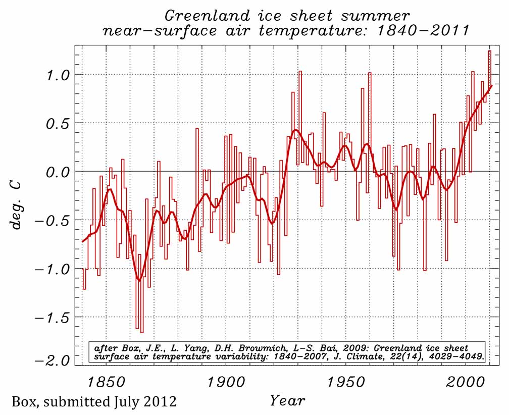
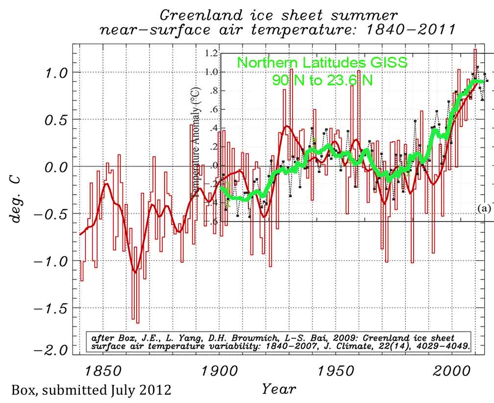
Call me a
converted skeptic. Three years ago I identified problems in previous climate
studies that, in my mind, threw doubt on the very existence of global
warming. Last year, following an intensive research effort involving a dozen
scientists, I concluded that global warming was real and that the prior
estimates of the rate of warming were correct. I'm now going a step further:
Humans are almost entirely the cause.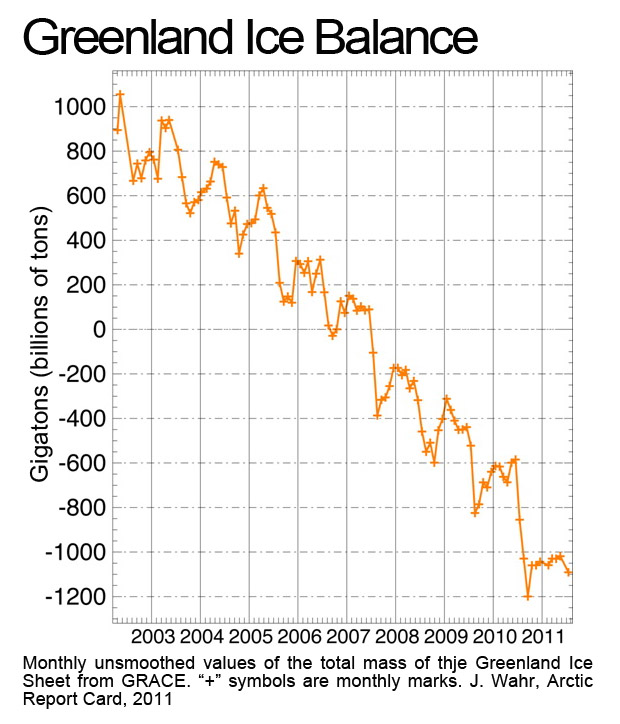 or the complicated nature of climate change,
or the propaganda supporting a message that the science is faulty, simply
allows for an incomplete picture of the actual changes taking place and their
implications. This
or the complicated nature of climate change,
or the propaganda supporting a message that the science is faulty, simply
allows for an incomplete picture of the actual changes taking place and their
implications. This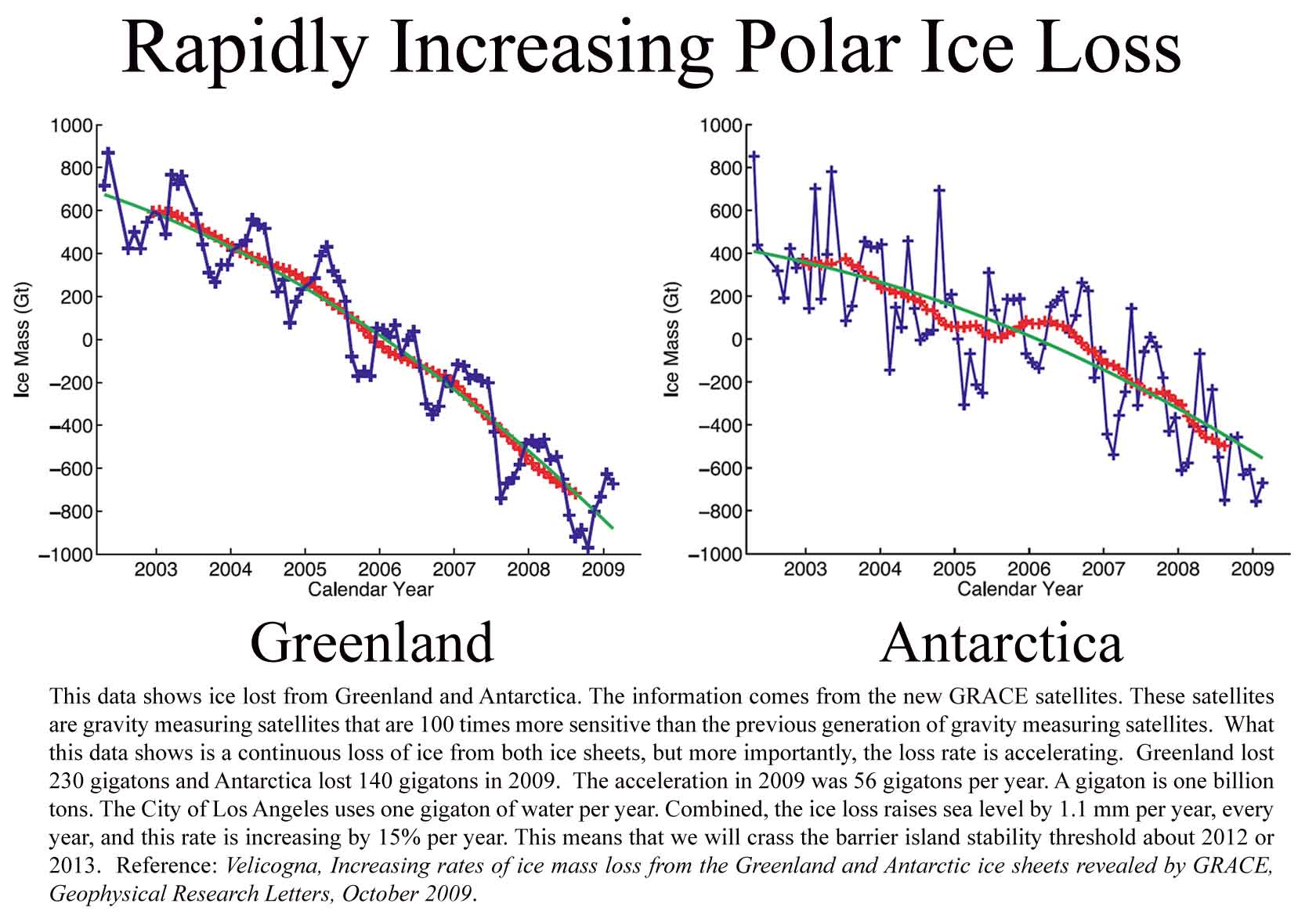 challenge is not one solely found in the media. The NASA
press release is typical. It tells us that Greenland is
losing 150 gigatons of ice per year. What the reporter does not tell us is
that research out of the University of California and the Jet Propulsion Lab
at the California Institute of Technology has found that Greenland melt and
ice discharge increased to 286 gigatons in 2009 (Velicogna 2009), or that
NASA's international Arctic Report Card, put together by 121 scientists from
14 different countries, tells us the 2010 Greenland ice loss increased to 430
gigatons.
This information
comes from the new gravity measuring satellites called GRACE (also from
NASA) that are 100
times more accurate than the previous gravity measuring satellites.
challenge is not one solely found in the media. The NASA
press release is typical. It tells us that Greenland is
losing 150 gigatons of ice per year. What the reporter does not tell us is
that research out of the University of California and the Jet Propulsion Lab
at the California Institute of Technology has found that Greenland melt and
ice discharge increased to 286 gigatons in 2009 (Velicogna 2009), or that
NASA's international Arctic Report Card, put together by 121 scientists from
14 different countries, tells us the 2010 Greenland ice loss increased to 430
gigatons.
This information
comes from the new gravity measuring satellites called GRACE (also from
NASA) that are 100
times more accurate than the previous gravity measuring satellites.
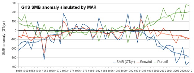 The
red is snow accumulation in Greenland, the green is melt runoff and the
blue is surface mass balance (SMB). SMB also diverged from snowfall
and melt pre-1970. But pre-1970, we had yet to begin to see substantial
impacts from climate change around the globe. This is the crux of our
situation.
The
red is snow accumulation in Greenland, the green is melt runoff and the
blue is surface mass balance (SMB). SMB also diverged from snowfall
and melt pre-1970. But pre-1970, we had yet to begin to see substantial
impacts from climate change around the globe. This is the crux of our
situation.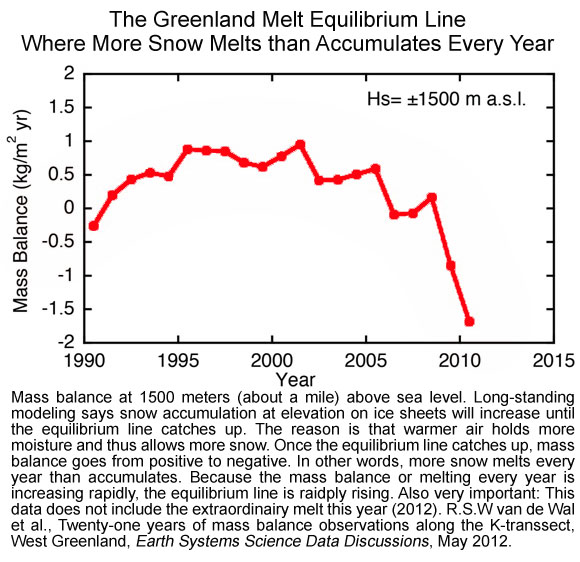
Hansen, Sato and Ruedy, Perception of Climate Change, PNAS, August 2012.
http://www.pnas.org/content/early/2012/07/30/1205276109.full.pdf+html
http://www.fs.fed.us/rm/pubs_other/rmrs_2009_van_mantgem_p001.pdf
http://www.pnas.org/content/106/37/15555.full
Box et al.,
Greenland Ice Sheet Surface Temperature Variability 1840 to 2007, American
Meteorological Society, J. of Climate July 2009.
http://journals.ametsoc.org/doi/pdf/10.1175/2009JCLI2816.1
http://www.arctic.noaa.gov/reportcard/greenland_ice_sheet.html The
material presented in this Report Card was prepared by an international team
of 121 scientists from 14 different countries, assisted by section
coordinators and the editorial team. The Circumpolar Biodiversity Monitoring
Program (CBMP) of the Arctic Council Conservation of Arctic Flora and Fauna
(CAFF) Working Group contributed material on biodiversity.
Independent peer-review of the 2011 Report Card was organized by the
Arctic Monitoring and Assessment Programme of the Arctic Council.
Raupach et al., Global and regional drivers of accelerating CO2
emissions, PNAS, April 2007.http://www.pnas.org/content/104/24/10288.full.pdf+html
IPCC Special Report on Emissions Scenarios
http://www.ipcc.ch/ipccreports/sres/emission/index.htm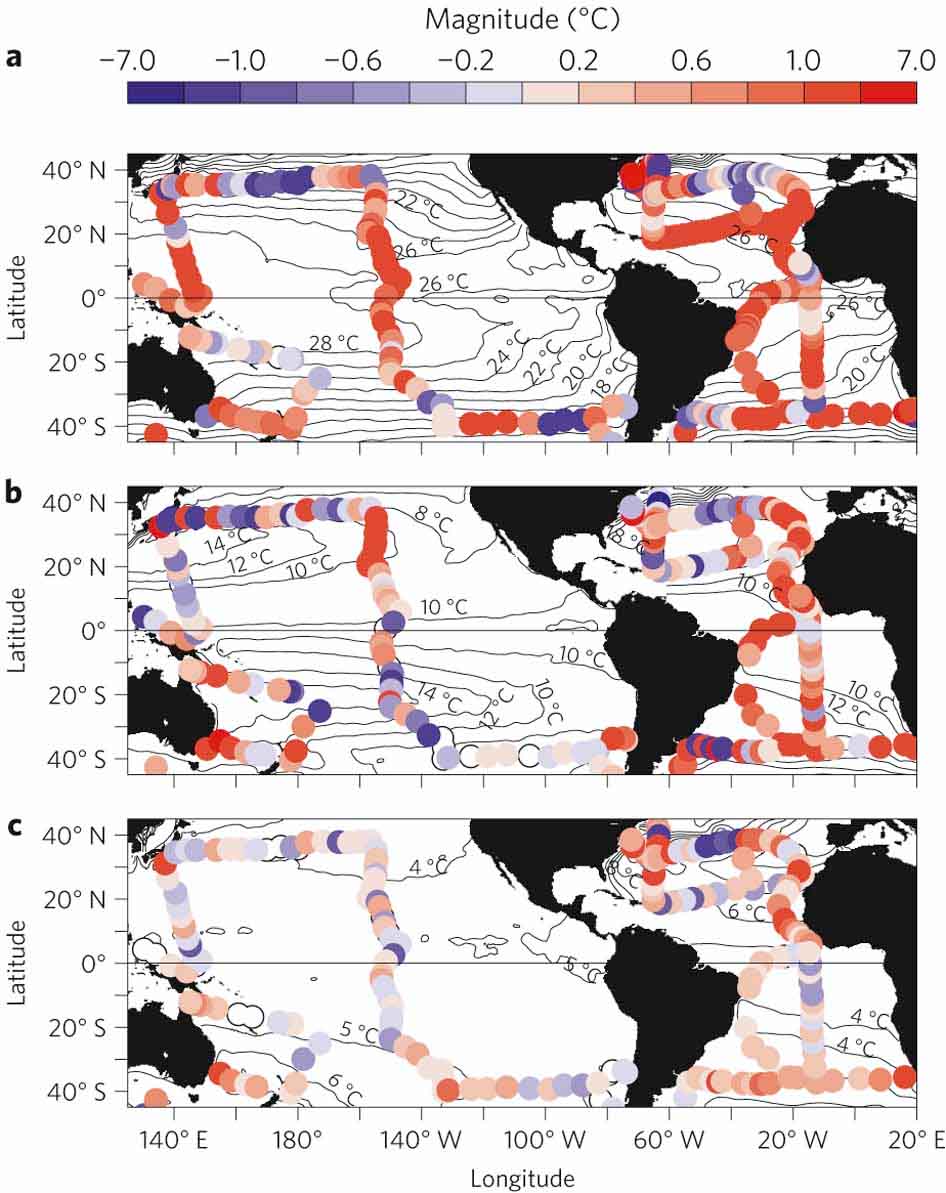 the
18th and 19th Century Provides Exceptional Baseline Data for Ocean Warming
Evaluation: The Royal Society,
University of Edinburgh and Mechiston Castle School sponsored the expedition
around the globe to explore the deep oceans. Led by Captain Geroge Nares,
the expedition is credited with the foundation of oceanography.
the
18th and 19th Century Provides Exceptional Baseline Data for Ocean Warming
Evaluation: The Royal Society,
University of Edinburgh and Mechiston Castle School sponsored the expedition
around the globe to explore the deep oceans. Led by Captain Geroge Nares,
the expedition is credited with the foundation of oceanography.
http://www.nature.com/ncomms/journal/v1/n5/pdf/ncomms1053.pdf
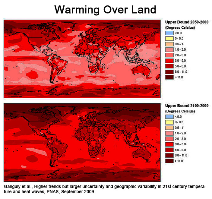
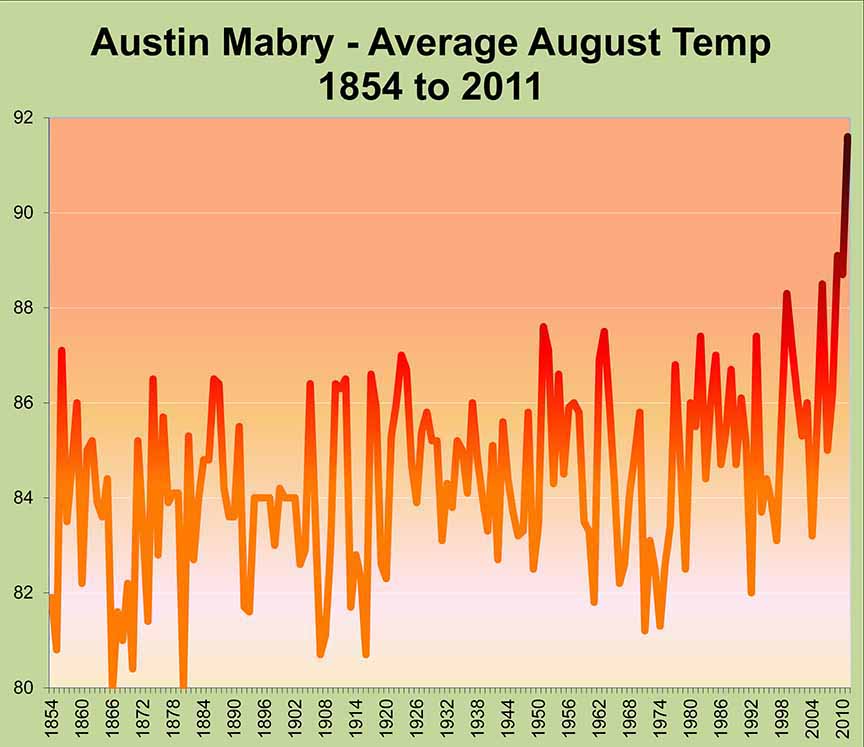
http://www.pnas.org/content/106/37/15555.full
http://www.pnas.org/content/early/2012/04/02/1202407109.full.pdf
Howarth et al., Methane and the greenhouse gas footprint of
natural gas from shale formations, Climatic Change, 106, 4, 2011.
http://www.sustainablefuture.cornell.edu/news/attachments/Howarth-EtAl-2011.pdf
Press Release:
http://www2.ucar.edu/news/2904/climate-change-drought-may-threaten-much-globe-within-decades
Full article:
http://onlinelibrary.wiley.com/doi/10.1002/wcc.81/abstract
http://www.pnas.org/content/107/8/3382.full.pdf+html
http://saive.com/911/DOCS/AAAS-Aerosols-not-CO2-Cause-Global-Warming.pdf  I g I get to the maps, and I will say that the next few
paragraphs are anecdotal. I don't keep notes about my gardening stuff,
I don't record the weather anymore and my perception of what is going on
may not be really what's going on. But I have been doing this at the
same location for 22 years an I have evaluated a lot of local weather
records that reveal that my anecdotal stories are more true than not.
I g I get to the maps, and I will say that the next few
paragraphs are anecdotal. I don't keep notes about my gardening stuff,
I don't record the weather anymore and my perception of what is going on
may not be really what's going on. But I have been doing this at the
same location for 22 years an I have evaluated a lot of local weather
records that reveal that my anecdotal stories are more true than not.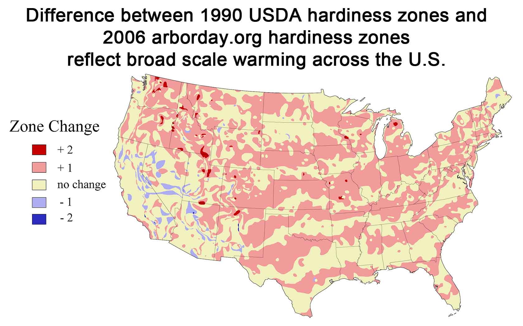
In early May it rained for the first time in six weeks and temps fell to normal-it seemed cold. Everyone was saying how cold it was, but the temps were only normal. It only rained about 0.2 inches at my house for six weeks beginning about the first day of spring on March 20. We had more rain in Jan/Feb/March (13.21") than we did in our 12-month unprecedented drought (September 2010 to August 2011 when we had 11.2 inches of rain). Then it only rained 0.2 for six weeks. In early May it rained five and half inches in three events. Since the turn of the century or thereabouts though, it's been hot. lass="style3"> Even my peppers quit setting fruit last summer. Normally peppers go all the way through. I simply gave up on tomatoes, where normally I can get the vines through until September when they start to set fruit again that ripens in November and December. Several years recently I have had tomatoes on the vine at Christmas. I think it was 2010 that I had them on the vine January 1. Before 2000, it was a challenge to get them through mid December. Now understand that our here in the hills west of town I have to cover up when it frosts or freezes. I can even get the tomatoes through a decent freeze, but once it gets down below about 27 or so, everything turns to mush. It's amazing what a little blanket, or even a simple cotton bedsheet will do in the garden.
The changes we have seen in our climate are recorded in the changes in the Hardiness Zone Maps. The first map, the one that looks like a pink striped tiger, shows the changes in the minimum annual average temperature across the U.S.
(For(For an enlarged image, right click on the image and choose view image.)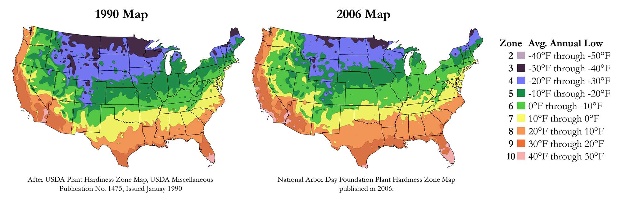
The temperature across the continent, that is the average annual low temperature, has increased a half zone. But the big deal is that the changes have all taken place since the 1990 map was created. All the previous maps are almost identical. The change has been about 5 degrees F. an> TherThere has been some small cooling out west, but by far the warming has been greater and is much more predominant across the continent. It is also important to understand the way the tiger striping works. The zones are ten degrees each, so the five degrees of temperature change is shown as half of each zone increasing by a full zone and the other half not increasing any. It's not that the country warmed in these funny strips by five degrees each separated by similarly wide strips where there was no warming. I am sure y'all picked up on that right away--it took me a few minutes.
So that's the big news - what a change! Of course this is not reflected in the average temperature change across the U.S. because it's not the average. It's the average annual low temperature. It's one of several weather extremes that shape our world. The others are the average hot extreme (which is really the longest average annual hot period, and the driest and wettest periods. These extremes shape our world. It's not the average temperature that does the damage, it's the droughts and heat waves and floods and cold snaps. Plants and animals don't care about averages--they evolved with averages. Human society evolved with the averages. This is why the extremes matter. We did not evolve with extremes that are different
As the heat waves increase in extremeness and frequency, crops will wither, forests will die, lakes will dry. What will we do? And before we get into trouble, what will the animals do when the plants all die like during the great Dust Bowl? lass="style3"> The first hardiness zone map was created in 1948, then another in 1960 (revised in 1967) and another utilizing more detailed data from 1974 to 1986 (revised in 1990). In 2006 National Arbor Day created their most current map, and in 2012 USDA followed. The differences between the 2006 and 2012 maps are small, it's the differences that started after 1986 that are substantial. Our climate remained stable during the period from about the turn of the century to 1986 so comparing 1990 to 2006 (above) is the easiest thing to do. Going back into historic time, we know there was a slight warming from about 1800 to 1900 that was less than the average warming we have seen since the 1970s. Before 1800 we know that the temperature fluctuated slightly during what is known as the Little Ice Age (which ended about 1850. Before this is prehistory where we have records from chemical indicators such as oxygen isotopes in ice sheets and caves formations. These tell us that by far, the temperature changes since the 1970s are far more radical than anything in the last 10,000 years.
AlsoAlso note a few places cooled between 1990 and 2006, but by far warming is predominant.
Note that the first traditional USDA Hardiness Zone Map is not the same scale as those after 1948--zones are 15 degrees, not 10.lass="style3"> To view larger images, right click and view image.
![[]](1948%20Arnold%20Arboretum%20num.jpg)
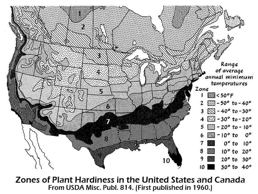
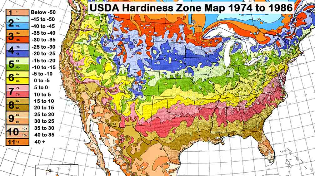
Below 2012 USDA Half-zone map:
What does this mean? It's getting warmer bigtime, and mostly it has happened recently.
Arbor Day Hardiness Zones: http://www.arborday.org/media/zones.cfm
Arbor Day press Release: http://www.arborday.org/media/zonechanges2006.cfm
April 18, 2011: Amundsen Embayment Antarctica, More Evidence of Antarctic Ice Sheet Disintegration from the Jackson School of
Geosciences in Austin --
ABSTRACT. The major outlet glaciers that drain the eastern sector of the
Amundsen Sea Embayment
MacGregor et al., Widespread rifting and retreat of ice-shelf margins in the
eastern Amundsen sea Embayment between 1972 and 2011, Journal of Glaciology,
No. 209, 2012.
Press release:
(Smith, Haynes, Thwaites and Pine Island) are
among the largest, fastest-flowing and fastest-thinning
glaciers in West
Antarctica. Their recent ice-flow acceleration is linked to ocean-induced
ice-shelf
thinning, but may also arise from additional losses of
ice-shelf buttressing that are not well understood.
Here we present a
comprehensive history of coastal change in the eastern Amundsen Sea
Embayment
between 1972 and 2011 derived mostly from Landsat imagery. The
termini of all four major outlet
glaciers have retreated, but retreat is
most rapid along the ice-shelf margins, where progressive rifting
has
occurred. This pattern of retreat coincides with the recent acceleration of
grounded ice and
contributed to loss of ice-shelf buttressing. The
observed pattern of margin-led gradual ice-shelf
disintegration appears
to be common in accelerating ocean-terminating outlet glaciers. We
hypothesize
that this pattern is part of a positive feedback between
glacier acceleration and rift growth that could
drive further buttressing
loss in the eastern Amundsen Sea Embayment.
http://www.igsoc.org/journal/58/209/j11J262.pdf
http://www.jsg.utexas.edu/news/2012/03/west-antarctic-ice-shelves-are-tearing-apart-at-the-seams/
April 14, 2012: In Just the Last 30 Years, Climate Extremes Have Increased 10 to 100 Times -- Dr. James Hansen could be the single most important climate scientists in the world. He has been the director of the NASA Goddard Institute for Space Studies (GISS) for30 years. He accused (successfully) the Bush Administration in 2005 of censoring climate science at GISS and retained his position as director. NASA GISS is the primary United States Government climate modeling agency. But Dr. Hansen's creds are not the most important thing about Hansen, it's his message. Today he has a paper "in" to the proceedings of the National Academy of Sciences of the Unties States of America that is unlike any before. The title is: "Public Perception of Climate Change and the New Climate Dice". Hansen's description of our new climate--the one we have already changed to, not the one that is predicted to happen in the future--is that the odds have changed as to whether or not we will see "normal" weather or "extreme" weather; hence the dice analogy. The concept is that the dice are now "loaded" to produce more sixes. Or more descriptively, more extreme weather. But most importantly(in my opinion), Hansen's statistical work that evolved into this "dice analogy" is what is the real star of this paper. It can be seen in the Bell Curve analysis resulting form the statistical evaluation of the global temperature dataset and indeed, Hansen has created some "groovy graphics."
Hidden behind this laid back title and dice analogy are a few ominous facts about how much our current climate has changed that I need to share before I get to the "groovy graphics." Hansen his team tell us that "the odds of an unusually warm season have increased greatly over the past three decades" and, "A new category of hot summertime outliers . . . has emerged, with the occurrence of these outliers having increased 1-2 orders of magnitude [10 to 100 times] in the past three decades. Thus we can state with a high degree of confidence that extreme summers, such as those in Texas and Oklahoma in 2011 and Moscow in 2010, are a consequence of global warming, because global warming has dramatically increased their likelihood of occurrence."
Not only is this one of the most forward leaning pieces of outreach ever written by such an authoritative individual, but it has a visual way of showing the increase in extremes in the last three decades. I new there was an excellent message in Hansen's graphics but it took me a week to figure out how to present it. I am still in awe of how this graphic visualizes so well the changes that have already happened. It shows the amount of shift in our climate already and not what is predicted to happen in the future. One must understand statistics to be able to understand what this graph means, but a visual inspection shows what you need to know and I will try to explain the statistics the best I can.
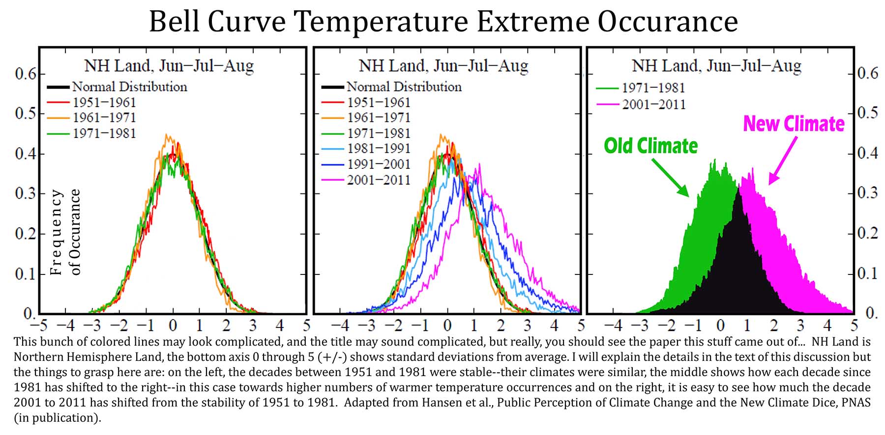
I've split apart a few key elements of this work to more readily show the
message. Hansen's original graphic is the one in the middle. On the left I have
removed the curves for the decades 1981 to 2011. On the right I have colored in
the curves under 1971-1981 (green) and 2001-2011 (purple). Black is where the
two curves overlap.
The decades from 1951 to 1981 show a stable climate snapshot. Even though
previous decades were different (not shown--they were colder), this period
represents our climate that allowed significant evolution of our modern
industrial society. The scale on the left represents the frequency of occurrence.
The numbers at the bottom
(0 to +/-5) represent standard deviations. Three standard deviations represent 99.7 percent
of all the data, two is 95.5 percent, one is 68 percent. Looking at
the curves for 1951 to 1981 on the left, the temperatures events (daily temps) at
the top of the curve happen most often, or about 40 percent of the time
(0.40) in
this "normal" dataset. The three standard deviations shown represent what is
considered to be a "normal" data set. And in a normal data set, 3 standard
deviations representing 99.7 percent of all data points means that 3 days out of 1000 have temperatures that are above or below
the
other 997 days.
Ok, go back and read that again, maybe Google standard deviation and check
out the Math is Fun page and standard deviation. Or just move on to the middle graph,
it's not that critical. When we
compare the successive climates of the 80s, 90s and 00s to the period 1951 to
1981, we see a decisive shift to the
right. This means that more of the time, warmer temperatures are happening. A
lot more of the time. The decades of 2001 to 2011 saw two standard deviations of change
relative to the climate of 1951 to 1981.
These new events are expanding towards greater temperature changes, so the
climate we are experiencing today, or more accurately of the decade 2001 to
2011, contains temperatures that are more than a third warmer than anything compared to
1951 to 1981. It's hard to put down in words, but easy to visualize with
the graph on the right. that purple are under the purple curve for 2001 to
2011 represents a lot of heat. The area
in black? This is the reason that scientists say they can not tell exactly if
any given weather event is caused by climate change. The two climates overlap
(our old one and our new one).
Now the finally: Looking at the curves for 1951 to 1981 look on the far right, where the curve comes back down to the baseline. Only 0.3 percent of all the temperature records in the decades 1951 to 1981, or only about thirty three days in this thirty year period were either above or below any of the other 10918 other days in those three decades. In other words, what happens at the very edge of the curve in a normal year, that extra rare event at the edge of the curve has a 1 in 370 chance of the daily temperature being warmer or colder than all the other days in that decade.
Now look at the big purple blob in the far right graph. The purple goes out to five standard deviations. Only three standard deviations are included in a "normal " population of data. Anything other than that is considered statistically weird and generally not included in calculations or comparisons with the other data. But now our climate has changed. Five standard deviations represent 99.99994 percent of all events under "normal circumstances."
What is happening today at the edge of the curve is two standard deviations beyond the normal edge of the curve. If we compare the edge of the curve today (2001 to 2011) to 1951 to 1981, that event at the edge of the five standard deviation curve has a 1 in 1,744,278 chance of happening. In other words, the most extreme events happening today are happening 4,714 times more often than "normal"!
Extra geeky explanation of science stuff: In case you caught the math discrepancy between 100 times more and 4,700 times more often: The paper says one to two orders of magnitude. This means add a zero to the numbers for one order of magnitude or add two zeros for two orders of magnitude. Referring to this as 10 to 100 times more is much more simple and close enough until more accurate numbers pop up that seem to discredit this simple explanation. One hundred times more that the 1 to 370 ratio of three standard deviations would be 1 to 370,000. for five standard deviations representing 1 to 1,744,278 times more we get a math equivalent of 471 times more. To reach three orders of magnitude it has to be 1,000 time more or greater. There are a number of things in this discussion (and many science discussions) that serve to create variable that move the target around so to speak. When this happens scientists refer to orders of magnitude in change. But because this is a nebulous term to most folks, I like to use more concrete descriptions and dispense with the details that tell us that the numbers I am referencing may be off by a hundred or more percent. The facts around these cases are that a few hundred percent is no big deal, it's orders of magnitude that make a difference. But if one does not really understand the extra layer of complicate that arises form orders of magnitude the details causing the scientists to say orders of magnitude rather than more specific numbers, then it is much more of an impediment than if the details were understood. So I tend to use numbers that may be inaccurate, but the inaccuracy is not relevant to the greater discussion of detail--but all of this is opaque to the what I write, so why again am I telling you this? Oh, yes because I said 100 time greater in one spot and 4,700 times more frequent in another.
Hansen et al., Public Perception of Climate Change and the New Climate Dice, PNAS in publication. http://arxiv.org/ftp/arxiv/papers/1204/1204.1286.pdf
April 10, 2012 A Decade of Weather Extremes (Coumou and Rahmstorf 2012) -- James Hansen told the U.S. Senate in 1988 that "it is time to stop waffling so much and say that the evidence is pretty strong that the greenhouse effect is here." After all of the recent unprecedented weather extremes globally, many of which were extremely cataclysmic and didn't hardly make the U.S. news, we get this paper from the prestigious Nature Climate Change (where the authors of the paper state): "We conclude that now, more than 20 years later (after the Hansen Senate testimony), the evidence is strong that anthropogenic, unprecedented heat and rainfall extremes are here — and are causing intense human suffering."
NOAA reports that the in the last 365 days, 240 record all-time high temperature records were set in the U.S. vs. 6 (six) all-time record low temperature records. In a normal climate, the number of high temperature records should be about equal to the number of low temperature records.
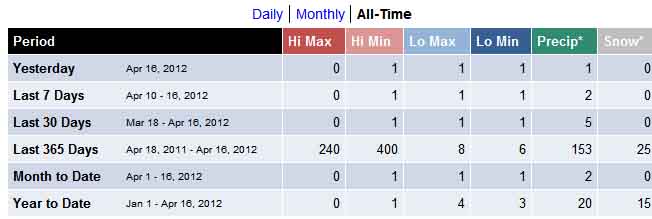
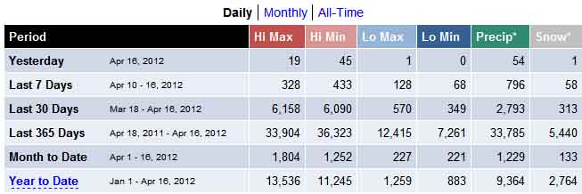
The last ten years have seen nearly double the number of billion dollar weather disasters (60) as the previous ten years (38) and four times more than the ten years before that (15). The inflation adjusted costs of the last ten years of disasters ($425 billion) was double the previous ten years' costs ($215 billion) and almost four times the previous ten years' costs ($135 billion). A simple reality check tells us these are good numbers. Our population has only increased by a third (36 percent, from 226 million to 308 million) since 1980, but the number of extreme events and the dollar damage of those events have each increased by about four hundred percent over the same period.
A record 753 tornadoes spun from the sky in April 2011 which smoked the previous record of 542 set in just May 2003. The authors tell us; "Other regions in the world were affected by extreme weather in 2011 as well: rainfall records were set in Australia, Japan and Korea, whereas the Yangtze Basin in China experienced record drought. In western Europe, spring was exceptionally hot and dry, setting records in several countries." The last decade though, really tells the story in physical damage and human suffering. A partial and incomplete list from the paper is presented below:
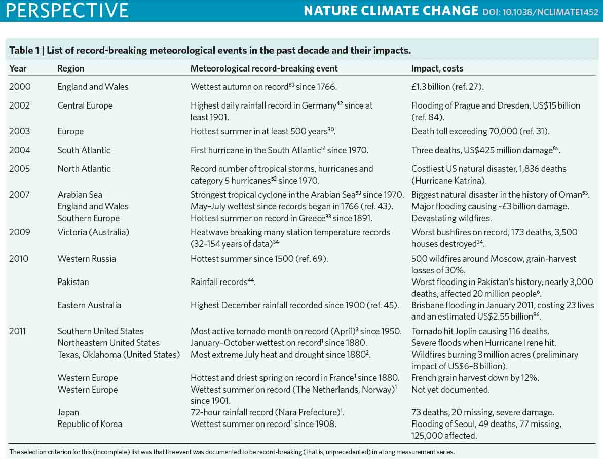
The authors tell us that the reason they chose to highlight the above disasters is because they are all "exceptional and unprecedented." These kind of things have not happened before during modern record keeping. The authors go on: "The [2010] Moscow heat wave and Pakistan flooding that year illustrated how destructive extreme weather can be to societies: the death toll in Moscow has been estimated at 11,000 and drought caused grain-harvest losses of 30%, leading the Russian government to ban wheat exports. At the same time Pakistan was hit by the worst flooding in its history, which affected approximately one-fifth of its total land area and 20 million people." The World Meteorological Organization issued a statement on the “unprecedented sequence of extreme weather events”, in August 2010. They stated that these unprecedented extreme weather events “match Intergovernmental Panel on Climate Change (IPCC) projections of more frequent and more intense extreme weather events due to global warming”.
Now comes the discussion of the links to climate change and while sobering they are fascinating as well. The decade of 1990 to 2000 was the hottest decade ever recorded, until the 20th century came along. Now the decade 2000 to 2010 is the hottest decade ever. The simple physical science behind how extreme weather becomes more extreme with rising temperature alone is enough to friz your hair. High temperature records have doubled while low temperature records have been halved. In a stable climate world, there would be an equal number of high and low temperature records. Air rises faster the hotter it is, the faster rising air creates more violent storms.
Warming leads to more evaporation. Each degree F warmer allows the atmosphere to hold 4 percent more moisture. This moisture comes from water bodies and oceans and it comes from plants and the soil. Four percent may not sound like much, but what if most of these extreme weather events were happening during months where the average temperature was five or six degrees warmer than normal (they generally are by the way). This makes formerly extreme storms even more extreme. It increases rainfall of course, but the warmer temperature increases winds as well. It increases updrafts which hold hail up in the cloud tops longer making the hailstones bigger. The increased winds make tornadoes more likely to form and it makes them more violent. The increased updrafts increase friction which increases static electrical discharge--lightning. Same thing happens in winter. Remember that old saying "too cold to snow"? The saying is true, or relatively true. Like discussed above, each degree of warming or cooling changes the capacity of the air to hold moisture by four percent. So the colder the air is the less moisture it can hold. This means that the nearer freezing it is (warmer), the more snow comes from any given storm--CaPOW! Snowmeggedon!
The opposite is true as well. The extra drying from the extra heat, when precipitation triggers are absent, acts as a feedback mechanism. The hotter it gets, the drier it gets and the drier conditions allow it to get even hotter, which completes the feedback loop until, like in Austin, Texas in 2010, we had 90 days of 100 degree plus heat when our average is only 12. We had less rainfall in a 12-moth period in 2011 than we had experienced since record keeping began in the 1850s.
So it's not just billions of dollars, it is statistics that are telling us that our climate has changed. The statistics of extreme weather are much more simple than other weather statistics. One of the most common questions asked of climate scientists is that age old question "was this or that weather event caused by climate change?" The answer is one that almost always leaves the public with a misunderstanding. There is no yes or no answer to this question so when the scientists says it is difficult to tell, the public usually takes that as a "no," when this is not the case at all. The correct answer involves probabilities, or chances of happening with a given amount of warming. But extreme events are different. Unprecedented weather events, or events like 100-years storms that happen only very rarely, can be very easy to say are caused by climate change with a high degree of certainty. This is exactly what we have been seeing in many places.
The scary part now is that the changes have just begun. We have decades of change stored up in the pipeline because our climate does not react immediately to changes in greenhouse gas concentration. The tremendous cooling capacity of our oceans and ice sheets sees to that. And now we have the Asian Brown Cloud to contend with. I've not reported on that lately, but it's still there and still growing with a mask of about 1.2 degrees F of cooling already. What this means is that, if all of the sudden, China and India stopped emitting the smog forming pollutants that form the Asian Brown Cloud, Earth's temperature would rapidly jump 1.2 degree F. This is almost as much warming as we have seen in the entire post industrialized world for the last 150 to 200 years.
Coumou and Rahmstorf, A decade of weather extremes, Nature Climate Change,
March 26, 2012.
Press Release:
http://www.pik-potsdam.de/news/press-releases/wetterrekorde-als-folge-des-klimawandels-ein-spiel-mit-gezinkten-wurfeln
April 2, 2012 -- Billion Dollar Weather Events at All-Time High
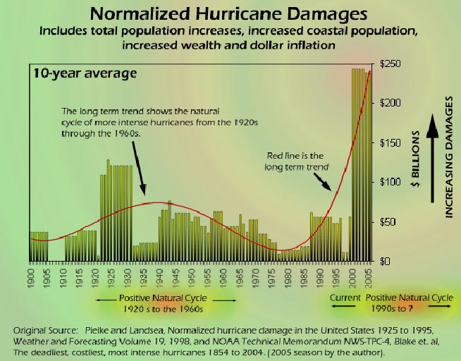 :
Think that our growing population is enduring increasing impacts from severe
weather and you would be correct. But adjusting extreme weather events for what
the scientists call "population bias" is nothing new. What is new is the amount
of press that the "voices" get for their arguments that it is all related to a
growing population. Climate scientists have been telling us for a long
time that it's related to climate change and that they have adjusted the
numbers for population bias, and growth trend bias and property value and
property location bias and several other biases depending on the type of
weather severity. Two examples:
:
Think that our growing population is enduring increasing impacts from severe
weather and you would be correct. But adjusting extreme weather events for what
the scientists call "population bias" is nothing new. What is new is the amount
of press that the "voices" get for their arguments that it is all related to a
growing population. Climate scientists have been telling us for a long
time that it's related to climate change and that they have adjusted the
numbers for population bias, and growth trend bias and property value and
property location bias and several other biases depending on the type of
weather severity. Two examples:
The first comes from lessons learned from hurricane Katrina. Climate
scientists do something called "normalization" to compare apples to apples when
dealing with climate comparisons and it accounts for all of the different things
(biases)
that may change the actual impacts of a given piece of severe weather. This normalization not only changes damage
costs into dollars that take inflation into consideration, but it changes the
population of impacted areas to represent that of the past at some point. It
changes the patterns of life that our civilization adopts over time, like for
hurricane damage evaluations, it accounts for increases in the number of vacation homes in
coastal areas to represent today's more affluent lifestyle vs. that of the past.
(See here for the rest of the story.)
The other example is tornadoes. We normalize tornado damage based on clever thinking involving the science around lives saved from innovations like early warming systems, Doppler radar, severe weather preparedness training, increases in telecommunications capabilities, tornado alerts, tornado sirens, and better building codes. All of these things have been related separately to lives saved in tornadoes. These things must be counterbalanced with increased observations of tornadoes from an increased population, tornado observation networks, Doppler radar, you get the picture. When current tornado outbreaks are then normalized as is described in the link to the rest of the story at the end of this paragraph, we find that not only are the numbers of tornadoes significantly increased, but the damages and deaths are too--even though actual deaths are only approximately equal to (or less than) the biggest tornado outbreaks in history. (The rest of the story.)
Looking at all extreme weather outbreaks since 1980 it's obvious to see the trend, even if the trend is only adjusted for inflation. The reason the trend is easy to see is that in the last decade (plus or minus) our population has not increased near enough to have this kind of effect. We are now up to a preliminary figure of $55 billion in total damages for 2011 with 14 events reaching the $1 billion threshold. The big spike in the NOAA Billion Dollar weather Disaster graphic in 2005 was Katrina of course. This one storm was not so much a climate related disaster as an engineering failure of spectacular proportions. It was an anomaly and should somewhat be disregarded when evaluating this sort of data. (It's the other four record Cat 5 hurricanes in 2005 that tell that story.) The trend is shown in the increasing number of $1 billion or more weather events shown by the blue bars. (See the rest of the story here.)
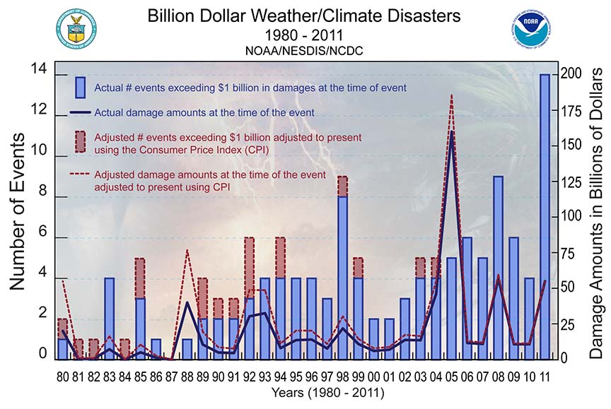
![]() Groundhog
Day blizzard »
Groundhog
Day blizzard »
January 29-February 3, 2011
![]() Midwest/Southeast
tornadoes »
Midwest/Southeast
tornadoes »
April 4-5, 2011
![]() Southeast/Midwest
tornadoes »
Southeast/Midwest
tornadoes »
April 8-11, 2011
![]() Midwest/Southeast
tornadoes »
Midwest/Southeast
tornadoes »
April 14-16, 2011
![]() Southeast/Ohio
Valley/Midwest tornadoes »
Southeast/Ohio
Valley/Midwest tornadoes »
April 25-28, 2011
![]() Midwest/Southeast
tornadoes »
Midwest/Southeast
tornadoes »
May 22-27, 2011
![]() Midwest/Southeast
tornadoes and severe weather »
Midwest/Southeast
tornadoes and severe weather »
June 18-22, 2011
![]() Southern
Plains/Southwest drought and heatwave »
Southern
Plains/Southwest drought and heatwave »
Spring-Fall,
2011
![]() Mississippi
River flooding »
Mississippi
River flooding »
Spring-Summer, 2011
![]() Rockies
and Midwest severe weather »
Rockies
and Midwest severe weather »
July 10-14, 2011
![]() Upper
Midwest flooding »
Upper
Midwest flooding »
Summer 2011
![]() Hurricane
Irene »
Hurricane
Irene »
August 20-29, 2011
![]() Texas,
New Mexico, Arizona wildfires »
Texas,
New Mexico, Arizona wildfires »
Spring-Fall 2011
![]() Tropical
Storm Lee »
Tropical
Storm Lee »
Early September, 2011
(* added Jan. 19, 2012)
April 6, 2012 Greenland Melt: Much Faster Than Previously Thought --
What was previously thought to be the threshold or complete melting of the
Greenland Ice Sheet was an average global warming of 3.4 to 9.2 degrees F
has now been refined as 1.4 to 5.8 degrees F
The image (left) shows the various melt scenarios (right click on the
image to see it larger). The left side is 500 years, the right 10,000 years.
The purple lines are the higher temperature model results. Melt happens much more
faster with higher the temperature increases. The solution is also non-linear.
That is, it behaves like a population explosion, or maybe a snowball rolling
downhill in a cartoon is more appropriate here. Once the melt gets started,
it gets really big
really fast. The steeper the hill (the faster the temperature increase) the faster the
snowball gets bigger (the more melt happens faster).
The The image on the right is one of those moulins, or
crevasses where melt water has made its way beneath the surface of the ice
cheet. A crack (crevasse) has been enlarged by melt water. Sometimes these
things can be bigger than a house. You can see a little melt water pouring
in at the bottom of the photo. The day that I took this photo was cold and
cloudy at the beginning of
winter in late August near Kanerglussuaq, on the Arctic Circle, west coast
of Greenland about a mile inland on the ice. So the melt water was not
everywhere as it is on a sunny summer day and flow down this moulin was
small.
The authors tell us:
"Our study shows that a temperature threshold for melting the GIS exists and
that this threshold has been overestimated until now. For a sufficiently
large temperature anomaly [increase in average temperature], a significant portion of the ice sheet may be
lost within several centuries, and the GIS will continue to melt even if
temperatures later drop below the threshold value (but stay in the multistable range). Therefore, if anthropogenic CO2 emissions in the coming
century drive the temperature considerably above the deglaciation threshold,
irreversible total loss of the GIS will be difficult to avoid, ensuring
continued substantial sea-level rise for millennia."lass="style3" style="height: 18px">
Robinson et al., ltistability and critical thresholds of the Greenland ice
sheet, Nature Climate Change, February 26, 2012.
March 27, 2012
How Many Unprecedented Historic Weather
Records Have to be Broken for Climate Change to Get Some Respect? The
Science of Early Spring -- So far
in 2012 in Austin we have had bout the same amount of rain than we did in the 12-month period
that marked the drought that peaked last summer (the deepest 12-month
drought Austin has ever experienced). Scientists have been telling us for
decades that climate change is real, that it will cause more extreme weather
and that delaying action to control our climate will make the extreme
weather more extreme sooner.(1) Climate scientists have
now started telling us that indeed, the extreme weather happening recently
is being caused by climate changes that have already happened. Because warmer air holds more moisture,
and warmer air rises faster, the two together means more rain faster, more tornadoes, bigger
winds, more hail, bigger floods, etc. (3,4) In 1975, Wallace Broeker even
predicted that by the first decade of the 21st century we would be
experiencing higher temperatures than we have experienced during the last
1000 years,
and this has indeed happened.(5) Global warming has specifically increased the chance
of killer heat waves like the European heat wave of 2003 and the Moscow heat
wave of 2010.(6,7) Even small changes in average temperature can
significantly increase the chance for drought and heat waves.(8)
This is because of the drying feedback - the drier it gets,
the hotter it is, creating more drying and increasing the heat even more.
Twice as many record highs have be set in the last decade than record lows. (11) The following is from Science Live, at Sciencemag.org,
the website of the peer review journal Science, a publication of
the American Association for the Advancement of Science (AAAS). This session
of Science Live was titled "The Science of Early Spring." The guest
commentators in this one hour chat are a couple of phenologists (scientists
who study cyclic seas on phenomena like plants flowering, birds migrating
and insects breeding) named David Inouye from the University of Maryland and
Jake Weltzin, director of the National Phenology Network.
http://news.sciencemag.org/sciencenow/2012/03/live-chat-spring-forwardthe-ecol.html Cherry blossums came up first, blossoming about 2 weeks
earlier than normal this extremely warm winter and in fact, dozens of plant
species are blooming early in Washington DC. Phenology is all about timing. Birds migrating at just the
right time to catch the swarms of bugs in the spring, insects breaking
dormancy at the appropriate time to pollinate those special plants that
must have certain insects as their pollinators; and other things like having enough cold weather to
stimulate those plants that require an extended dormant period to flower
(apples for example). The way that climate change screws thing up is some
species behavior timing is based on day length and some on temperature. So if a day
length triggered species is dependent on a temperature triggered species
(some caterpillars and some birds),
the caterpillars may be in their cocoons when the birds arrive that depend on
them for food to feed their babies. Spring is getting earlier in the Rockies, but the date of
the last average freeze is not. This is happening in many places across the
globe. What was once just a normal "false spring," like happens now and
again in our "old climate" is now happening more often and the false springs
are getting longer and warmer. Plants are breaking dormancy then getting
frozen back where as before, the false spring was not long enough for the
plants to break dormancy. What this does is continually stresses these
plants and they become weak and diseased and susceptible to ecological
replacement by more vigorous or tolerant plants. This changes the composition
of the ecosystem that has a ripple effect from the smallest organisms to the
largest. Eight thousand species of plants rely on hummingbirds for
pollination. Many of these, especially in the Rockies, are blooming now
before the hummingbirds return from their southern migration over the
winter. Apricots and cherries are budding out earlier and their buds
are getting frozen off. Caterpillars are coming out early to eat the early
leaves then they get frozen to death in the last freeze, setting back
the chain of life that relies on these caterpillars. In 2007 there was an
event like this in the Rockies that caused $2.2 billion in damages. Plants that flower earlier in the years seem to be more
responsive to climate changes than those plants that flower later in the
spring or during summer or fall. Temperate and more polar areas are more
likely to strongly more likely to be impacted by
climate change because of reasons listed above, but also because the middle
and higher latitudes are seeing greater climate changes than tropical regions. The
USA National Phenology Network,
www.usanpn.org, tracks
over 700 species through citizen input. Another place to find information
about the changes of plants with the changing seasons is:
www.citizenscience.org
Hurricane Season and Climate Change:
http://www.meltonengineering.com/earth%20at%20risk/Pages/earth%20at%20risk/Chapter%2010%20Hurricane%20Season%20and%20Climate%20Change%20051506.pdf
NCDC Billion dollar weather events:
http://www.ncdc.noaa.gov/oa/reports/billionz.html
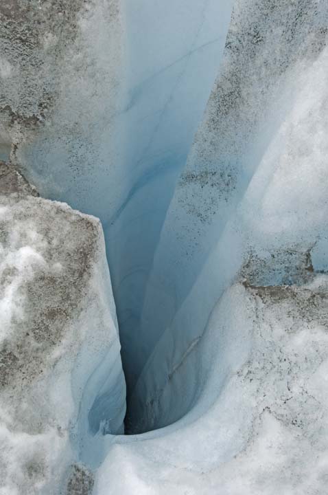 with
a best estimate of 2.9 degrees of warming above preindustrial times. It is extremely important to understand that this
with
a best estimate of 2.9 degrees of warming above preindustrial times. It is extremely important to understand that this
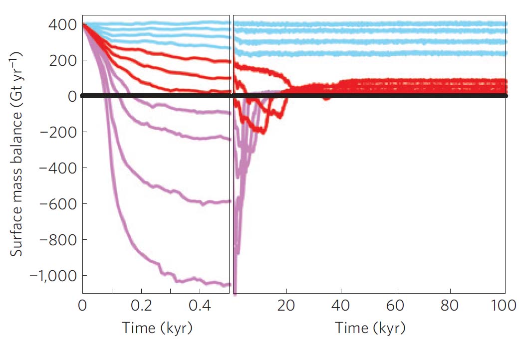 evaluation
was done based on the A1B scenario: again--the middle of the road business
as usual scenario. We are currently nowhere close to this as our emissions
have been on the worst-case scenario track for most of this decade.
For temperatures at the higher end of the IPCC 2007 projections, this work
is conservative and melt will progress faster.
The
modeling assumes that Greenland's average summer temperature will be 50
percent warmer than the global average. But already, the winter of 2010/11
saw most of Greenland experiencing about ten degrees of average warming and
winter temperatures warm less than summer temps.
This work also does not include dynamical ice sheet disintegration. A
process that is aided by rapid melt on the interior of the ice sheet that
allows melt water to penetrate to the bottom of the ice through crevasses
and lubricate the flow of ice to the sea.
evaluation
was done based on the A1B scenario: again--the middle of the road business
as usual scenario. We are currently nowhere close to this as our emissions
have been on the worst-case scenario track for most of this decade.
For temperatures at the higher end of the IPCC 2007 projections, this work
is conservative and melt will progress faster.
The
modeling assumes that Greenland's average summer temperature will be 50
percent warmer than the global average. But already, the winter of 2010/11
saw most of Greenland experiencing about ten degrees of average warming and
winter temperatures warm less than summer temps.
This work also does not include dynamical ice sheet disintegration. A
process that is aided by rapid melt on the interior of the ice sheet that
allows melt water to penetrate to the bottom of the ice through crevasses
and lubricate the flow of ice to the sea.
Press Release:
http://www.pik-potsdam.de/news/press-releases/gronlands-eismassen-konnten-komplett-schmelzen-bei-1-6-grad-globaler-erwarmung
There is some evidence that the earliest flowering plants in the Arctic are blooming too early to be pollinated by the main early spring bumble bee pollinators becuase the bumble bees are simply not emerging early enough.
The fall season may hold really important problems too. Many creatures (like butterflies) use much more energy in early hibernation in the fall--as much as four times more than in deep winter. This is because they go through different types of dormancy and the early dormancy is more energy intensive. It is so much so that one day of energy use in fall dormancy is equal to four days of dormancy energy use in the winter. A late fall may mean curtains for these creatures. If they are butterflies or moths, if the energy use requirements in the fall exceed the normal amount of energy that those creatures evolved with, then they perish. The nourishment that these larvae produce feed many other creatures and those too may be in peril if other sources of energy (food ) are not available, say because they migrate by day length and warmer temperatures means spring starts much earlier.
In the Rockies they have been tracking the onset of the spring melt for 70 years. This is very reliable indicator of the very beginning of spring. What has been found, all across the Rockies, is spring is coming up to a month earlier than normal. This leaves a lot more summer out there to evaporate water out of the environment. Becuase the West is mostly an arid region, this is not good news. The warm season, especially the hot summer period, can evaporate ten times more (really a lot more than that) water than evaporates in winter. This means drought can persist even with greater than normal rainfall.
So now that I have rattled off a few; a big question arises. Can we blame the changes in this plant phenology on climate change? The answer is yes. The link between plant flowering and temperature is very strong. So if one "believes" in climate science, the answer is "yes." Likewise, species migrations are linked as well. When the American robin's wintering grounds experience early spring and they fly north and there is still five feet of snow on the ground in their summering grounds in the Rockies, something is amiss. That something is early warming and again, belief in climate science points the finger at climate change.
NOAA Factoids for 2011:
-31degrees F: the record low temperature reported in Nowata, Oklahoma, on February 10, 2011, which is the coldest temperature on record for the state. (All extremes are amplified and even though many more high temperature records are being set than low records, some of the low records still being set are pretty fantastic.)
3 Million+:
the number of residents who lost power during an unseasonably early
nor’easter storm that spanned West Virginia to Maine (Oct 29-31).
343: the largest
outbreak of tornadoes ever recorded (April 25-28), which left a deadly path
of destruction from Alabama to Virginia.
199: the number of
confirmed tornadoes across the Southeast on April 27, the most on record for
any single day in the United States!
1 Million+: the number of
acres burned across just Texas, during a record wildfire season for the
Southern Plains states.
3 Billion: the potential
cost (dollars) to rebuild Joplin, Mo., after it endured the single costliest
tornado in U.S. history on May 22. It was the 7th deadliest tornado the U.S.
has seen, with 158 lives lost.
(The rest of the story
here.)
-7.97: the value of the
Palmer Hydrological Drought Index (PHDI) for Texas in September that
indicated the most intense drought to affect the state in 117 year period of
record.
(See the rest of the story here.)
300
percent: three times the amount of average precipitation
(mainly rainfall) in the Ohio Valley that caused historic flooding along the
Mississippi river.
19: the number of tropical storms in the Atlantic
this year, the 3rd busiest season since record keeping began in 1851.
From the Guardian in the U.K.:
"Drought zones have been declared across much of England and Wales, yet
Scotland has just registered its wettest-ever May. The warmest British
spring in 100 years followed one of the coldest UK winters in 300 years.
June in London has been colder than March. February was warm enough to strip
on Snowdon, but last Saturday it snowed there. Last year, more than 2million sq km of eastern Europe and Russia
scorched. An extra 50,000 people died as temperatures stayed more than 6C
above normal for many weeks, crops were devastated and hunderds of giant
wild fires broke out. The price of wheat and other foods rose as two thirds
of the continent experienced its hottest summer in around 500 years. In Queeensland, Australia, an area the size of Germany and
France was flooded in December and January in what was called the country's
"worst natural disaster". It cost the economy up to A$30bn (£19.5bn) In China, a "once-in-a-100-years" drought in southern and
central regions has this year dried up hundreds of reservoirs, rivers and
water courses.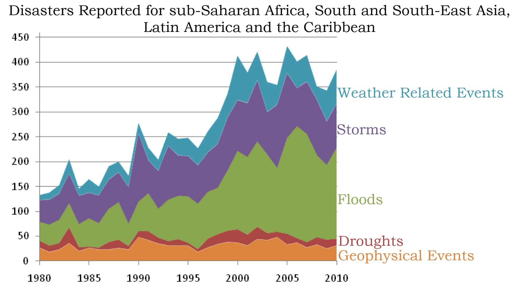 "
"
Oxfam reported that while the number of "geo-physical" disasters (such as earthquakes and volcanic eruptions) has remained more or less constant, those caused by flooding and storms have increased from around 133 a year in 1980s to more than 350 a year now.(10) The Executive summary of this reports states: "There is an upwards trend in the number of reported disasters. This is chiefly driven by a steep rise in reported floods in all regions and, to a lesser extent, storms in Africa and the Americas. When weather-related disasters are analyzed separately, the average rate of increase is 4.1 per cent per year for the sample of countries which have a first disaster reported from 1980 (a rise of 233 per cent over 30 years), and 4.9 per cent per year for countries whose first report was from 1990 or before (159 per cent over 20 years). The rise in the number of reported disasters, and of floods in particular, is broadly supported by independent data."
All total, 133 disasters were reported in 1980, whereas in
recent years it has become the norm for over 350 disasters to be reported
annually. Yet not all types of disaster are increasingly reported: the
number of geophysical events and droughts has remained more or less stable
over time, while there has been a sharp increase in the number of reported
floods and storms and, to a lesser extent, in the number of other
weather-related events such as wildfires and extreme temperatures."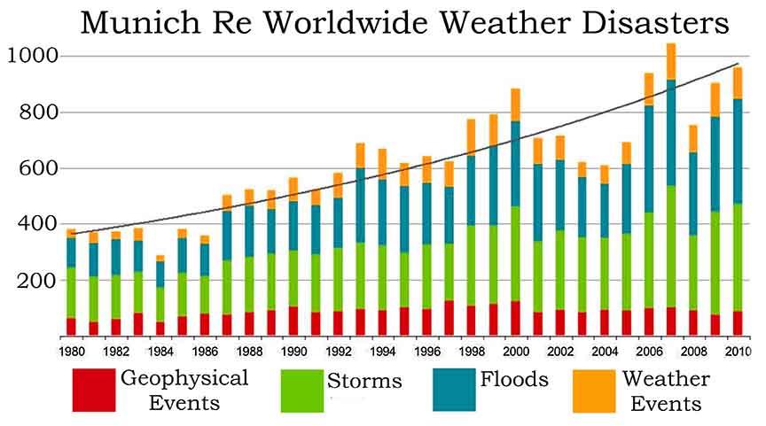
Swiss Re, which last month estimated losses from natural disasters have risen from about $25billion a year in the 1980s to $130 billion a year today
Munich Re also shows undeniable increase in the trend of losses. One note about these insurer statistics too. This is the most rock solid of conservative economic evaluations that you will find. When the insurance companies are telling us that natural disasters are increasing and it's not the population, it's a sure thing. (11)
1) Hansen, et al., Global climate changes as forecast by GISS three dimensional model, Journal of Geophysical Research, August 1988. http://pubs.giss.nasa.gov/docs/1988/1988_Hansen_etal.pdf
2) Min S., X. Zhang, F. Zwiers, and G. Hegerl, 2011: Human contribution to more-intense precipitation extremes. Nature 2011 Volume: 470, Pages: 378–381. doi:10.1038/nature09763
3) Trenberth, The Russian Heat Wave and Other Climate Extremes of 2010, 2011 GSA Annual Meeting in Minneapolis (9–12 October 2011) http://gsa.confex.com/gsa/2011AM/finalprogram/abstract_190757.htm
4) Hansen communication: Oct. 1, 2010:
How Warm Was This Summer? Discussion of recent global temperatures and
near-term projections.
http://www.columbia.edu/~jeh1/mailings/
6
7
8
10) Jennings,Times Bitter Flood, Trends in natural disasters, Oxfam, May 2011. http://www.oxfam.org.uk/resources/policy/conflict_disasters/downloads/rr-times-bitter-floods-270511-en.pdf
March 25, 2012 Early Spring Drives Butterfly Decline --
From NSF "Early snowmelt caused by climate change
 in
the Colorado Rocky Mountains snowballs into two chains of events: a decrease
in the number of flowers, which, in turn, decreases available nectar. The
result is decline in a population of the Mormon Fritillary butterfly,
Speyeria mormonia.
Using long-term data on date of snowmelt, butterfly population sizes and
flower numbers at the
Rocky Mountain Biological Laboratory, Carol Boggs, a biologist at
Stanford University, and colleagues
uncovered multiple effects of early snowmelt on the growth rate of an insect
population. "Predicting effects of climate change on organisms' population
sizes will be difficult in some cases due to lack of knowledge of the
species' biology," said Boggs, lead author of a paper reporting the results
online in this week's journal Ecology Letters. Taking into account the
butterfly's life cycle and the factors determining egg production was
important to the research. Butterflies lay eggs (then die) in their first
summer; the caterpillars from those eggs over-winter without eating and
develop into adults in the second summer. In laboratory experiments, the
amount of nectar a female butterfly ate determined the number of eggs she
laid. This suggested that flower availability might be important to changes
in population size. Early snowmelt in the first year leads to lower
availability of the butterfly's preferred flower species, a result of newly
developing plants being exposed to early-season frosts that kill flower
buds. The ecologists showed that reduced flower--and therefore
nectar--availability per butterfly
in
the Colorado Rocky Mountains snowballs into two chains of events: a decrease
in the number of flowers, which, in turn, decreases available nectar. The
result is decline in a population of the Mormon Fritillary butterfly,
Speyeria mormonia.
Using long-term data on date of snowmelt, butterfly population sizes and
flower numbers at the
Rocky Mountain Biological Laboratory, Carol Boggs, a biologist at
Stanford University, and colleagues
uncovered multiple effects of early snowmelt on the growth rate of an insect
population. "Predicting effects of climate change on organisms' population
sizes will be difficult in some cases due to lack of knowledge of the
species' biology," said Boggs, lead author of a paper reporting the results
online in this week's journal Ecology Letters. Taking into account the
butterfly's life cycle and the factors determining egg production was
important to the research. Butterflies lay eggs (then die) in their first
summer; the caterpillars from those eggs over-winter without eating and
develop into adults in the second summer. In laboratory experiments, the
amount of nectar a female butterfly ate determined the number of eggs she
laid. This suggested that flower availability might be important to changes
in population size. Early snowmelt in the first year leads to lower
availability of the butterfly's preferred flower species, a result of newly
developing plants being exposed to early-season frosts that kill flower
buds. The ecologists showed that reduced flower--and therefore
nectar--availability per butterfly
 adversely
affected butterfly population growth rate. Early snowmelt in the second year
of the butterfly life cycle worsened the effect, probably through direct
killing of caterpillars during early-season frosts. The combined effects of
snowmelt in the two consecutive years explained more than four-fifths of the
variation in population growth rate. "Because species in natural communities
are interconnected, the effects of climate change on any single species can
easily be underestimated," said Saran Twombly, program director in the
National Science Foundation's Division of Environmental Biology, which
funded the research. "This study combines long-term, data models, and an
understanding of species interactions to underscore the complex effects
climate change has on natural populations." "It's very unusual for research
to uncover a simple mechanism that can explain almost all the variation in
growth rate of an insect population," said David Inouye, a biologist at
the University of Maryland and co-author of
the paper. Indeed, "one climate parameter can have multiple effects on an
organism's population growth," Boggs said. "This was previously not
recognized for species such as butterflies that live for only one year. "We
can already predict that this coming summer will be a difficult one for the
butterflies," she said, "because the very low snowpack in the mountains this
winter makes it likely that there will be significant frost damage."
"Long-term studies such as ours are important to understanding the 'ecology
of place,' and the effects of weather and possible climate change on
population numbers," said Inouye. "This research is critical to assessing
the broader effects of weather on an ever-changing Earth," he said. "By
facilitating long-term studies, field stations such as the
Rocky Mountain Biological Laboratory are an invaluable asset."
Stanford University's Vice Provost
for Undergraduate Education also funded the work."
adversely
affected butterfly population growth rate. Early snowmelt in the second year
of the butterfly life cycle worsened the effect, probably through direct
killing of caterpillars during early-season frosts. The combined effects of
snowmelt in the two consecutive years explained more than four-fifths of the
variation in population growth rate. "Because species in natural communities
are interconnected, the effects of climate change on any single species can
easily be underestimated," said Saran Twombly, program director in the
National Science Foundation's Division of Environmental Biology, which
funded the research. "This study combines long-term, data models, and an
understanding of species interactions to underscore the complex effects
climate change has on natural populations." "It's very unusual for research
to uncover a simple mechanism that can explain almost all the variation in
growth rate of an insect population," said David Inouye, a biologist at
the University of Maryland and co-author of
the paper. Indeed, "one climate parameter can have multiple effects on an
organism's population growth," Boggs said. "This was previously not
recognized for species such as butterflies that live for only one year. "We
can already predict that this coming summer will be a difficult one for the
butterflies," she said, "because the very low snowpack in the mountains this
winter makes it likely that there will be significant frost damage."
"Long-term studies such as ours are important to understanding the 'ecology
of place,' and the effects of weather and possible climate change on
population numbers," said Inouye. "This research is critical to assessing
the broader effects of weather on an ever-changing Earth," he said. "By
facilitating long-term studies, field stations such as the
Rocky Mountain Biological Laboratory are an invaluable asset."
Stanford University's Vice Provost
for Undergraduate Education also funded the work."
Article:
http://www.nsf.gov/news/news_summ.jsp?cntn_id=123520&org=NSF&from=home
http://www.nsf.gov/news/news_summ.jsp?cntn_id=123520
March 21, 2012: Thoreau's Woodland is no More -- Henry David Thoreau, Concord Massechusetts, Walden Pond. Among temperature and non temperature dependent flowering species, climate change has affected and will likely continue to shape the pattern of species loss in Thoreau's woods. Species that have decreased greatly in abundance include anemones, buttercups, asters, campanulas, bluets, bladderworts, dogwoods, lilies, mints, orchids, roses, saxifrages, and violets. (1)
All total, Thoreau
documented 473 species between 1852–1858. reliable temperature
records did not exists in the mid 19th century at Walden pond, but over the
past 100 years the temperature there has risen by 4.3 degrees. Flowering plants
are blooming on average 7 days later than in Thoreau's time. (2)
Twenty seven percent of the plants studied by Thoreau have become extinct and 36 percent are now so rare that they may soon become extinct. More northerly species have decreased in abundance in relation to southerly species. (3)
The work by Willis et al., from Harvard, Boston University and Yale, is the first to report that extinction risk due to climate change is directly influenced by climate change. Plants whose flowering times are not based on temperature (i.e. daylight length flowering species) are also decreasing in abundance.
The authors go on to relate their findings to global patterns of species extinction due to climate change. "These results represent a link between the impacts of climate change on local community composition and broader patterns of taxonomic selectivity observed in the fossil record during past mass extinction events." (4, 5)
1. Willis et al., Phylogenetic patterns of species loss in Thoreau's woods are driven by climate change, PNAS, July 2008.
2. Miller-Rushing and Primack, Global warming and flowering times in Thoreau's concord: A community perspective, Ecology, 2008.
3. Willis et al., Phylogenetic patterns of species loss in Thoreau's woods are driven by climate change. Proceedings of the National Academy of Sciences U.S.A., 2008. http://www.pnas.org/content/early/2008/10/24/0806446105.abstract?sid=d1511438-5704-4d47-9188-bae1000a8d80
4. McElwain and Punyasena, Mass extinction events and the plant fossil
record, Trends in Ecology and Evolution, 2007.
5.
Tannner et al., Assessing the record and causes of LateTriassic extinctions,
Earth Science Reviews, 2004.
March 17, 2012 Impacts of a Little More Than Three Feet of Sea Level Rise This Century: New Maps – Pick an amount of sea level increase, any old amount will do. The minimum is the IPCC estimate of about 15 inches (a half meter). This of course does not include any increase in discharge from Greenland and Antarctica above turn of the century levels. It also does not include ocean warming above the middle of the road A1B scenario. Because we are on a much warmer track, ocean expansion will be a lot more, totaling more than 15 inches alone . Current sea level rise estimates this century range from just under a meter to nearly two meters. This amount of rise does not include significant rise from what the ice scientists call “dynamical ice sheet disintegration.”
What this crazy dynamical ice sheet disintegration term means is that sometimes, ice sheets
collapse. The ice scientists know it has happened before. They know that it
happened last when Earth’s temperature was about what it is now, and they
know that sea level jumped ten feet in ten years or less. But the one to two
meter sea level rise scenario simply comes from increased melt and increased
iceberg discharge.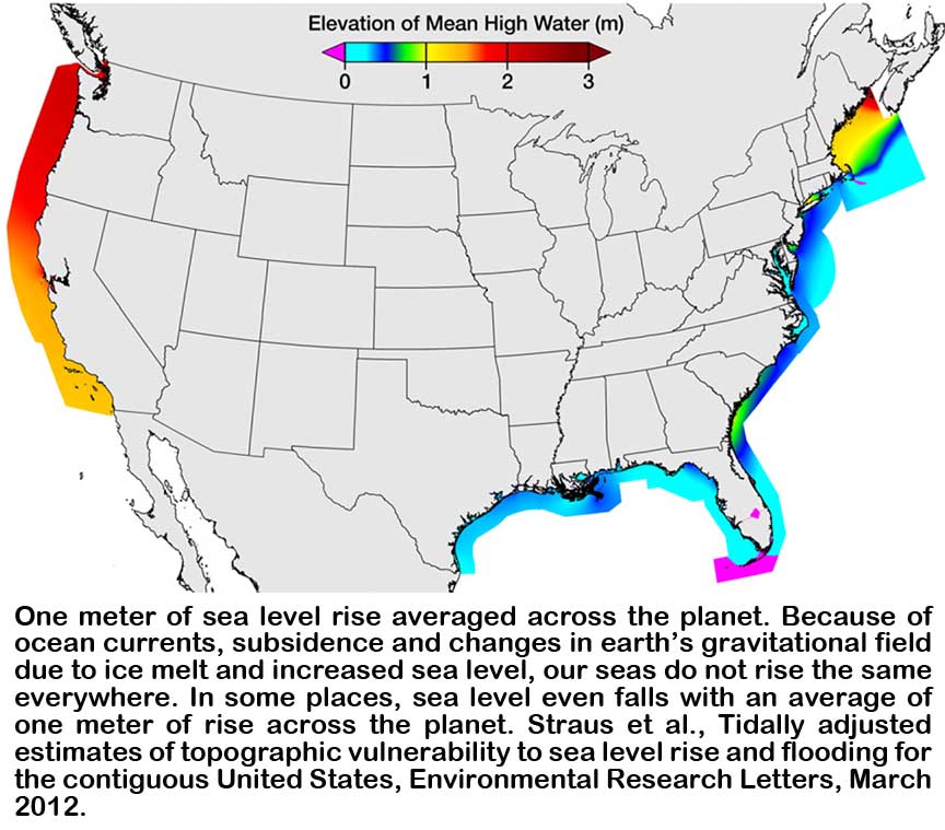
Without this “dynamical ice sheet disintegration,” the
loss of property will be immense. A total of 2150 towns in the U.S. have at
least one person living below one meter in elevation. If sea level rises
just three feet, 1.5 million housing units will be flooded and 3.7 million
people displaced
Our seas do not rise the same everywhere because of ocean currents, land subsidence, crustal rebound and changes in Earth's gravitational field. What you say? As an example, the Pacific Ocean is up to several feet higher than the Atlantic Ocean on average. Ocean currents play a tremendous role in controlling sea level, this is a fairly easy thing to visualize. Point an ocean current at a shoreline and the water piles up. The stronger that current is, the more the water piles up. But gravity plays a role too. The higher the water piles up, the more gravity pulls it back down and the less influence increasing volume of water in the oceans has.
Land subsidence and crustal rebound play a role to. Many places across Earth are subsiding because of various things caused by man and not. Many places on earth are still changing from when the ice age ended. Masses of ice as large as ice sheets depress Earth's surface hundreds of feet. When the Earth's crust goes down in one place, it generally goes up in others. The little squeeze dolls with the pop-out eyes are a good example of this efect. Because the mantle is made of different material that behaves differently under stress, some areas pop-out more than others.
The great depression in Earth's surface from the northern ice sheet is rebounding too. And it's not just the land under where the ice sheet once was. For hundreds of miles away from the edge of the ice sheet the land was pushed down by the ice and is still rebounding after the melt.
Beyond those hundreds of miles, land is falling because of the land under where the ice sheet was is rising. Think of a gravy ladle and a serving of mashed potatoes. Push the gravy ladle down into the mashed potatoes and the serving of potatoes gets bigger around. But if the mashed potatoes were the Earth's crust, and there was no place for the mashed potatoes to go when the ice sheet gravy ladle pushed down, the mashed potatoes around the edge of the ice sheet would rise--that is, beyond that several hundred mile area away from the edge of the ice sheet that would be dragged down because of the weight of the ice. A good example is the central eastern U.S. coastline. It is still falling quite a bit from the end of the ice age 10,000 years ago.
Even more, all of that ice melting has mass. Mass creates gravity. More mass near the giant ice sheets that can pile up over two miles high creates more gravity in those areas. Gravity affects sea level. So as the ice melts, mass is shifted from the ice sheet and redistributed in much smaller amounts all around the globe as water. This means that the gravity from that mass of ice, once concentrated at the poles, is redistributed around the earth.
All of these things affect sea level rise. This is really quite an astounding body of work from the last several decades that has looked at how sea level changes. Now we have this current work by Strause and his team that has put all of these things together and modeled the outcome.
Straus et al., Tidally adjusted estimates of topographic vulnerability to sea level rise and flooding for the contiguous United States, Environmental Research Letters, March 2012.
March 15, 2012:
Politics and Economics are Public’s Primary Climate Change Cue’s -- In
a paper in Climatic Change,
Researchers from Drexler University, the University of Montreal and Ohio
State have found that politics and economics (unemployment) are the most
important things that shape our thoughts about climate change.
When the economy is tight and or when our politicians are
actively advocating for or against climate change science, public opinion
shifts the most. The authors looked at science knowledge, extreme weather
and even media coverage and these things in general, had little statistical
influence on the public’s belief one way or another about climate change.
But when the economy is bad, we are too concerned about
where the money is going to come from to worry about the “perceived” threat
from climate change. Likewise, when we see our leaders working hard to
advance or defeat action on climate change, we change our views to match
these actions. But hurricanes,
tornadoes and floods make little difference. It doesn’t seem to matter a
great deal how much these extreme weather events are in the media. The
number of scientific papers published on climate change doesn’t seem to
matter much either.
These two things, politics and the economy though, make
the case. Since 1986, nearly 300 public opinion polls have been taken
dealing with climate change. The data from this large body of work was
evaluated and correlated to things like Copenhagen, the movie
The Day After Tomorrow, Al Gore’s
An Inconvenient Truth, extreme
weather outbreaks, media coverage of congressional actions about climate and
other similar events.
The authors do admit that even this large amount of data
has its flaws. Until recently, thorough, unbiased polls have not been
repeated over long enough time frames to come to valid statistical
conclusions about the trend of public opinion. They also tell us that in a
few more years current work will remedy this situation. Until then, the
modeling compiled from this work does have some decent statistical validity.

The authors have developed a Climate Change Threat Index (CCTI)
that shows the general sentiment of the public at any given time. From this
CCTI, they can map out the different influences in our society and draw
conclusions. Those influencing factors have been well identified in previous
literature and in addition to the above include: publicly made positions of
industry and religious leaders (what they call “elite cues”), climate denier
and climate skeptic tactics, increasing drought and temperatures,
information deficit—when politics make it “inconvenient” to discuss climate
change issues, the inherent difficulty of understanding climate change,
limitations of personal experience, and inappropriate mental models
(understanding that weather and climate are the same thing), wars and energy
prices.
One of the flaws that I see in this work is the lack of
any relationship with media coverage, one way or the other. Events like the
great tornado outbreaks, floods, snowpocalypses and hurricanes, and
climategates of all sorts, failed to move the CCTI in a statistically
significant way. But the facts are that these things made no difference.
Maybe it is those “inappropriate mental models.” Incomplete knowledge about
the difference between weather and climate is a good example.
The inherent difficulty of understanding climate science is another.
Public knowledge simply may not exist in a great enough quantity to
evaluate the extreme weather events as being a part of climate change.
Especially when so many television weather personalities refuse to become a
part of the perceived controversy. Weather extremes today have actually
crossed the line into climate change territory, but the same old line about
“any one individual weather event not being attributable to climate change”
is ever present in the media, even when the extremes have been shown to be
significantly caused by climate change.
Some of the tools that the authors used to help compare
the data are NOAA’s extreme climate index, the Palmer Drought Severity
Index, the number of articles about climate change in the scientific journal
Science, the number of articles
in 15 major popular scientific magazines, the number of climate change
stories on the nightly news and on all
of the major networks, the number of climate change stories in the New York
Times, Newsweek, Time, U.S. News and World Report … You get the picture.
Amazingly, only a few things other than politics (elite
cues) and economics (recession and unemployment) made any difference. One
was
An Inconvenient Truth and its
subsequent Academy Award. The release of major climate assessments and
individual articles in popular science magazines had slightly significant
impacts. Democrats releasing public statements had about a 30 percent
greater impact than did Republican releases.
Of most importance in this study was the finding
concerning voting habits of Republicans in the House and Senate. When
Republicans made a big deal about climate legislation, public support of
climate science fell whereas Democratic voting had no discernible effect.
Brulle et al., Shifting public opinion on climate
change: An empirical assessment of factors influencing concern over climate
change in the US 2002 to 2010, Climatic Change, Feb 2012.
March 3, 2012: 32 Killed by Tornadoes Yesterday: So Early In the
Season -- How many more people will have to die in these
unprecedented outbreaks before the delayers get it? It's hard to say. By
all (media) accounts, these outbreaks are not as bad as in the past. We have
inflation and more people to increase the chance of damage and death. The
D&D (delayer and denier) crowd cites these facts religiously. But they don't talk about the
earliness of these outbreaks much and they don't talk about the relative
number of deaths compared to the pre-early warning system/pre-radar/pre
advanced building codes society that has evolved beginning about the time of WWII.
These things are all talked about in depth in the entry for April 29, 2011.
Researchers tell us that if today was then, at least for the Oklahoma
tornado outbreak in 1999 that killed 36, we can multiply the deaths by
about 14 to get a similar amount killed ito back-in-the-day. So thank
goodness 416 people were not killed yesterday as the comparison would tell
us.
March 3, 2012 Money, Oil and Money -- British
Petroleum supposedly settled their lawsuit with the Gulf Coast yesterday. A
paltry $7.8 billion sum was agreed upon, that includes $2.3 billion to
continue to help resolve economic issues. Of course, BP reminds us that it
has spent more than $22 billion so far, including $8.1 billion in payments
to individuals. This is phenomenal amount of Thirty Billion Dollars! And BP
says no harm was done to the Gulf.
Jiminy Cricket! I can not even think that high much less understand how much
money that is. We need something to compare it too, and I apologize
for veering off into oil and the economy, but there is a madness to my
reason. Oil is of course one of the big fossil fuel polluters that we need
to target with radical emissions reductions. More importantly, oil is
responsible for two and a half times more warming than coal because of the
dirty cooling pollutants that coal emits
(http://www.meltonengineering.com/It's
cars, Not Coal 102610.pdf).
So we really need to be leaving the oil in the ground to use another day
when we have our atmosphere back under control. But this is not my point.
The issue here is the Grand Deceit being perpetrated on our society by big
money. BP denies the problems they caused in the Gulf. What does this mean?
It means that the view this $30 billion dollar mountain of money paid,
mostly to individuals, as being wrongly done. They view themselves as
the victim of wrongdoing by the public and the U.S. government. That $30
billion is rightly theirs (their shareholders) and they think they should keep it
because nothing bad happened in the Gulf because of their unprecedented oil
spill disaster.
Then, they post profits for the "disaster year" of 2011. British
petroleum, you know--the guys who tell us the price of oil is so high
because of unrest in the Mideast, problems at refineries and shut downs
because making gasoline is simply unprofitable anymore with all the
government regulations and red tape? These bandits made $40 billion in
profits in 2011.
Bandits, liars and thieves. Why is this? It's because they can.
Greedy corporations and individuals will get away with anything they can get
away with including murder (remember the 11 who died that the three parties
involved keep blaming each other for?). Our leaders and judges are to blame.
Hundreds of millions go to lobbyists to "persuade" lawmakers. Hundreds of
millions go to propaganda through Citizens United to fool Americans into
believing that BP is not at fault, they are the victim, they are the
aggrieved. These efforts have paid off in grand style. The biggest oil spill
every recorded was paid off with less than a year's worth of profits.
Please help end corporate influence in lawmaking and advertisement.
February 5, 2012 The Latest Most Accurate Evaluation of Global
Temperature
-- Here's the latest scientific explanation of global temperature and why there is
contention on how much it has warmed. The data below represents the
consensus post IPCC 2007.
The UAH data is the cherry picked data that folks like Rush Limbaugh and the
Cato Institute refer to in their routine attempts at discreditation of
climate science. In the raw data it is easy to see that the UAH data represents the
least amount of warming and this is because of the way that the data is
collected. It does not mean that this data (or any of the other data) is
wrong it simply means that it needs more correction than other data. And
when I say correction, this is like taking your own body temperature after
you have just been out for a brisk walk. Your temperature is elevated for
reason after the walk. These reasons are what creates the difference between
the UAH data and everybody else. Notice that other sources of data also show
differences. The UK Meteorogical Service for example does not consider
Arctic temperature change in their work. They do this because there are no
temperature reporting stations in the high Arctic. So they ignore this area
of the globe and opt to not use other sources besides temperature recording
stations to seek out this data. In reality, this area is warming faster than
anywhere else as reported in ships records and various other reports of
scientific and military efforts, including
The adjusted data graphic factors out sunspots, El
Nino and volcanic aerosols. These are very well known factors that are well
accepted in the literature
but little known in the public realm.
Now a word about the deniers and delayers telling us this science is bunk
because the data only look back to 1979. It is spurious for two reasons. One is that we do not have
the robust data to go back further, the analysis could go back much farther
but the most accurate and well accepted data begins with the satellite era.
The argument that satellite data is wrong has been valid at times but the
corrections have been made and those arguments are simply invalid today.
From these satellite corrections even the previous satellite data has been corrected,
yet the "Voices" don't give a hoot what the subsequent
academic evaluation of true skeptical arguments reveals. They just keep
trotting out their dated and now invalid talking points. I urge you to read
the paper and see for yourself. You are plenty smart enough to evaluate this kind
of thing. A concerted effort has been made to communicate these findings in
much more palatable language than previously used in academic work. This is
quite common across all disciplines of climate science these days.
One more thing that is not represented here is the Asian Brown Cloud. This
massive aerosol temperature mask has a significant cooling effect on Earth
that is somewhere around 1.2 degrees F. It can be directly compared to the
smog problem in the U.S. that developed after World War II and peaked in the
1970s. The creation of the Clean Air Act by President Nixon helped to vastly
reduce the trouble we were having with smog then that had a very measureable
impact that caused global temperature to stabilize for thirty years. The
Asian Brown Cloud is directly related to the very rapid modernization of
Asia in recent years. This modernization is the same kind of thing that
happened in the U.S. after WWII, only much bigger. It is still relatively
poorly understood, but a much better understanding is available today than
just a few years ago. It is quite like that the IPCC will include
significant discussion of this mask that approximately equals most of the
warming that has happened on Earth since the industrial revolution.
Paper link:
http://iopscience.iop.org/1748-9326/6/4/044022/pdf/1748-9326_6_4_044022.pdf
January 29,
2012, The Wall Street Journal “No Need to Panic About Global Warming”
Sixteen Deniers Authorities Delegate Delay – These 16 “scientists,” as
the Wall Street Journal calls them, have published a letter that has some
news for the readers of the WSJ. They tell us that our planet has not warmed
for well over ten years… Which
in itself is quite puzzling considering the all-time global high temperature records set in 2005, 2007,
2009 and 2010. They also tell us that we have seen less warming than
the IPCC predicted for the last 22 years. Since 2000 the rate has dropped
off a bit, but this has been attributed to many different things including
the cool phase of the Pacific Decadel Oscillation, the largest solar spot
minimum in 100 years and more La Ninas than El Ninos. In addition, growth in
China and India is higher than anticipated. Like the U.S. growth after World
War II, when we had very few pollution controls, China and India are
producing enormous amounts of aerosols. These aerosols were responsible for
about 1.2 degrees of cooling across the planet as of 2008 and China and India
barely felt the recession. The unexpected doubling of emissions in 2010 was
also the product of this rapid growth along with its disproportionate load
of cooling aerosols. Many of our top scientists are quite concerned that the
next few years will see a large jump in global temperature. Myself, I am
looking for the flip that has been discounted for about two decades now by
climate scientists. This is purely a fictional "belief" on my part however
as we had 90 days of 100 degree heat here in Austin last year and I may
still be somewhat delirious from the heat. More, the deniers tell us
Next: the
letter says that the warmists have shifted their ploy to one that promotes
weather extremes so that any old extreme weather can be attributed to
climate change. There has actually been no shift. The projections of greater
extremes in weather have been prominent in climate change projections for
over two decades. The physics is simple. Warm the pot on the stove and
convection currents increase (you can see it in the moving water, it gets
faster and faster until it boils). Our atmosphere is no different than the
pot on the stove except the convection current s in our atmosphere cause
weather (and it's not quite as warm). The stronger the convection current,
the stronger the weather, regardless of it being water in a pot or gases in
our atmosphere. Then they try and proclaim that CO2 is not a pollutant.
And they are correct. Chromium is a trace element vital to life in trace
amounts, but in excess it causes cancer. The excess CO2 in our atmosphere
put there by burning fossil carbon (we know this because it can be dated
using carbon 14 dating) is about 100 parts per million. Normally, when
earth’s atmosphere is in balance with its ocean temperature, we have about
280 ppm in our atmosphere. 250 ppm of gaseous arsenic inhaled for 30 minutes
can kill a human outright. Long term exposure to a half a ppm of arsenic in
mice causes anemia. A part per million by the way is equal to one drop in 14
gallons. Next: Plants do better with more CO2 –True!
Except when the CO2 is associate with warming and excess evaporation.
The evaporation effect because of warming is so large that rainfall can
actually increase while drought persists. This in combination with more
extreme weather, which is associated with larger rainfall amounts, but
falling at faster rates, meaning more rain runs off and less water soakes into the
ground. But mostly, warming will cause less rain to fall. These are the
general climatic conditions projected for the future across most of the
interior of large land masses, aka the interior of continents.
Scientists at NASA have already seen large parts of the northern
hemisphere browning because of adverse climate conditions. Forests across
the north are growing slower and they are sicker. Forest across the Rocky
Mountain West are dieing twice as fast as they were 50 years ago, and this
does not include forest losses due to the great pine beetle pandemic. Now,
scientists tell us the Amazon has already flipped from a carbon sink to a
carbon source because of two great droughts since 2005. Billions of trees
are dead. And right here in my backyard, our unprecedented drought last year
is supposed to have killed a half billion trees as per the Texas State
Forest Service. Carbon dioxide truly is a fertilizer in many plants under
controlled conditions. Ever hear of Mother Nature being controlled? This is getting tedious. Now they want to drag out the
old “CO2 was ten times higher in Earth’s history” argument. Yep, right
again. Except there were no green plants on land then. It was four times higher (about 1,000 ppm)
at the most in the last 500 million years since plants colonized land and
atmospheric oxygen weas
2.5 percent (it is 21 percent now).
Old science said that CO2 was 2,000 to 3,000 ppm back during dinosaur times or before. The latest science
however says it was only about 1,000 ppm. But back then, the continents were
arranged around Earth's equator. Today most of our land mass is
located in the northern hemisphere. This is a big deal when we have an earth
that wobbles regularly on its axis. When one part of the earth is pointed
more towards the sun, it tends to warm the planet more. This is the basis
for the orbital cycles theory of climate change. It means a lot and when the
continents were arranged along the equator. Earth’s equilibrium temperature was higher
then. That is, we are likely living on a more delicately balanced planet today than in ancient times.
And 1,000 ppm is likely where we are headed given our track record,
not 2,000 or 3,000 or even 4,000 ppm CO2.
We were supposed to have reduced emissions to 7 percent below 1990 levels by
this year – 2012, as per Kyoto.
Instead, emissions have risen 50 percent above 1990 levels.
The cast of the WSJ letter: Claude Allegre: French politician and geochemist
published “the Climate Lie” with at least 100 errors. He believes the causes
of climate change are unknown. More than 500 French researchers have asked
the French Science Minister to “dismiss” Allegre’s book.
He describes asbestos as harmless. The others include a professor of marketing, a pediatric physician, a
former president of research and engineering for Exxon, a board member at
the Geroge Marshall Institute, an electrical engineer, William Kininmonth;
meteorologist science adviser to the Exxon-funded Science and Public Policy
Institute, a member of the Exxon funded Heartland Institute Richard Linzen,
a polymer chemist, former director of the Heartland Institute Rodney
Nichols, former U.S. Senator Harrison Schmidt, a professor of astrophysics
and featured speaker at the Heartland Institute, Henk Tennekes, former
director of the Dutch Meteorological Service and featured writer for the
Exxon funded Science and Policy Institute, and a nuclear physicist. Meet the Wall Street Journal 16:
http://drich13.newsvine.com/_news/2012/01/29/10263079-meet-the-wall-street-journals-16-climate-scientists
January 1, 2012
How Many Climate Scientists Does it take to . . .
How
many climate scientists does it take to screw in a light bulb? None -
There is no known evidence that light bulbs burn out.
What happens when you rub two climate scientists
together?
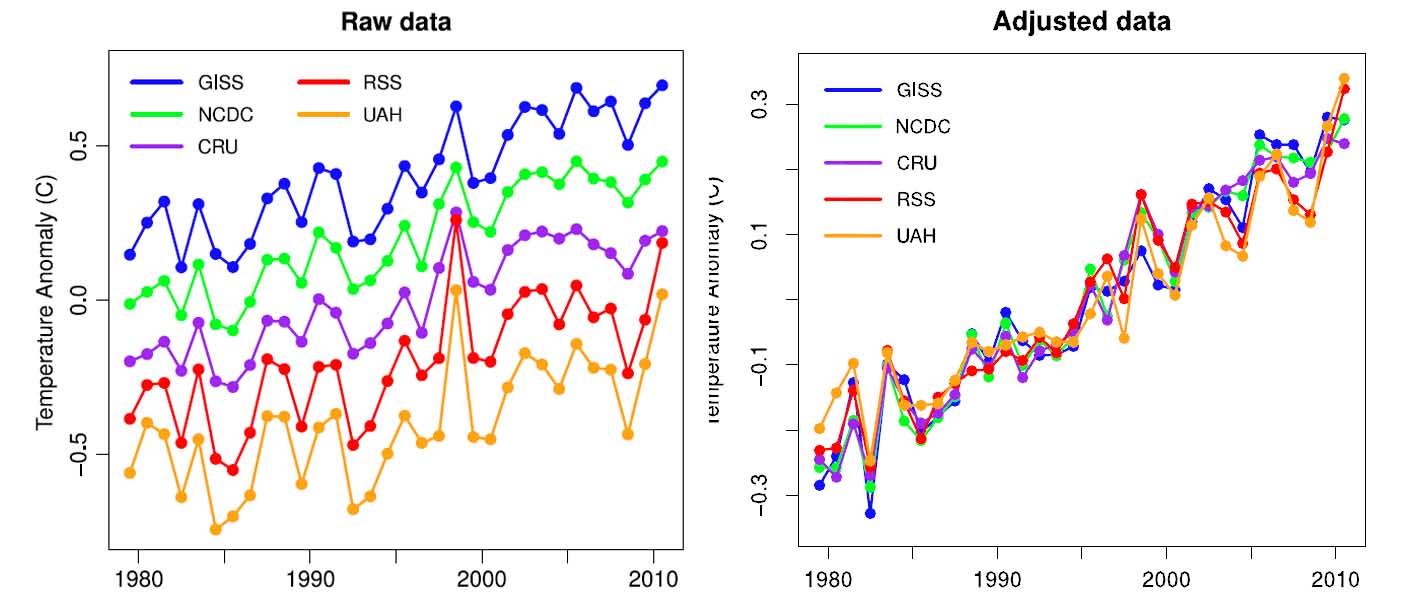 some
satellite data. These sources of data are included in the NCDC and GISS
temperature records.
some
satellite data. These sources of data are included in the NCDC and GISS
temperature records.
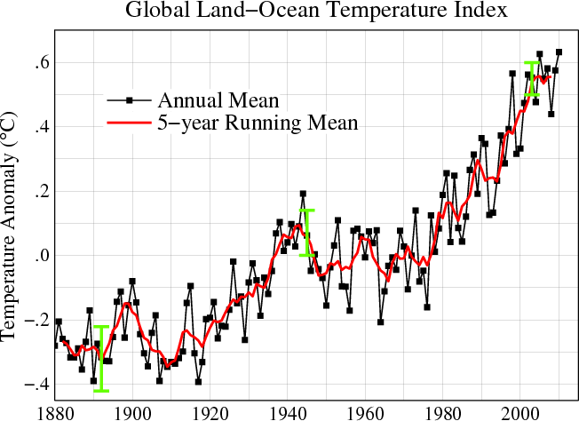
How many climate scientists does it take to screw in a light
bulb? None - The human species is too inconsequential to change a
light bulb. Ha-Ha-ha-ha!
How many climate scientists does it take
to screw in a light bulb? None - It is too early to say if the light
bulb needs changing. Ha-Ha-ha-ha!
How many climate scientists does
it take to screw in a light bulb? None - The light bulb will
eventually begin working again. Ha-Ha-ha-ha!
How many climate
scientists does it take to screw in a light bulb? None - The light
bulb is not really burned out, it is a scientific conspiracy.
Ha-Ha-ha-ha!
How many climate scientists does it take to screw in a light
bulb? None - They will never agree on exactly how to change the light
bulb. Ha-Ha-ha-ha!
How many climate scientists does it take to
screw in a light bulb? None - It is more cost effective to live in the
dark. Ha-Ha-ha-ha!
How many climate scientists does it take to
screw in a light bulb? None - We only know how to screw the planet.
Ha-Ha-ha-ha!
How many climate scientists does it take to screw in a light
bulb? None - The Internet has proven that the light bulb is not
actually burned out but is burning even brighter than before.
Ha-Ha-ha-ha!
How many climate scientists does it take to screw in a light bulb?
None - There were far more burned out light bulbs in the ancient past, why
should we change them today? Ha-Ha-ha-ha!
How many climate scientists does it take to screw in a light bulb?
None - Changing light bulbs is for engineers.
How many climate scientists does it take to screw in a light bulb?
Duh! It's not the light bulb; IT'S THE SUN, STUPID!!!
How many climate
scientists does it take to screw in a light bulb?
The luminosity of the sun is of the order of 10^26 watts, so clearly the
effect of any single light bulb is so small as to be negligible.
How many climate
scientists does it take to screw in a light bulb?
None - The climate skeptic believes it will clearly be more cost effective
to adapt to the darkness.
How many climate
scientists does it take to screw in a light bulb? It
is far too expensive to change the light blub.
How many climate scientists does it take to screw in a light bulb?
None - Light bulbs have been burning out since the days of the dinosaurs,
why should be change them now?
How many surrealist painters does it take to change a light bulb?
Fish.
Hot water comes out of both taps.
You go outside and your shadow stays inside.
The chickens are laying hard boiled eggs.
The trees are whistling for dogs.
You no longer associate bridges or rivers with water.
Morning dew is an oddity.
How many politicians does it take to solve climate change? The theory that
politicians solve anything at all is yet to be proven.
Ha-Ha-ha-ha!
What did one climate change denier say to the other? "I'm not hot, and this
ain't Hell"
December 19, 2011 A Half Billion Trees Have Been Killed by Drought
in Texas -- In a preliminary report, the
Texas Forest Service says that 100 million to 500 million trees have been
killed across Texas. A more detailed evaluation is due out in the spring.
What was done this time was a survey of foresters and agriculture
specialists across the state. What they found was that 2 to 10 percent of
Texas' trees have perished, not including trees killed by wildfire.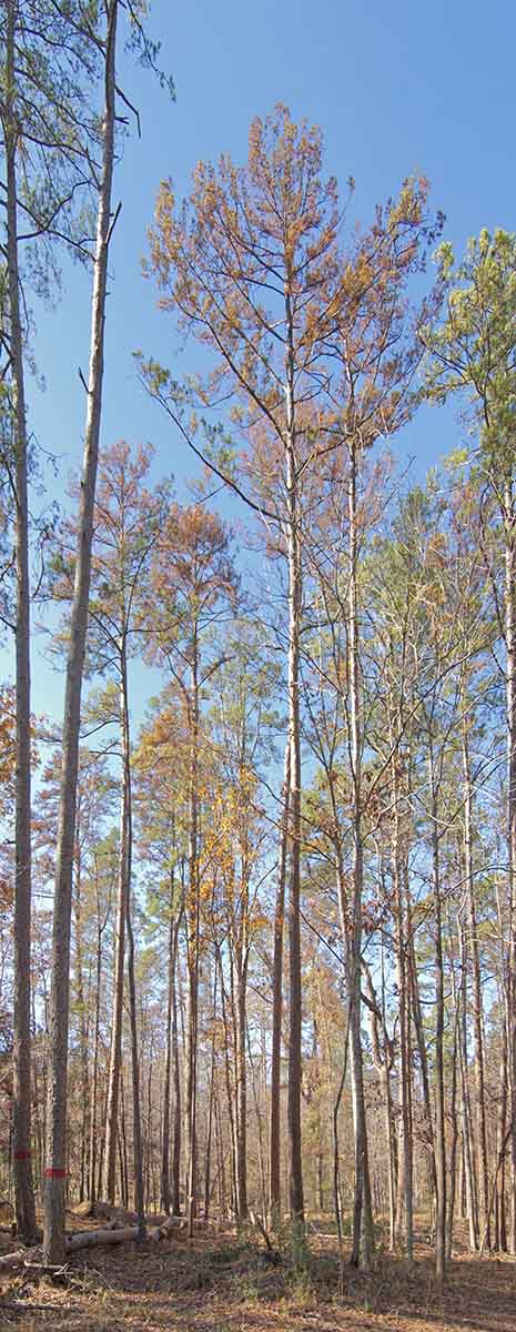
Worst hit of Texas' 63 million acres of forested lands include parts of Caldwell and Bastrop counties southeast of Austin, parts of five counties to the north and west of Houston, including Harris County (the greater Houston area), and much of the forested area between Kerrville and Fredericksburg and the edge of the Central Texas forest west of Junction.
My own personal surveys and scouting for my film work extended from Houston to the edge of the forest west of Junction. These surveys were just windshield surveys, and the extremeness of the kill was about the same from Galveston Bay all the way to Fredericksburg. Beyond Fredericksburg westward, the kill was probably two or three times greater than east. I estimated 500 million trees killed along that east west line from Houston to Junction and 100 miles either side. Making a wild-assed-guess that 70 percent of this area is forested, and a few more than 20 drought killed trees per acre on average would yield a half billion trees.
 Texas' 63 million acres of forested land yields 8 drought killed trees per
acre according to the Texas Forest Service, or 500 million of the 4.9
billion trees in our state's forest. Considering the average number of trees
per acre in Texas is 78, the estimate of 8 trees per acre killed seems quite
a bit low to me. My surveys showed a good quarter of the trees along that
330 mile long stretch of road between Houston and Junction were brown and
dad looking (they could be just dormant), not
ten percent. However, windshield surveys might be deceiving. In Rocky
Mountain National park I did a grid count and found that what looked like
more 80 or 90 percent kill from the road was actually about on half to
2/3rds kill. All that red in the canopy, seen from the road, seems to
overwhelm the remaining live trees, or in the case of Texas--brown.
Texas' 63 million acres of forested land yields 8 drought killed trees per
acre according to the Texas Forest Service, or 500 million of the 4.9
billion trees in our state's forest. Considering the average number of trees
per acre in Texas is 78, the estimate of 8 trees per acre killed seems quite
a bit low to me. My surveys showed a good quarter of the trees along that
330 mile long stretch of road between Houston and Junction were brown and
dad looking (they could be just dormant), not
ten percent. However, windshield surveys might be deceiving. In Rocky
Mountain National park I did a grid count and found that what looked like
more 80 or 90 percent kill from the road was actually about on half to
2/3rds kill. All that red in the canopy, seen from the road, seems to
overwhelm the remaining live trees, or in the case of Texas--brown.
It seems that there is a bit of conservative estimating going on with the TFS. Natural mortality of trees in a forest is about one percent per year. Stating that the bottom estimate of mortality is two percent is almost certainly far below the actual number of trees killed.
We will see. Unfortunately, even if the drought eases trees will continue to die. As an example of how hard drought is on trees, one paper I read about forest mortality from drought in Texas tells us that the Central Texas forest is likely still recovering from the drought of the 50s. This paper was written in the mid 1990s.
The pine forest and park entrance monument are in the Davy Crocket National Forest northeast of Houston. Ratcliff Lake Recreation Area is closed for logging of hazard trees. This is all too familiar to me from the Rockies where the pine beetle has ravaged somewhere near 70 million acres by now. The beetle pandemic there, like here, is because of warming. There, the beetles numbers have skyrocketed because of stressed trees and low temperatures that have risen above levels that kill beetles in a meaningful way. In Texas, it's a different species of pine beetle that appears to have caused much of the havoc in the area I surveyed at Ratcliff Lake.
The beetle outbreak at Ratcliff is likely enhancd because of drought stress. The trees cannot defend themselves in times of drought because there is not enough moisture to make sap to push the little boring beetles out of their boreholes. Consequently, the beetle is running rampant. In the recreation area itself, about half of the trees have been cut, and a significant number of the remaining trees are red. Remember, pines generally don't turn red until the season after they are attacked and have died. I also identified a number of green trees that were actively being attacked with live beetles. If this area is like others I've seen, most of the trees will have to be cut to keep them from falling on visitors.
On the other side of the state, from the edge of the oak/juniper
woodlands in the Hill Country forest west of Junction all the way to Austin
and Bastrop and on to Houston, the trees that browned off last summer still
have their brown leaves. In Texas, about two-thirds of the trees lose their
leaves naturally in the fall leaf turn and the brown trees just look like more autumn
leaf turn.

The image with the prickly pear cactus is from south Austin in September; a good 6 to 8 weeks before these winged elms normally lose their leaves in the fall.
I lost several large shrubs and a number of smaller perennials at my house in southwest Austin. All of them were natives, but even being a native doesn't help if it doesn't rain. In the twelve months from September 2010 to August 2011, we had 11.2 inches of rain.
About a third of my Saint Augustine grass bit the dust and my summer veggie garden was abysmal. I just gave up on my tomatoes. They quit setting fruit in April this year. Tomatoes do that when the afternoon and or overnight temperatures go above 90 degrees or 70 degrees respectively. We had 90 days of 100 degree or hotter temperatures this summer, 29 days more than the previous record set in 2009.
The final image is from the Fredricksburg area about 90 minutes west of Austin. Out there the drought has been so bad for the last 6 years that in places, half of the live oaks have dropped their leaves completely. Many of these trees are dead as they have not leafed out in several years. It will be a few year yet before we know if this latest crop of leaf drop will result in dead trees or not in these areas. But even if the drought does not kill the trees directly, disease can set in because the trees are so, so weak.
One fungus in particular is wreaking havoc in these parts because of the drought. A particular fungus called hypoxylon canker simple loves trees with low moisture content in their live wood. Stress and particularly drought stress result in this condition and the hypoxylon canker has become widespread. Trees attacked by hypoxylon general show rutpures in the bark and weeping ooze coming from the wounds.
http://txforestservice.tamu.edu/main/popup.aspx?id=14954
December 10, 2011 Scientific American Says (Eroneously) Atmospheric Capture Infeasible: Handing a Huge Piece of Pie to the Denying Delayers -- I am talking about climate science business as usual. As in: classic conservative science. The scientists responsible for this report in the Proceedings of the National Academy of Sciences are stuck inside of their science as usual box.
This a long a ridiculous debate where the "air capture" of CO2, in the world of industrial scale processes is compared to new progressive thinking that utilizes much more "organic" processes that rely on natural forces to do much of the work. This is a big deal between theoretical thermodynamic theorists and the new rules of climate change. The "snake-oil salesman" inference in the MIT press release (it actually said that) is embarrassingly juvenile and tells us something about the mindset of the scientists that are perpetuating this myth. And to think that these folks are on our side. I suppose this goes to show the competitiveness of some scientists.
The one argument that these theorists never broach is the most important one. This is not about thermodynamic equations. What I mean by this statement is that this is not about theoretical efficiency of process. Certainly, removing CO2 at 0.03 percent concentration in the atmosphere compared to 80 percent concentration in flue gas, is going to be a less efficient process -- based on current, or old school technologies. Those processes being 1100 pounds per square inch of pressure and 2400 degrees F temperature.
It is a simple fact that nearly half of our CO2 emissions are from nonpoint sources like transportation or are because if energy loss from buildings. There is no clear mechanism for removing these emissions at their sources like we can do with catalytic converters on cars, and it is not likely that there will be a solution in time frames that matter (a few decades.)
These sources will (hopefully) get more efficient and emit less CO2, likely in the future that does measure in decades. But what about the rest of the emissions from cars and that buildings are responsible for? thinking we can reduce them by half in the next twenty years is likely optimistic, but even with a 50 percent reduction, 25% remain.
There is no other way to remove these emissions (pollutants.) To achieve our
goals of keeping climate change below the dangerous level (which is probably
more realistically "keeping climate change below extremely dangerous
levels), we must reduce all emissions to zero and quite likely go even
further than that.
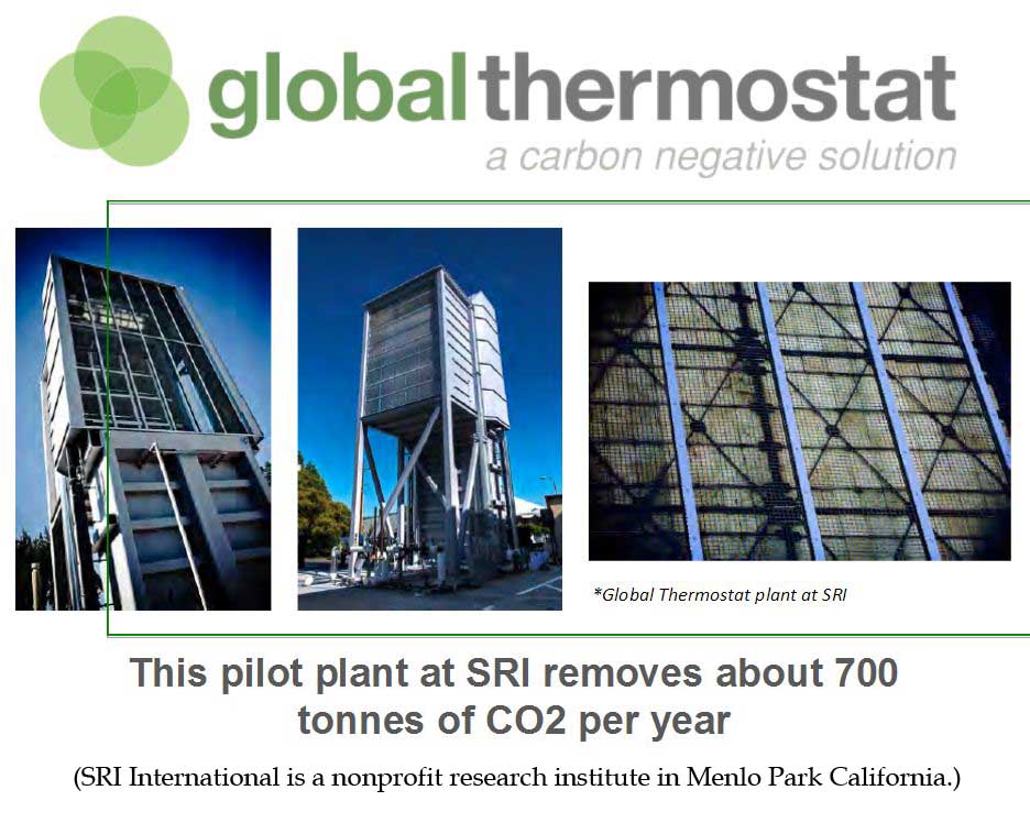
We cannot remove more than 100 percent of flue gas CO2 from flue gas. Agriculture emissions reductions are not likely to be able to continue to decline with developed world efficiencies if our population grows as forecast. Deforestation emissions suffer from the same challenge only the ability of forests to absorb carbon is now being shown to be in jeopardy with the great forests die-offs across the world and specifically with the flip of the Amazon from a sequestration sink to a source of greenhouse gases nearly as large as that of the United States.
The warning that are coming true now (made twenty to thirty years ago) as climate change emerges from the noise of weather chaos, s so many unprecedented droughts, snowstorms, floods, heat waves and insect infestations are becoming more common across the planet, are sobering to say the least.
The feasible path for preventing the complete destruction of the climate that our civilization evolved in now shows we must reduce emissions to zero or less by some time between 2050 and 2100. What are we supposed to do with the nonpoint sources? We will not stop burning oil and natural gas by 2100 much less coal, how do we account for the emissions from transportation and inefficiency of buildings?
It must be through atmospheric capture. There is no other way. This is a new climate rule. The new climate rules require that we sometimes look at things differently than we have in the past. This is exactly what Broeker and Lackner of Lamont Doherty Research and Columbia University are doing today. They are no longer thinking of CO2 as a thermodynamic problem, but as an equivalent energy problem. They are asking what is the cost relationship between emitting CO2 and removing it from the atmosphere, not the simple thermodynamic relationship between the chemistry and mechanical energy needs to run the process.
To put this into common terms, wind energy is now approaching the cost of energy from coal. If we were to supply the average American with all of his or her energy requirements generated from wind it would take the energy found in the wind in area the size of the side of a barn. Compare that to generating energy from fossil fuels and then removing the CO2 from the atmosphere to get an equivalent energy area the size of a barn window. This is what Lackner and Broeker tell us is possible, based on scale sized process experiments funded by Gary Comer (Founder of Land's End.) Emitting CO2 and removing it from the air then becomes twenty or more times more efficient at cooling Earth than generating that energy from wind.
Results from their pilot plant show that a structure the size of the Great
Wall of China could remove half of our global CO2 emissions every year.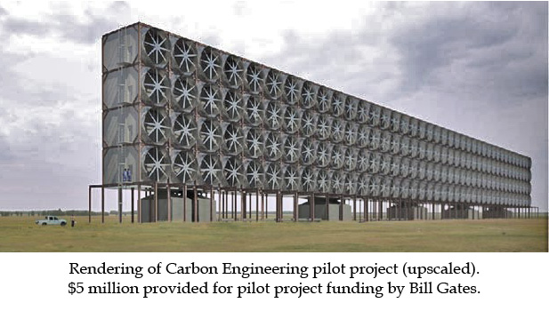
This is another of those counter intuitive things with climate change like the difference between warming caused by energy generation with fossil fuels vs. warming caused by transportation. Warming caused by transportation is two and a half times greater than that for energy generation which is dominated by the king of dirty fossil fuels -- coal. The reason is that dirty coal emits a huge amount of masking aerosols (nitrogen and sulfur oxides) that cool the planet. Transportation uses relatively clean burning fuels. The difference is that transportation, not coal, is the main culprit in the climate change conundrum.
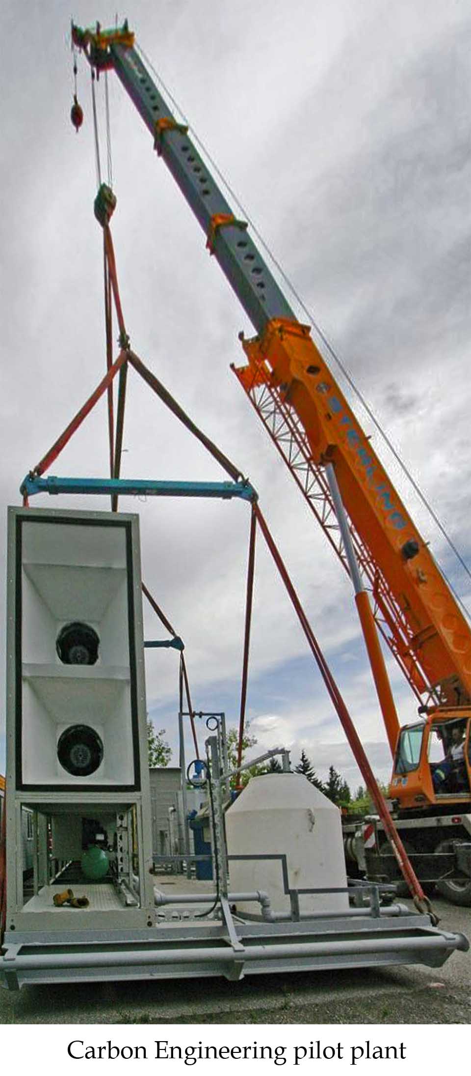 This
evaluation is only valid for the short term (climate short term) because
after a few days or months the aerosol pollutants fall our of the sky due to
gravity or are neutralized by other chemical reaction in our skies. What
this means is that once the math is done in about fifty years, king coal
will regain it's seat as the most warming economic sector, but not until
then. considering the climate short term is at high risk of crossing tipping
points, we can not afford to be addressing coal emission unless we address
transportation sectors with two and a half times more resources.
This
evaluation is only valid for the short term (climate short term) because
after a few days or months the aerosol pollutants fall our of the sky due to
gravity or are neutralized by other chemical reaction in our skies. What
this means is that once the math is done in about fifty years, king coal
will regain it's seat as the most warming economic sector, but not until
then. considering the climate short term is at high risk of crossing tipping
points, we can not afford to be addressing coal emission unless we address
transportation sectors with two and a half times more resources.
The bottom lines is that we must get moving with the industrialization of air capture.
It's important to note that air capture will not "empower" citizens to do nothing about climate change for whatever backward reasoning that may be conjured up by those who use this scare tactic. In 100 years this may be the case, but not until then. The infrastructure that we have to build to remove our gaseous carbon pollution from the air, treat it and dispose of it, is not of the "energy too cheap to meter" ilk. Implementation of this technology will be similar in cost and time-to-build as our wastewater collection and treatment systems -- not a trivial undertaking. The costs of this wastewater infrastructure are:
Richard Alley, one of the most important Greenland ice scientists in the world, tells us in his new book Earth: the Operators Manual, that the cost of our wastewater collection and treatment infrastructure and it's time-to-build was similar to what we can expect with our new CO2 pollution collection and treatment infrastructure. This is about 1% global annual GDP for 100 years. No trivial amount, but an entirely achievable goal, one that has been achieved several times over in the last century with infrastructures for potable water, electrical generation, transportation, telecommunications, etc.
An important aside: if it turns out that the installation of our CO2 pollution collection and treatment infrastructure a trivial thing, and atmospheric removal of CO2 DOES allow citizens to freely emit CO2 that is then inexpensively removed from the air at a far less cost than by generating that electricity from a more expensive technology, what's wrong with that?
Back to a blistering review of these scientists' publication: The article is completely biased towards the "dilution principle." The chemists and mechanical engineers that are doing these counterproductive inside-the-box evaluations are basing their statements on closed-mind thinking. For example: because the CO2 concentration is about 300 times more dilute in the atmosphere than in flue gas, they tell us that the mechanical costs of scrubbing the atmosphere rather than flue gas will need 300 times more energy to move the air with giant fans and then 300 times more energy to heat it to extract the CO2 and regenerate the sorbent to repeat the process. This thinking is irrational. Of course removing a pollutant that is 300 times less common in a process stream will cost astronomically more than removing the same pollutant in the same media with a concentration that is hundreds of times greater.
The "new rules" tell us however, that atmospheric removal of CO2 will rely mainly on natural forces to move the air (wind) and regenerate the sorbent (starting with sodium carbonate, instead of sodium hydroxide.) ANYTHING OTHER THAN THAT IS PROHIBITIVELY EXPENSIVE, DUH, WE KNOW THAT ALREADY. The "new rules" technology (and man-created energy use required) is completely different than that for flue gas removal.
This report simply does not take this knowledge (this new knowledge) into consideration. It is simply a reiteration of the irrational concerns of the conservative science crowd based on the old thermodynamic evaluation of the old process. What's more, Lackner and Broeker tell us that the number of btu's to remove CO2 from the air using "new-age" climate rules is only slightly greater than to remove it from flue gas like we did in the old days of the 20th century even though the concentration is 300 times greater in flue gas. The side of the barn vs. the barn window analogy is a good way to think of this comparison. So the argument that the old school is using is not even valid any longer.
In other words, treating atmospheric CO2 emitted from fossil fuels is 170 times more efficient than generating energy from wind. Yes this does tell us that we can regenerate as much CO2 as we can remove from the atmosphere, but getting to the end of that equation is one that takes a similar amount of time and investment as getting to the end of the wastewater infrastructure equation. Lackner and Broeker have created scale sized units that demonstrate the validity of this new-age science. Claims in Scientific American and the MIT press release that say otherwise and that also say that this technology is based only on calculations from bench models are simply invalid.
Overall this push by these thermodynamic zealots is very unscientific in its presentation and their refusal to acknowledge the difference in the principles between the two techniques appears representative of the grasping of straws that comes from a losing cause.
Robert Kunzig's biography of Walley Broeker, Fixing Climate, discusses the new rules of atmospheric capture at length.
Richard Alley's, Earth: the Operators Manual, discusses the comparison of our carbon sequestration infrastructure construction relative to that of existing parts of our planet's infrastructure at length as well.
House, et al., Economic and energetic analysis of capturing CO2 from ambient air, PNAS December 2011.
Abstract: hhttp://www.pnas.org/content/early/2011/11/28/1012253108.abstract
Press Release: http://web.mit.edu/press/2011/carbon-dioxide-capture.html
Scientific American article: http://www.scientificamerican.com/article.cfm?id=scrubbing-carbon-dioxide-air-too-expensive
November 26, 2011 Globally, Wind Energy to Be Cost Competitive by 2016 Already competitive with subsidies in many places, already competitive in several places without subsidies, Especially to natural gas, wind energy will be competitive world-wide with gas, oil and coal in five years. Bloomberg New Energy Finance issued a statement on November 10 with this news. Wind energy will drop 12% in the next five years allowing it to become cost competitive with natural gas.
The best wind farms in the world already produce energy equal to or less than the cost of coal. In 1984 there were only 0.3 gigawatts of installed wind generators. By the end of 2011 there will be 240 gigawatts installed. The efficiency of wind turbines has nearly tripled over the last 27 years. Operation and maintenance costs of wind farms had decreased by 85 percent over the last 30 years. These trends will continue.
Lead analyst at Bloomberg Justin Wu tells us: "The press is reacting to the recent price drops in solar equipment as though they are the result of temporary oversupply or of a trade war. This masks what is really going on: a long-term, consistent drop in clean energy technology costs, resulting from decades of hard work by tens of thousands of researchers, engineers, technicians and people in operations and procurement. And it is not going to stop: In the next few years the mainstream world is going to wake up to wind cheaper than gas, and rooftop solar power cheaper than daytime electricity. Add in the same sort of deep long-term price drops for power storage, demand management, LED lighting and so on – and we are clearly talking about a whole new game.
Bloomberg Energy: http://bnef.com/PressReleases/view/172
November 20, 2011 IPCC Special Report SREX, Managing the Risks of
Extreme Events and Disasters to Advance Climate Change Adaptation
A classic report, full of conservative information created by committee. Not
that the IPCC does not represent the best science that we have. It's just
that these guys do things by enormous committees and compromise is the
standard operating procedure when creating policy, or anything really, by
committee.
So what does this report mean? Honestly, my focus is on impacts happening now. I did read the Summary for Policy Makers though. One statement stood out, relative to impacts happening now; "For the high emissions scenario, it is likely that the frequency of hot days will increase by a factor of 10 in most regions of the world." Conservative? Yes.
The USGS tells us that 100 degree days will increase ten-fold across almost the entire country by the decade beginning 2080. (See entry for November 21, 2009.) This finding would support the SREX, except that it is based on one of the middle of the road scenarios, not a higher emission scenario. A higher emissions scenario means higher temperatures.
Diffenbaugh and Ashfaq tell us that some parts of the North American southwest will see the hottest season of the last 60 years repeated ten times during the decade of the 2030s -- as in, every year of the 2030s will be as hot as the hottest season of the last 60 years. See entry for July 8, 2010: Time frames are everything. Except when the science tells us that things will be ten times worse than they are now based on a middle of the road climate scenario, like Diffenbaugh and Ashfaq have done.
April 7, 2011; a paper in Climate Change, a Wiley Interdisciplinary Review, tells us that by 2035 (the decade 2021 to 2030), Dust Bowl conditions will dominate a majority of the United States. In other words, Dust Bowl conditions will be the typical condition: the average, the normal condition, in just 24 years. Some years will be cooler, but just as many will be more extreme. This is another instance of extraordinary climate change happening far ahead of the conservative assessment process suggestion. This one too is based on the middle of the road scenario, not the worse-case scenario. I can not emphasize enough that our emissions are following the worst-case scenario, not one of the middle of the road scenarios.
And this year in Austin, and all across Texas (see entry for October 1, 2011) we experienced our first summer that was ten times more extreme than average. This year we had 90 days of 100 degree heat. Normally, we average 11 days of 100 degrees or above. Technically of course, 90 days of 100 degree heat is only 8.2 times more than our average of 11 days of 100 degree heat, but if you suffered through it like we all did in Central Texas, it was every bit as extreme as ten times more extreme than normal.
SREX Report: http://ipcc-wg2.gov/SREX/
Global Change Research Program
Global Climate Change Impacts in the United States, A State of Knowledge Report from the U.S. Global Change Research Program, 2009, page 90.
http://www.globalchange.gov/publications/reports/scientific-assessments/us-impacts
Diffenbaugh and Ashfaq, Intensification of hot extremes in the United States, Geophysical Research Letters, July 2010
Dai, Drought under global warming - a review, Wiley Interdisciplinary Reviews - Climate Change, p 45-65, January-February 2011
November 15, 2011 Large-Scale Ecoregime Change Underway in the North
American West
It's been happening for more than a decade.
Drought, insects and disease are recreating the landscape of western North
America. A paper out of Oregon State tells the story: "A huge “migration” of
trees has begun across much of the West due to global warming, insect
attack, diseases and fire, and many tree species are projected to decline or
die out." These forests have been where they are (or where they once were)
for millennia. Now abrupt climate change is causing a massive ecoregime
change, unlike anything mankind has ever experienced.
This ecoregime change is what ecologists call it when an ecosystem changes to a different ecosystem. In its most extreme form called desertification, this can be thought of as a line of sand dunes marching across a forest, completely extinguishing all life previously known in the forest ecosystem. This may seem extreme, but in reality, the paper says that many of our forests across the North American West are at risk of being replaced by grassland. The great conservativeness of course, this study was done with the A2 scenario: one of the middle of the road scenarios. Our climate, pushed hard by our society, with decades if not generations of warming to come from already emitted greenhouse gasses, is tracking the worst-case scenario path.
Extra - Local Bulletin, Austin, Texas: The great forest die-off began in Austin with the drought of 2005/6. Our forests are not as severely impacted as those of the Rockies and the Southwestern U.S. -- yet. This latest drought, the third in row, was quite likely twice as extreme as the drought of record here in Central Texas: the Drought of the 1950s. Visibly, to civilians, little has changed. That's the trouble with outreach and forest mortality. Once a tree dies and its leaves come off, it tends to quickly disappear back into the forest. the limbs of a tree simply have much less visible mass than all those leaves. In addition, surviving neighboring trees rebound rapidly. The dead trees leaves a hole that it full of water, light and nutrients. Neighboring trees soak it up in a process that foresters call "release." The term was coined to describe increased tree growth when a forest is selectively logged. the trees that remain are released.
Forest die-of from drought, insect infestation or disease does the same thing. the trees that survive get a growth spurt very rapidly after their neighbors die. This growth covers up
Press Release: http://oregonstate.edu/ua/ncs/archives/2011/nov/climate-change-causing-movement-tree-species-across-west
Nicholas C. Coops, Richard H. Waring. Estimating the vulnerability of fifteen tree species under changing climate in Northwest North America. Ecological Modeling, 2011; 222 (13): 2119 DOI: 10.1016/j.ecolmodel.2011.03.033 Richard H. Waring, Nicholas C. Coops, Steven W. Running. Predicting satellite-derived patterns of large-scale disturbances in forests of the Pacific Northwest Region in response to recent climatic variation. Remote Sensing of Environment, 2011; DOI: 10.1016/j.rse.2011.08.017
November 12, 2011 Sea Level Rise - the Biggest Long Range Climate
Threat
Over the years I have been watching the reports
reporting how sea level rise slowly increasing. Slowly however is a
misnomer. Sea level rise has rapidly increased since about 1990. The papers
tell the story.
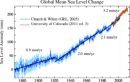
Throughout most of the 20th century, sea level rise was between 1.2 and 1.5 mm per year. About 1990, it was found to be 2.0 mm per year. By the late 90s it was 2.1 mm per year, then 3.0 then 3.4, now I've seen 3.7 mm per year. All the while the reports of increasing melt from mountain glaciers, Greenland and Antarctica continued.
Over the past four or five years the reports from Greenland and Antarctica have shown melt and iceberg discharge increasing rapidly. Antarctica was not even supposed to be losing ice until the 22nd century according to the IPCC, but now it has caught up with ice loss from Greenland.
All the while, our beaches and coastal wetlands are sweating bullets. the US Global Change Research Program's report in 2008 telling us that our barrier islands and wetlands will begin to disintegrate and disappear when sea level rise reaches 7 mm per year has been looming precariously in the near future.
New findings about the collapse of the West Antarctic ice sheet the last time Earth was within about 1 degree C of being as warm as it is today, about 120,000 years ago, saw sea level rise 30 mm per year for centuries on end.
Seven mm per year is about 2.4 feet per century. The West Antarctic Ice
Sheet collapse at 30 mm per year saw sea level rise 10 feet per century.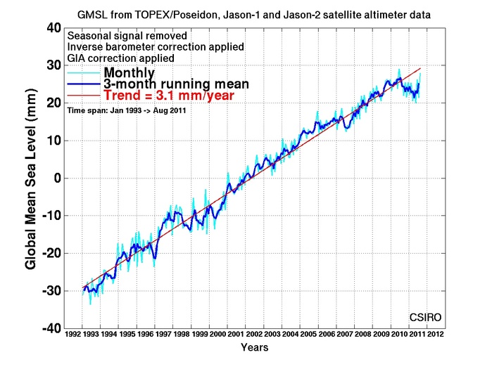
Assessments of the impacts of climate change tell us that our society can adapt to sea level rise of no more than about one foot per century. The reason is the vast infrastructure lying within feet of sea level that has been constructed over generations.
Today the most detailed evaluations of sea level rise yet are being published. Church and White's latest contribution however has a twist. it appears to be a linear trend in sea level rise beginning about 1990. the rate is 3.1 mm per year, but this rate is not averaged. It fits a straight line trend. this is very odd considering the increase in melt from mountain glaciers, Greenland and Antarctica.
Why is sea level rise not following an exponential trend like temperature and ice discharge? The most likely answer is "I have no idea." thinking about the water cycle though, the amount of water remains constant. as temperature rises though, more water can be held in the air. Too, as our society grows, more water is taken out of the ground. this water ends up in our rivers or the sky and becomes a part of the water cycle, it should increase sea level rise.
But we have to subtract the amount of water impounded from new reservoirs. Our society has yet to stop building dams. these dams are a significant amount of capture, equal to a share of "negative" sea level rise. Altogether however these pluses and minuses, intuitively, should still be causing an exponential rise, not a linear rise.
The contribution from mountain glaciers is supposed to be diminishing, is this happening and is it happening in a strong enough way to offset the increase in rise from Greenland and Antarctica?
Is our society at a peculiar crossroads where environmentally increasing variables are nearly exactly matched by society's increasing population and manipulation of resources? Our aerosol emissions are increasing so rapidly that they are masking more than half of our current warming. It could certainly be possible that we have temporarily locked up the missing sea level rise in new reservoirs, or increased storage in the atmosphere because of the capacity of warmer air to hold more water.
Climate change deniers would say it is because climate change is not real. Sea level rise is not increasing. But Church and White's tide gauge data from 2005 (top graph) shows distinctly that sea level rise in the early 20th century was less than 1.0 mm per year. Numerous studies of sea level rise over the last several thousand years, from fossil corals and stranded beaches, shows that sea level rise through this period has been near zero. (The climate change deniers are good at ignoring lots of data.)
So what is the answer? No-one knows as of yet, but I bet it will not be long until we find out.
Church and White CSIRO: http://www.cmar.csiro.au/sealevel/sl_hist_last_15.html
November 9, 2011 The Point of No Return is in 2017; Just Five Years the
International Energy Agency
The International Energy Agency
(IEA) has returned a valuable yet frightening assessment of our current and
future energy use and climate change. We have just five years to bring our
energy sources into line with climate change mitigation scenarios or we
default on our planet. Says the IEA: "On planned policies, rising fossil
energy use will lead to irreversible and potentially catastrophic climate
change."
The IEA was created in 1973 after the world oil crisis. Their mission was
meet world energy knowledge and policy needs in the future so as to manage
for things like the 1973 oil crisis. The Agency broadened its mandate to focus
on the 3Es of sound energy
policy: energy security, economic development, and environmental protection.
IEA Ministers say "Current energy trends are not sustainable and a better balance must be found between the three Es. Energy is part of many environmental problems, including climate change, and must be part of the solution. The IEA has been engaged for more than a decade on designing cost-effective approaches to reduce CO2 emissions, from the international policy architecture (including trading mechanisms) to energy efficiency policy and the promotion of clean technologies."
The IEA says reveals a more aware evaluation of global energy issues than is customary for this organization: "The window of opportunity is closing ... Governments need to introduce stronger measures to drive investment in efficient and low-carbon technologies. [Remember, this is the IEA, famous for fossil fuels.] Faith Birol, IEA Chief Economist is quoted in the press release: "As each year passes without clear signals to drive investment in clean energy, the „lock-in of high-carbon infrastructure is making it harder and more expensive to meet our energy security and climate goals."
The 660 page World Energy Outlook 2011 is the flagship publication of the IEA.
Faith Birol, IEA Chief Economist says: “As each year passes without clear signals to drive investment in clean energy, the lock-in of high-carbon infrastructure is making it harder and more expensive to meet our energy security and climate goals.” What Ms. Birol is telling us is that if we continue with business as usual energy usage, when 2017 rolls around CO2 levels in our atmosphere will rise to 450 ppm regardless of other actions we take and 2 degrees of warming will be guaranteed.
There is good news and bad with this evaluation. There is time to act. Some international commitments do allow for reductions in our emissions but as of now, agreement and ratification by many of the most important countries is unlikely to happen in the next several years.
More good news: The technologies to reduce emissions exist now. New technologies have been proven in the lab and rapid implementation is completely economical relative to the cost of inaction. But the motivation of our leaders is lacking.
The IEA relies on a 450 ppm scenario. This path calls for allowable emissions demonstrated to meet the globally agreed upon goal of limiting the temperature rise to 2°C. Four-fifths of the total energy-related CO2 emissions allowed by 2035 are already locked-in by existing investments including power stations, transportation, buildings and factories. Continuing with business as usual means that by 2017, the energy-related infrastructure then in place would generate all the CO2 emissions allowed in the 450 Scenario up to 2035.
The big problem here is that much of the latest science now tells us that 350 ppm is the maximum CO2 concentration we can reach before experiencing 2 degrees C. of warming. We have already experienced 1.4 degrees and between and 0.8 degrees (depending on the study) of warming will occur because of emissions already made. Our CO2 concentration when these reports were made was a little over 380 pm. You do the math.
More concerning, there is a growing position that 1 degree C represents the threshold to "dangerous climate change." This represents 300 ppm CO2 or 350 ppm CO2"e", which takes into account warming from non-CO2 greenhouse gases.
More good news (even though at first glance this appears to be anything but good news.) The report tells us: "Delaying action is a false economy: For every $1 of investment in cleaner technology that is avoided in the power sector before 2020, an additional $4.30 would need to be spent after 2020 to compensate for the increased emissions." In other words, from the 2009 IEA report: "The world will have to spend an extra $500 billion to cut carbon emissions for each year it delays implementing a major assault on global warming." So where is the good news here? Start now. These costs figures represent about 1 percent of global annual Gross Domestic Product (GDP). In 2010 Global GDP was $63 trillion. One percent of this amount is $630 billion, a little more than the IEA estimate it will cost to mitigate for the delayed costs per year.
The really good news here, did you catch my math error? The IEA says that it will cost $500 billion per year after 2020. Up until then, $1 dollar spent avoids $4.30 cents after 2020. In other words, what we spend in the next nine years is discounted by over 75 percent! Lets get busy!
Report: http://www.worldenergyoutlook.org/
Press Release: http://www.worldenergyoutlook.org/docs/weo2011/pressrelease.pdf
November 3, 2011 The US Government Says 2010 was Worse than the
Worse Case Scenario - CO2 Emissions Rise a Whopping 6 Percent! Emissions in
the U.S. rose 3.2 percent from 2009 to 2010, but they were still 3.7
percent below 2008 levels. This was not the case across large parts of the
developing world.
While many areas in Europe were mirroring U.S.
emissions, many developing nations saw emissions skyrocket. When I first saw the
Associated Press (AP) article describing the new U.S. Energy Administration's
greenhouse gas emissions data for 2010, I was in disbelief. It was not that
I did not believe the Energy Departments numbers, I couldn't find them! All
I could find was link after link to the AP article on this whopping 6
percent increase in greenhouse gas emissions in 2010. I simply did not think
the world economy had recovered enough to double the previous growth rate of
greenhouse gases.
I thought the numbers might be right, but I thought I new that the source of gases was not what the AP article said. The AP said it was human emissions. I simply did not realize how robust developing nations across the world are. This recession thing is something manufactured in the developed world by out of control moneyed interest. It simply has no effect on the developing world.
What I assumed when I first read this piece was that that the real source of this increase was feedback from global forest die-off, methane clathrate venting in the Arctic Ocean and greenhouse gas release from permafrost melt. I did not have the source document from AP. Their link did connect to the home page for the U.S. Energy Administration, but there were no press releases and no indication of the source document from AP used in their story. The Associate Press, in my experience, rarely gives decent references. Fortunately, my mind only ran wild for about 24 hours and I did not publish anything with my assumptions. It is the rest of the story that is important her and it has to do with those feedbacks I mentioned at the beginning of this paragraph.
I am slowly coming to realize the scope of climate changes happening right now across the globe. The two droughts in the Amazon, responsible for emitting 75 percent of the total greenhouse gases emitted by the USA every year, was a jolt of reality. The author of the paper that does the math on those emissions estimates that over 2 billion trees were killed. The flip of the Amazon ecosystem from carbon sink to carbon source was not supposed to happen unless we did nothing to limit our greenhouse gas emissions and then it was a consideration for the distant future with significant uncertainty. But It has now happened. The Amazon has flipped from one of the most important carbon sinks on the planet to a carbon source nearly the size of the United States.
My work with forest issues and climate change has reveled an enormous amount of information that is virtually unknown by everyone except a very few specialists. A great example of this is the relative size of the Amazon's actual carbon sink. Most believe it is the most important forest of its kind and that tropical forests are the single most important carbon sink on land. The Amazon specifically and tropical forests in general are the most important forests on Earth relative to diversity. The ability of a tropical forest to absorb and store carbon however pales in comparison to that of the great northern forest.
A report by the Canadian Boreal Initiative in 2009 tells us that the great northern forests of our world contain almost twice the carbon as do tropical forests. Even though tropical forests cover about the same the land area of boreal forests (15 million sq km each,), the carbon content of the boreal is nearly twice that of the tropical forests. How can this be? It's the northern soils. It is fairly well known that most tropical forests exists on very poor soils. Nutrient cycling in the tropics is really fast. Forest debris decompose very rapidly and are constantly cycled from tree to dead wood and forest litter and back again.
The boreal forest has a much slower carbon cycle. As a consequence, forest
litter does not decompose nearly as fast. Slowing things further, northern
forests are frozen for some to eight months or more of every year. In
addition, much of northern forests are underlain by permafrost. Permafrost
contains an enormous amount of dead, partially decomposed organic material
that is a semi-permanent state of storage.
So when the analyses and the math is completed, 703 gigatons of carbon is contained in the boreal forests while only 375 gigatons of carbon is contained in tropical forests.
My estimates of tree mortality from the little drought here in Texas are at a half billion. Estimates of tree mortality from the 64 million acres of beetle kill in the Rockies range from 2 to 8 billion. Scientists in Alaska tell us that the forest death there from fire that has increase four times above the 20th century average is greater than all of the fires in Canada for the last 40 years. The Weather Underground tells us that the great drought in Central Russia last year was possibly a once in 15,000 year event.
Forest die-offs in the tens of millions of acres are happening across the globe. It's highly possible that 8 to12 billion trees have died across the planet in the last decade, because of climate change, most of them in the last five years. These trees were now emitting greenhouse gases instead of absorbing them. If we look at these 8 to 12 billion dead trees in a similar way as we look at the emissions from the dead trees in the Amazon, we are talking about emissions roughly equal to the total annual global man caused greenhouse gas emissions. Exactly enough to double the greenhouse gas emissions rate over the trend of the last decade or tow, like what the AP reported.
Very few numbers exist for exactly how much these emissions amount to, except for one evaluation of the Amazon. So my guess could be off by a lot. But even if it off by a lot, the Amazon is still emitting nearly as many greenhouse gases as the United States. The rest of the forest death across the planet is real. it is likely that new emissions -- feedback -- from dead forests are already the biggest emissions source on the planet. I don't make predictions often, and I really don't like to draw my own conclusions. My work is about reporting the breaking climate science discoveries, not creating them. but this case is different. I have don't a lot of work with forest across north and Central America.
Because it takes a while for the data to be collected and deciphered and written up and peer reviewed and rewritten and re reviewed - then queued up to be published, I think the findings will follow, but it may still be some months or longer before the publishing actually happens.
Caron Dioxide Analysis and Information Center: http://cdiac.ornl.gov/trends/emis/perlim_2009_2010_estimates.html
Convention on biodiversity: http://www.cbd.int/gbo1/chap-01-05.shtml

http://news.yahoo.com/biggest-jump-eve r-seen-global-warming-gases-183955211.html
November 2, 2011 The Berkeley Earth Project: Turning Point or Business As Usual? Professor Rich Mueller's The Current Status of Climate Change - A Non-Partisan Analysis, has done what hundreds of others have in the last several decades -- confirmed the facts of climate science. Will it make a difference? Personally, I don't believe so. The greed and selfishness portrayed by those who have created the propaganda is not something that can be fixed by a mere couple of hundred global scientific assessments. The authority figures are hooked -- they are addicted to money. This addiction is as strong or stronger than heroine, tobacco and alcohol combined. The followers of the anti-science campaign? Ever heard of the Reverend Jim Jones in Guyana? Deceit of this kind happens. It happens to good people, lots of them. The reverend Jones took over 900 innocent souls with him to the ever after, based on his word that Nirvana awaited. Am I comparing the non climate science propagandists to the Reverend Jim Jones? Damn straight I am.
 The
misinformation that has been distributed, by what is basically the elite of
conservative politics, is nothing new. People have been protesting the
improprieties of the moneyed elite for centuries. In the last few decades
however, and especially since about the turn of the century, the means
that these authority figures have used to perpetuate their propaganda have
grown ever more inappropriate. And I am not just talking about climate
change.
The
misinformation that has been distributed, by what is basically the elite of
conservative politics, is nothing new. People have been protesting the
improprieties of the moneyed elite for centuries. In the last few decades
however, and especially since about the turn of the century, the means
that these authority figures have used to perpetuate their propaganda have
grown ever more inappropriate. And I am not just talking about climate
change.
Occupy Wall Street is society's backlash, at least against the moneyed elite's excesses of this generation. But the same disease, or dysfunction, or addiction, or what ever it is that motivates these people's greed, is at work all across America.
Now look, this is not about making a profit. What Wall Street has done, what the pharmaceutical industry has done, the insurance industry, the energy industry . . . what is going on here is far more than mere profits. If my small business made the profits that these industries make, I could support the entire town that I grew up in. The greed is out of control. Their supposition that near truths are ethical is now valid.
The Top 1% income graph sort-of looks like the hockey stick doesn't it. How did this happen? Why did the top 1 percent's income grow ten times more than mine? Looking back to the roaring 1920s, why were rich people's incomes so much of the total back then - surprisingly similar to today? Could it have something to do with the Great Depression and the banking rules our government created to keep us from ever having another massive stock market crash resulting in a decade long economic depression with nearly 30 percent unemployment? You bet it did.
Conservatives say that millionaires need tax cuts to create jobs when the top 500 businesses in America are paying less than 15 percent taxes on average. Tell me how, during Clinton's administration, when the top income bracket was 39%, we created ten times more jobs than George "Dubya" did with his tax cuts? Tell me how, during the first three quarters of this year, that energy made 54 billion and
A new report on 280 Fortune 500 companies from 2008 to 2010 shows that their supposed 35 percent tax rate is on average only 18.5 percent. Seventy-eight of the study group of Fortune 500 companies paid no taxes at all. They earned a collective $78.6 billion yet paid not taxes at all -- AND, they received $10,.8 billion in tax rebates!
Despite $160 billion in profits, these 280 companies received $223 billion in tax subsidies. Thirty of the companies enjoyed a negative tax burden of over the three year study period while at the same time earning $160 billion in profits. Finally, another of the big lies of the right has to do with the competitiveness of US Companies compared to international companies because "U.S. tax rates are higher than the rest of the world's." The study finds this is just a myth. Two-thirds of the study group who had profits overseas and in the U.S. paid more taxes overseas than they did in the U.S.
Taxes, the banking mess, financial bailouts and conservative politics. They tell us they can not go on unless they have less taxes yet they had much higher taxes and created ten times more jobs under the Clinton administration. Their tax/money issues smell very much like their line on climate change. What is coming out of their mouths in both situations seems to be pretty much opposite from reality.
The following is a list of just a few of the Fortune 500 Companies with negative tax rates - that's right, Uncle Sam paid these folks, they did not pay Uncle Sam taxes: Wells Fargo ($17.9B for billion), GE ($8.3B), IBM ($$8.2B), Goldman Sachs ($3.1B), Verizon ($12.3B), Boeing ($3.5B), Exxon ($4.1B), Coca-Coal ($2.4B), DuPont, Corning, Honeywell, El Paso Natural Gas, Baxter International, Conway, Ryder, Pepco, PG&E, Central Point Energy, Atmos Energy, American Electric Power, Wisconsin energy, Duke Energy, Consolidated Edison, Xcel Energy, CMS Energy -- you should read the report, there is much more there.
The fraud has been widespread since Al Gore was elected by the Supreme Court. The outcome of the Berkeley Earth Project, partly funded by the Koch Brothers? Business as usual. The report is now supposedly flawed.
The climate science antagonists are performing amazingly similarly to the bankers and financiers and insurance people. Their latest, led buy Anthony Watts at Watts up with that, tries to demonize a couple of long standing climate scientists (Trenberth, Abraham and Gleick) who have finally started questioning why Roy Spencer continues to practices climate science. Watts continues to uphold Spencer's allegations -- this time about satellite temperature observations. This paper was published in the academic Journal Remote Sensing, and it was so bad, that the Chief Editor of the journal has now resigned directly because this paper is so bad that he should have never published it. Still, just like Big Business as Usual, the climate unscientist supporters bravely slog through their own pits of deceit.
Canadian Boreal Institute Report -- The Carbon the World Forgot: http://www.borealbirds.org/carbonreport.shtml
CBS News Link: http://www.cbsnews.com/8301-201_162-20129155/study-many-fortune-500-cos-paid-$0-taxes/
Study Press Release: http://www.ctj.org/corporatetaxdodgers/CorporateTaxDodgersPR.pdf
Full Study: Corporate Taxpayers & Corporate Tax Dodger 2008-10, A Joint Project of Citizens for Tax Justice & the Institute on Taxation and Economic Policy, November 2011. http://www.ctj.org/corporatetaxdodgers/CorporateTaxDodgersReport.pdf
October 30, 2011 Snowtober: The First Snowtastrophe of the Year - Possibly
Bigger than Hurricane Irene Widespread one foot totals, even
more widespread 2 foot totals, with peaks up to 32 inches fell in Jaffrey,
New Hampshire. Eleven dead, 3
million without power. Heavy wet snow with leaves still on the trees. NJ
Conn and New York - states of Emergency. The storm blanketed states from
Virginia to Maine and its only October smashing October snowfall records.
More than 800,000 power customers were without electricity in Connecticut
alone – shattering the record set just two months ago by Hurricane Irene. 20
October daily records were set from West Virginia through New York.
 Trains
were shut down in Connecticut, Vermont, Massachusetts and New York and New
Jersey. States of emergency were declared in Massachusetts, Connecticut, New
Jersey, and 13 counties in New York state. We are still seven weeks away
from winter and authorities say it will be a week before all power is back
on.
Trains
were shut down in Connecticut, Vermont, Massachusetts and New York and New
Jersey. States of emergency were declared in Massachusetts, Connecticut, New
Jersey, and 13 counties in New York state. We are still seven weeks away
from winter and authorities say it will be a week before all power is back
on.
From Capitol Climate: Reference: "Early American Winters", David Ludlum
http://capitalclimate.blogspot.com/2011/10/october-snow-historical-context.html
"The current October snowfall in the northeastern U.S. has certainly been impressive, particularly in the areal extent, but the historical record shows that autumn snowstorms were both earlier and more frequent in the mid-19th century. In his definitive history, "Early American Winters", David Ludlum lists records of early season snowfalls in 21 of the 50 years from 1821 to 1870, including many in September and several in late August. The mid-1830's were particularly prolific, with 3 events before the middle of October in 1836, including at least "some snow" as far south as South Carolina. 1821: Oct. 25-26, Salem MA: "sufficient to cover the ground" 1823: Sept. 29, Worcester County MA: "snow in several parts of the county" 1829: Sept. 3, Sherburne VT: "an inch and a half deep" 1832: Aug. 25-26, New Hampshire: "White Mountains covered by snow apparently several inches deep" 1833: Oct. 30, Somerset PA: "Two inches snow, the fourth fall of the autumn" Oct. 29-30, Philadelphia PA: "Houses whitened by snow" 1835: Sept. 30, northern New England: 6-12" in Franklin County, Vermont; 6" at Kilkenny New Hampshire 1836: Sept. 28: Hamilton NY 4", Bridgewater NY 3", Rochester NY 1" October 5-6: Onondaga County NY 2 feet, Auburn NY 24-26" Cortland NY 18", Hollidaysburg PA 26", Sideling Hills MD 10", Loudoun County VA 5", Yorkville SC "some snow" October 11-12: Hamilton NY 35" "measured as it fell", Madison NY 12", Bridgewater NY 18", Oxford NY 12" "
October 27, 2011 Greenland Melt Equals 2010, Melt Index was 6th Greatest in 2010 -- Our buddy Tedesco at Cryospheric Processes tells us that The Greenland Melt Index ranked 6th in 2011. The melt index anomaly is the number of days with detectable surface melt compared to the baseline period of 1979-2010, and is estimated from satellite microwave observations. But this "melt index" is something like comparing sea ice extents in the Arctic ocean. It is a tool, but by no means definitive. For one thing, the baseline period interferes with the comparison. If every year, a greater amount of surface area is exposed to melt, and every year the baseline changes to include the increasing melt years, the baseline average increase, thus decreasing the relative value of the Melt Index.
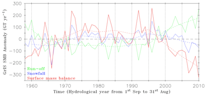
Comparing the Melt Index to sea ice extents measurements does not take the other variable into consideration. For sea ice, wind direction and strength and ocean temperature plays a significant role in how much ice volume actually exists. It's the ice volume that must be melted, not the ice area. With Greenland ice melt/loss, a simple area ratio only tells us the change in the amount of are subject to melt compared to the average for the period of record. No consideration is given to how hot it was when the melt area was above freezing, what the cloud cover was, if snow was present or only bare ice, or how fast the wind was blowing; all of which have an impact on ice melt and sublimation.
Like the publicly perceived controversy over Arctic sea ice decline, the rest of the story of Greenland 's ice shows things a little different than the more simplistic tools. For example, other evaluations of the melt in Greenland this year showed runoff, surface mass balance, albedo and bare ice exposure were approximately equal to last year's record levels.
Tedesco et al., Year 2011 Greenland melting remains well above the (1979-2010) average, close to record mass loss, Cryosphere Today online publication, http://greenland2011.cryocity.org/
Box, Arctic Report Card: Update 2010, NSIDC, http://www.arctic.noaa.gov/reportcard/greenland.html
October 26, 2011 Greenland Melt 2010 New Record
Tedesco et al., The role of albedo and accumulation in the 2010 melt record in Greenland, Environmental Research Letters, January 21, 2011
October 23, 2011 "Humankind May Not Survive" says Novel Laureate Yuan Tseh Lee GLOBAL warming poses the greatest threat today, and unless changes happen in about a decade, humankind may not survive, a Nobel laureate said during a conference in Manila on Monday. “The thing I worry about the most is the global-warming trend,” said Dr. Yuan Tseh Lee, who was awarded the Nobel Prize in Chemistry in 1986 and is now president of the International Council of Scientific Unions. The Taiwanese professor was the keynote speaker at the opening ceremony of the international conference “Ethics in Science and Technology” at the University of Santo Tomas.
http://manilatimes.net/index.php/opinion/editorials/9725-mankind-running-out-of-time-nobel-laureate
October 18, 2011 High Arctic Lakes Disappearing Sixteen thousand lakes in the far northern Arctic have disappeared between 2000 and 2009. Considering there are 1.2 to 1.3 million lakes in this region, the number is not extreme, but the trend is very important. Even more important is the rest of the story. The paper's abstract states: "Previous local to regional scale studies have shown a considerable reduction in the size of lakes in this region. (in North America between 50 and 70 degrees north.) The subsequent exposure of carbon- and methane-rich sediments and the direct changes in surface albedo feed back into the drivers of regional and global climate change. Understanding and quantifying changes in the Arctic is a critical component of climate modeling due to the cooling effect of the Arctic on the global climate."
We know that the Arctic has warmed three times more than the rest of the world, and that lake sediments contain comparable amounts of carbon to forests. In the south, slight increases in lakes size are overwhelmed by the larger losses in the north. In the south the growing lakes are caused by permafrost melt, but permafrost melt is not yet widespread in the far north. Growing lakes are caused by permafrost melt, but the authors say that permafrost melt in the far northern region is not a big deal yet. The overall amount of change between 2000 and 2009 is 22,010 km2 surface area gain and 28,697 km2 loss.
Also, during this study period, the area of this study generally received higher than average rainfall. So what in the world is going on? It's all about warming. Two things happen with warming. One is that warmer temperatures increase evaporation. one degree of warming increases atmospheric moisture content by 4 percent. This may not sound like much, but some areas in the Arctic have warmed 7 to 10 degrees. Considering the relationship between temperature and evaporation to be linear (close enough at these levels) this is a 30 or 40 percent increase in atmospheric moisture.
The other thing that happens is a warmer climate
 results
in fewer days of snow or ice cover. When lakes are frozen, their evaporation
is reduced almost to zero, so an increase in ice free days yields a
tremendous amount of additional evaporation potential. These things
are both feedbacks. Climate change has a lot of feedbacks and
feedbacks often are non-linear. this means that the rate of change gets
larger as the change progresses farther.
results
in fewer days of snow or ice cover. When lakes are frozen, their evaporation
is reduced almost to zero, so an increase in ice free days yields a
tremendous amount of additional evaporation potential. These things
are both feedbacks. Climate change has a lot of feedbacks and
feedbacks often are non-linear. this means that the rate of change gets
larger as the change progresses farther.
The paper concludes: "The current results suggest there may be far more change occurring in the tundra farther north that is not currently accounted for. It is likely that this decrease in surface area of inland water is already impacting ecosystem functioning in high northern latitudes of North America and creates multiple feedbacks into the climatic system through modification of surface albedo, evapotranspiration, and carbon cycling."
Abstract: http://www.agu.org/pubs/crossref/pip/2011GL049427.shtml
Article: http://www.newscientist.com/article/mg21228345.000-strange-case-of-the-vanishing-arctic-lakes.html
October 20, 2011 Climate change will alter forests in the U.S. Southeast, ecologist says But she can't really tell because drought killed half of her study trees.
http://onlineathens.com/local-news/2011-10-20/climate-change-will-alter-forests-ecologist-says
October 15, 2011 Governor Perry's State Environmental
Commission Appointees Censor Climate Science. A 2010 report on the
Environmental health and future of Galveston Bay, has been further delayed
because the authors refuse to have their names associated with the report
after it was censored of climate change related information by the Governor
Perry appointed Texas Commission on Environmental Quality.
The
Governor appoints the three person commission who then selects upper level
management. The report, a ten year review of Galveston Bay research, had been approved
by staff. Upper level management censored the report.
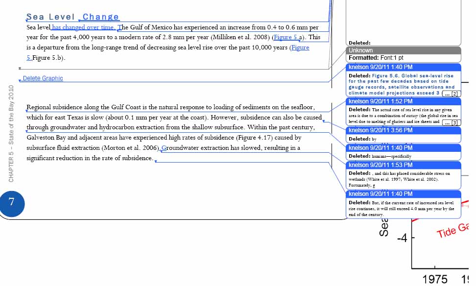
The scientists who wrote the report new that highly volatile topics such as climate change should be avoided or minimized with this commission, so they automatically wrote around things like IPCC and human-caused warming. This was a bit difficult when the main tenet of the report is that sea level in Galveston Bay is rising at 3 mm per year, or 6 times greater than the long term average. All of the information in the report was taken from previously published peer reviewed work. Very few of the important details though, appeared in the final version.
Perry's people made 72 deletions in all, some of them were not climate related but related to subsidence caused by oil and gas extraction around Galveston Bay. I wonder what that was all about (protecting the oil industry of course.) Several were related to dam building and sediment starvation. This is well established science -- like fifty years or more, truthfully, what were they trying to accomplish with this censor move?
All three scientists associated with the report have refused to have their names associated with the censored report. The Houston Chronicle said that TCEQ spokeswoman Andrea Morrow gave no reason for the deletions in an e-mail response, saying only that the agency disagreed with information in the article.
Hey, this is Texas, I live here and I have been paying attention to this sort of thing for decades. It is ridiculous, it permeates all conservative politics here and it went national in 2000. As Molly Ivins called him "Shrub" made a mess out of this country and it is becoming obvious that because of him, impacts to climate change are far more than messy. To have another Texas Governor as president (tagged Govn'r Goodhair by the late great Ms. Ivins), even worse than Shrub, would lead to climate change mitigation stalling that would push us far out into the risk zone for irreversible tipping points.
Houston Chronicle: http://www.chron.com/news/houston-texas/article/Professor-says-state-agency-censored-article-2212118.php
Mother Jones: http://motherjones.com/politics/2011/10/perry-officials-censored-climate-report
October 13, 2011 The Time Has Come - All of These Ultra Extreme Weather Events ARE Caused by Climate Change It is about time that the climate scientists have decided that it is appropriate to start blaming all of these ultra extreme weather events on climate change. The message is finally beginning to gain broad acceptance in academic circles. At the Annual American Meteorological Society meeting this year, Kevin Trenberth, one of a handful of the most important climate scientists in the world, has come out publicly advocating that; Yes Indeed, all of this crazy extreme weather we have been seeing around the globe is absolutely caused by climate change.
I have been telling folks for six or seven years now (Remember Katrina?) that
on moral grounds, it is a certainty
that all of these uber extreme weather events are caused by climate change.
The standard line "We can't tell if any one individual weather event is caused
by climate change" is receding from use in discussions by climate
scientists. The reasoning; the convincingly strong circumstantial
evidence of a substantially increasing number of unprecedented weather events. Combine
this with consistent projections for over twenty years telling us that the weather
would become more extreme with climate warming and one can make the leap and
associate these things with climate change.
The reason that climate scientists could not previously say with exact certainty whether or not any one event was caused by climate change was the lack of data. Science is a statistical game. One has to have lots of data to be sure of their findings. This is why, in the 1980s, climate scientists were unsure whether or not climate change was real and or caused by humans. They said that it would be 20 or 30 years before we could collect enough data to know for sure. Now it has been 20 or 30 years and we have that data and we know for sure and climate scientists are saying so.
But we still have this problem with all of the snowpocalypses and snowmegeddons, unprecedented droughts, fires and floods, and uhm, all those hurricanes in 2005. But the tide is turning. There are two things going on here. Enough data is accumulating to give some confidence to the suggestion. But maybe what is more profound, more and more scientists are saying that circumstantial evidence is enough. It's good enough to send a murderer to the death chamber for goodness sakes, shouldn't it be good enough to help us define policy and get something down about the grave risks of uncontrolled climate change?
Kevin Trenberth is head of the Climate Analysis Section at the USA National Center for Atmospheric Research. He was a lead author of the 2001 and 2007 IPCC Scientific Assessment of Climate Change (see IPCC Fourth Assessment Report) and serves on the Scientific Steering Group for the Climate Variability and Predictability (CLIVAR) program. In addition, he serves on the Joint Scientific Committee of the World Climate Research Programme, and has made significant contributions to research into El Niño-Southern Oscillation. He was made an Honorary Fellow of the Royal Society of New Zealand in 2000, awarded the Jule G. Charney Award from the American Meteorological Society and the NCAR Distinguished Achievement Award in 2003. (Wikipedia October 17, 2011)
Trenberth says that our warming atmosphere warms the oceans. Warmer water and a warmer atmosphere contribute to evaporation. With more moisture in the air, storms are bigger. At the same time, the increased intensity of storms influences weather adjacent to the storm. Atmospheric circulations grow stronger. The jet stream is enhanced. All of these things not only increase the amount of extreme weather like storms, tornadoes, hurricanes and floods, but they increases the intensity of snowstorms and droughts and wind storms and floods and all. Think of a warmer planet creating more extreme weather similarly to what happens when you stir up a fire ant bed with a stick. No, really. A little energy added to that ant mound allows an explosive feedback reaction to occur in a very similar way to adding a little energy to our atmosphere.
Specifically, ocean waters are about one degree warmer F than in the 1970s. This means that the air is four percent wetter than before. The extra heat then, like a pot of water on the stove -- the warmer it gets the more convection there is in the pot -- creates more convection in the atmosphere. So we get a double whammy. This is what the models predicted and this is what we got. It's simple physics and finally, climate scientists are backing away form their standard statistical evaluation procedures and recognizing that what they have been predicting for over two decades (actually three now) has finally happened.
The unusually wet monsoon in Pakistan in 2010 that created so much unprecedented flooding blocked moisture from getting to central Russia where we would up having, what a Wunderground meteorologist called a 15,000 year heat wave. The enhanced Beaufort High north of Canada in the Arctic Ocean energized the jet stream and pushed all those snowtastrophes down into the U.S. Northeast and northern Europe for the last several years. The examples are everywhere. The European heat wave that killed 30,000 in 2003. That extraordinary Hurricane year in 2005. The never before seen flooding in the Midwest this year and all the tornadoes. And right here in my backyard, a totally unprecedented heat wave capping a third drought in six years and resulting in the lowest 12-month rainfall ever recorded. These weather extremes in Texas this year contributed to the destruction of thousands of homes from wildfire and $5.2 billion in drought damages all together; so far.
On top of this we have had ten extreme weather disasters in the U.S. that topped a billion dollars each this year. This is three times the average where we have seen 110 billion dollar events (adjusted) in the last 31 years. The old yearly record was nine set in 2008 and 8 in 1998. The next ranked years were six billion dollar events in 2006 and 2009 and five in 2005 and 2007. Over half of the billion dollar weather events of the last 31 years have happened since the turn of the century. The total losses this year are $49 billion (so far.) Here's the list from the National Climatic Data Center (see also August 8, 2011):
1. Upper Midwest flooding, summer: Melting of an above-average snowpack across the northern Rocky Mountains, combined with above-average precipitation, caused the Missouri and Souris rivers to swell beyond their banks across the Upper Midwest. An estimated 11,000 people were forced to evacuate Minot, N.D., due to the record high level of the Souris River. Numerous levees were breached along the Missouri River, flooding thousands of acres of farmland. The flooding, which is ongoing, has caused more than $2 billion in damages.
2. Mississippi River flooding, spring-summer: Persistent rainfall (nearly triple the normal precipitation amounts in the Ohio Valley), combined with melting snowpack, caused historical flooding along the Mississippi River and its tributaries. The region suffered $2 billion to $4 billion in losses. At least two people died.
3. Southern Plains/Southwest drought, heat wave and wildfires, spring-summer: Drought, heat waves, and wildfires scorched through Texas, Oklahoma, New Mexico, Arizona, southern Kansas, western Arkansas and Louisiana this year. In Texas and Oklahoma, respectively, 75 percent and 63 percent of range and pasture conditions were classified as "very poor" as of mid-August. Wildfire fighting costs for the region are about $1 million per day. Well over $5 billion in damage has been done so far, with over 2,000 homes and structures lost.
4. Midwest/Southeast tornadoes, May 22-27: Central and southern states saw approximately 180 twisters and 177 deaths within a week . A tornado rated EF-5 on the tornado damage scale struck Joplin, Mo., resulting in at least 141 deaths, making it the deadliest single tornado to strike the United States since modern tornado record keeping began in 1950. The total losses were greater than $7 billion.
5. Southeast/Ohio Valley/Midwest tornadoes, April 25-30: This outbreak of tornadoes over central and southern states led to 327 deaths. Of those fatalities, 240 occurred in Alabama. The deadliest of the estimated 305 tornadoes in the outbreak was an EF-5 that hit northern Alabama, killing 78 people. Several major metropolitan areas were directly affected by strong tornadoes, including Tuscaloosa, Birmingham and Huntsville, Ala., and Chattanooga, Tenn. Total losses exceeded $9 billion.
6. Midwest/Southeast tornadoes, April 14-16: An outbreak over central and southern states produced an estimated 160 tornadoes. Despite the large overall number of tornadoes, few were classified as intense, with just 14 EF-3 --and no EF-4 or EF-5 -- tornadoes identified. Total losses were greater than $2 billion. Thirty-eight people died, 22 of them in North Carolina.
7. Southeast/Midwest tornadoes, April 8-11: An outbreak of tornadoes over central and southern states saw an estimated 59 tornadoes. Total losses were greater than $2.2 billion.
8.` Midwest/Southeast tornadoes, April 4-5: An outbreak of tornadoes over central and southern states saw an estimated 46 tornadoes. Total losses were greater than $2.3 billion. Nine people died.
9. Groundhog Day blizzard, Jan 29-Feb 3: A large winter storm hit many central, eastern and northeastern states. Chicago was brought to a virtual standstill when 1 to 2 feet (0.3 to 0.6 meters) of snow fell across the city. Total losses were greater than $2 billion. The snowstorm killed 36 people.
10. Hurricane Irene, August 20-29, 2011 Minimal Category 1 hurricane makes landfall over coastal NC and moved northward along the Mid-Atlantic Coast (NC, VA, MD, NJ, NY, CT, RI, MA, VT) causing torrential rainfall and flooding across the Northeast. Wind damage in coastal NC, VA, and MD was moderate with considerable damage resulting from falling trees and power lines, while flooding caused extensive flood damage across NJ, NY, and VT. Over seven million homes and businesses lost power during the storm. Numerous tornadoes were also reported in several states further adding to the damage. Over $10.0 billion in damages/costs; at least 45 deaths
Geologic Society of America press release: http://www.geosociety.org/news/pr/11-69.htm
Billion Dollar U.S. Weather/climate Disasters, National Climatic
Data Center,
http://www.ncdc.noaa.gov/oa/reports/billionz.html
October 9, 2011 RAIN ! ! ! We had 2.5 inches at the airport and an inch an a half in Oak Hill! The last time we had more than a nickel's worth of rain in Oak Hill was the middle of June -- four months ago!
October 8, 2011 Welcome to Climate Change -- This is an article that I wrote for the Sierra Club Central Texas Chapter newsletter; the Austin Sierran.
Welcome to Climate Change
If this is not climate change, then
this is exactly what climate change will be in as little as a decade. What
has been happening in Texas, with these unprecedented (in time frames that
matter) droughts and wildfires, is exactly what the climate scientists have
been warning us about for over twenty years. We have been building up to
this point since about the turn of the century, and now ecosystems have
tipped over the edge. Climate feedbacks have kicked in hard.
A half
billion trees may have died already and that many more may die in the next
five years from the damage that has already been done. These are the trees
that have died in the drought, not the fires. The first of this series of
drought in 2005/6 was just classified as extreme. The last two have been one
category worse than extreme - the exceptional category. The last 12 months
were drier than the worst 12 months of the great drought of the 1950s.
Worse, it’s hotter now. Heat increases evaporation disproportionately
intensifying the effects of drought. In other words, the same drought is
much worse if it is only a little hotter.
Trees started dying from
the drought in 2005/6. The die-off became really bad in 2009 when broad
swaths of the countryside west and east of Austin turned brown and failed to
turn green again in the spring. Trees damaged from just one of these
droughts can remain weak and susceptible to disease or dieback for a decade
or more after the drought. The little root hairs on tree roots that soak up
water take a long time to grow back. West of Fredericksburg for 100 miles to
the edge of the forest the desert has arrived. Fully half of the trees in
that region are defoliated from drought (only a small amount is from oak
wilt.) The fate of many of these trees is sealed, but there is hope that
rain will return fast enough to make a difference for some.
The total number of fires in Texas since November 2010 (through September
20) is 22,790 totaling 3,759,331 acres. This exceeds the previous record of
2.1 million acres, set in just 2005/6, by 80 percent. We almost doubled the
last record, set just five years ago. Thirty-three percent of U.S. wildland
fires this year have been in Texas. The number of Texas fires this year is
61 percent greater (so far) than the 10-year national average for the entire
United States. Six of the ten largest wildfires in Texas history have
occurred in 2011.
Sure, there have been bigger droughts and bigger
fires in the early 1900s or the 1800s or the 1300 hundreds or 3,000 year BC,
but our complicated society did not evolve back then. We do not have
the water to support our region today. This is why we have water use
restriction in effect now, and last summer and every summer since the turn
of the 21st century.
Do those bigger droughts in past matter?
Not one bit unless one uses that knowledge to understand the droughts and
other really serious impacts allowed by drought that will happen right here,
starting now. This is exactly what our climate scientists have been doing
for these last twenty or thirty years that they have been warning us that
these things would become the normal on a warmer planet.
In June
2009, the U.S. Global Change Research Program, founded by Ronald Reagan,
published a report that tells us that by 2080, Austin will see an average of
90 to 120 days of 100 degree weather every year -- ten times more than
today’s average of 12 days per year. And this evaluation was done based on
one of the middle of the road scenarios. We are currently smack-dab in the
middle of the worst-case scenario of the climate models. FYI: the Sonoran
Desert Research Station in Arizona, the one with the giant Saguaro cactus,
has an average of 87 days every year where the temperature tops 100 degrees.
A paper in Geophysical Research Letters in July 2010 (Diffenbaugh and
Ashfaq) tells us that climate conditions will continue to rapidly worsen in
the interior of North America and especially the West. The worsening will be
so rapid that the decade 2020 to 2029 will include three to five droughts as
bad as or worse than the worst drought that we have seen since 1951 (like
what we just had.)
A report out of the National Climatic Data Center
in February 2011 (Dia) tells us that beginning in just 19 years (2030) Dust
Bowl conditions will be the average climate condition across much of the
interior of the U.S. By 2060, much of the interior of the nation will be two
to three times as bad as the Dust Bowl with some areas four to five times
more extreme than the Dust Bowl.
If you think I am trying to scare
you, you are wrong. Projecting the second year of this current drought
similar to or worse than what we have just experienced, with a growing La
Nina and Lake Travis at 38 percent of capacity right now -- that’s scary.
Lake Travis was 100 percent full just 16 months ago. Travis is at its third
lowest level or as low as it has been in 47 years. The only reason that it
is not the lowest level ever though, is that prior to 47 years ago Lake
Travis was used extensively for hydropower generation. This has not been
done since that time.
What are we going to do? Getting through
the drought and fires is very important. This situation is extremely
dangerous. Trim your trees, police your underbrush, move that firewood pile
away from the house, get your valuables together in a “go-bag.” The threat
of suburban and even urban firestorms, as demonstrated in Bastrop last month
and accidentally predicted, to the weekend -- by our State Climatologist --
is real and it is not likely to get better for another year. The future is
here now. We must change the evolution of our society fast, before we ruin
completely out of water. Prehistory tells us that these abrupt climate
changes can be exceedingly violent.
This is no longer business as
usual. Water use restrictions will not meet this challenge alone. We must
act now to convince our leaders that this is not just another in a long
string of extraordinary weather events that we cannot yet blame on climate
change. If we do not immediately change our habits and lifestyles, we will
run out of water. Our forests are already dying because they have run out of
water.
Now: if you have read this far, you deserve a break. The
bigger picture is a little more comforting than what is happening in our
region today. I just finished another book by Dr. Richard Alley, one of the
pivotal climate scientists of our time. Professor Alley tells us in Earth,
the Operators Manual, that fixing our climate will be no more difficult or
costly than creating our society’s wastewater collection and treatment
infrastructure. Cleaning up human waste took about 100 years and so will
fixing our climate. It took about 1 percent of global GDP to install our
wastewater infrastructure and this is close enough to the latest economic
analyses of dealing with climate change to make the comparison valid.
But like our climate scientists have been warning us for twenty years or
more now, if we do not act now, the costs and impacts will only become
greater.
October 7, 2011 Unprecedented Arctic Ozone Destruction: The Antarctic ozone hole was caused by man-made emissions of "ozone depleting chemicals." When we realized that Earth was in grave danger because of the great threat to our ozone layer that these emissions presented, we the people of this planet agreed to do something about it. A treaty was formed called the Montreal Protocol. It was ratified in 1989.
The media these days say that atmospheric scientists say that we have likely stabilized our
ozone troubles and we can expect to see a slow improvements over the next
couple of decades. But this is not really what the climate science tells
us. Yes, we have stabilized emissions of ozone depleting chemicals, but the
simple facts of climate science tell us that fewer ozone depleting chemicals
will have greater impacts to the ozone layer as the planet continues to
warm.
The ozone depleting chemical reaction happens at the coldest time of the
year in the coldest place on the planet. The colder it is the stronger the
reaction. The reason that it has only happened in Antarctica, or at least
that the ozone depletion at the North Pole has always paled in comparison to
the South Pole, is that it simply does not get as cold at the North Pole
than it does in the South.
So if Earth is warming, why are we even worried about ozone depletion and why are we having an ozone hole form over the
Arctic where it is not as cold as it the Antarctic?
There was some conflict about this process back around the turn of the
century because it did not appear that the upper atmosphere was cooling.
We have discovered a few errors in our data since then -- deteriorating satellite
orbits mostly -- and after correcting for these errors we now see that the
stratosphere is indeed cooling, just like the models said they would. (The
climate change denying community continues to march around the old papers
claiming a conflict though. Science is not really a high point of theirs.) The answer has to do with basic climate science. The way that greenhouse gases warm
the planet is they trap heat. They trap heat in the troposphere, where most of
the greenhouse gases can be found. The troposphere is the "active" layer of
our
atmosphere, or the layer where all of our weather can be found. The troposphere
is that part of our sky below about 58,000 feet, or 35,000 to 40,000 feet at the
poles.
You
can actually see the bottom of the stratosphere sometimes when big
thunderstorms form. The typical anvil head that forms on top of big storms
is where the upward convection of the storm is stopped against the bottom of
the stratosphere.
The "ozone" layer then is way up there in the stratosphere. Because extra
heat is being trapped in the troposphere, that heat does not make it up to the
stratosphere and the stratosphere cools. This is normal climate science, it has
been in the science discussion for decades and the models predict it famously.
So, hey Republicans, here is another way that global warming actually makes it
colder!
The answer has to do with basic climate science. The way that greenhouse gases warm
the planet is they trap heat. They trap heat in the troposphere, where most of
the greenhouse gases can be found. The troposphere is the "active" layer of
our
atmosphere, or the layer where all of our weather can be found. The troposphere
is that part of our sky below about 58,000 feet, or 35,000 to 40,000 feet at the
poles.
You
can actually see the bottom of the stratosphere sometimes when big
thunderstorms form. The typical anvil head that forms on top of big storms
is where the upward convection of the storm is stopped against the bottom of
the stratosphere.
The "ozone" layer then is way up there in the stratosphere. Because extra
heat is being trapped in the troposphere, that heat does not make it up to the
stratosphere and the stratosphere cools. This is normal climate science, it has
been in the science discussion for decades and the models predict it famously.
So, hey Republicans, here is another way that global warming actually makes it
colder!
So on a warming planet, as the stratosphere gets colder, conditions that favor ozone depletion will become more frequent. It's this polar stratospheric cloud thing (PSC) that does the damage. PSCs actually contain a lot of nitric acid (yes, we have nitric acid clouds on Earth) and it is this acid that combines with ozone, and sunlight, to destroy the ozone. The ozone destruction process is a photochemical reaction. Pretty crazy stuff really, but it happens somewhere up there above 50,000 feet in the stratosphere, in a place that is cooling because of global warming.
This Arctic Ozone hole
has happened before and its occurrence is getting more frequent. This is easy to
see in the graph discussing PSCs above Sodankyla Finland. As our planet
has warmed, the number of days with favorable conditions (really cold) for PSC
nitric acid clouds to form has been steadily getting greater. So, why
haven't we seen a similar thing happening at the South Pole? This is because the
Arctic is warming much faster than the Antarctic. The Antarctic is warming, but
slowly. The reason is that the Antarctic is surrounded by a cold ocean, with a
circular current that cuts off warmer waters in the north from reaching anywhere
near the continent. The Arctic is surrounded by land that readily adds heat to
the environment.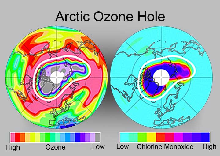
The previous Arctic ozone holes were nowhere near the size of the one last spring. It was not as big as the Antarctic ozone hole, the physical characteristics of the Arctic Polar Vortex will prevent that from happening, but curiously, there is more ozone in the Arctic than the Antarctic and as much ozone was destroyed this year in the Arctic as is normally destroyed in the Antarctic ozone hole every year.
The Arctic ozone hole this year saw an 80 percent depletion of ozone, 20 percent larger than the previous largest Arctic ozone hole in 2000. We normally see ozone destruction in the Arctic spring, but nowhere near what we saw this year.
Journalists reports discuss this record Arctic ozone hole being caused by extremely low surface temperatures. But ozone depletion occurs in the stratosphere. These reports are likely just from confused reporters. What we have seen happening in the Antarctic is that the Antarctic Vortex has strengthened creating conditions in the wintertime that increase Antarctic sea ice with higher winds dismantling already formed sea ice and blowing it out to sea. This allows more sea ice to form and effectively creates a larger coverage area of thinner ice. It is likely that these same physical things are happening in the Arctic. The low surface temperatures are just a reflection of the low stratospheric temperatures. But the rest of the weather reporting system is not reporting extreme cold, instead actual record warmth is what is happening. This fits well with standard climate science and cooling in the stratosphere, so I'll go with confused reporters.
Another reason I will stick with "confused reporters" is that Arctic sea ice virtually tied the big 2007 record coverage, but 2011 saw a record low Arctic sea ice volume, as thick ice continues to melt faster than it is replaced.
O.K. - the leap: what happens with global warming? The stratosphere cools. What happens when the stratosphere cools? The ozone depleting chemical reaction increases. What happens as our climate continues to warm?
Incidentally, the Antarctic ozone hole never really started shrinking after it grew so rapidly because of ozone depleting chemicals. This was not really what the atmospheric scientists expected.
World Meteorological Association Arctic Ozone Bulletin 2005/6: http://www.wmo.int/pages/prog/arep/gaw/ozone/documents/arctic-bulletin-2005-2006.pdf
http://climate.nasa.gov/news/index.cfm?FuseAction=ShowNews&NewsID=596&Print=Yes
http://www.nasa.gov/home/hqnews/2011/oct/HQ_11-329_Arctic_Ozone_Loss.html
October 5, 2011 Will Texas Run Out of Water in 2012?
October 4, 2011 Summer 2011 Second Lowest Arctic Sea Ice Extents since 2007, Record Lowest Sea Ice Volume Multi-year Ice Continues to Decline Arctic sea ice near record lows The summer sea ice melt season has ended in the Arctic. Arctic sea ice extent reached its low for the year, the second lowest in the satellite record, on September 9. The minimum extent was only slightly above 2007, the record low year, even though weather conditions this year were not as conducive to ice loss as in 2007. Both the Northwest Passage and the Northern Sea Route were open for a period during September.
October 1, 2011 Texas State Climatologist, Epic Drought, 90 days at 100 or above
The State Climatologist is little different from most climate scientists. I have one thing to say about climate scientists and State Climatologists: They can not say what they see coming, only what their data tell them. The conservative nature of science demands that scientific proclamation be robustly supported by long term data. This makes it difficult to identify a fundamental shift in data until long after that fundamental shift has occurred. Like Climate scientists told us in the 1980s, that it would be 20 or 30 years before they had enough data to tell if climate change was real and if it was caused by man -- we have the data now, it is real, it is caused by man and it started 20 or 30 years ago. This is only good scientific practice and I would not have it any other way. But we have a problem here with any number of ongoing extraordinary climate change impacts that are just not getting anyone's attention. And we have a problem with these irreversible tipping points that are lurking, or even have already begun. Are we supposed to wait another 20 or 30 years to find out if we have irreversible changed our climate?
Right now I want to talk about Texas and this totally unprecedented drought
and series of wildfires that have menaced this state for the last half dozen
years. We beat the 100 degree day record by at least 30 percent this
year. Statistically, this means something extraordinary has happened. Yet,
few acknowledge anything more than La Nina and how we will get back to
"normal" as soon as La Nina goes away. This statistical anomaly shows that
we have seen a fundamentally shift in our weather pattern. For twenty years
climate scientists have been warning us that this would happen. Now that it
has happened, nobody noticed!
 There
is much more to this story as I will tell.
There
is much more to this story as I will tell.
The "so-called" record number of 100 degree days for Austin, 69 set in 1925 and 66 set in 1923, are very likely in error. These years were certainly hot, but surrounding weather stations from Del Rio to Dallas come no where near these levels. Let me back up a little bit. About the turn of the 21st century, our climate began an abrupt change. This is evident in regional areas across the globe including both polar regions. The American West is warming at twice the rate of the global average. The Arctic is warming at 4 to 5 times the global average.
The unprecedented snowstorms in the U.S. Northeast and parts of Europe in the last two or three years, the tremendous winter in China three years ago are other regional scale changes of unprecedented nature that are far beyond the known records. Moscow's heat wave last year was, as Weather Underground says, possibly a one in 15,000 year event. And what about the 100-year drought in the Amazon in 2005 and the following drought in 2010 that was four times worse than the 2005 drought -- that killed two billion trees or more? There are so many more -- this is what my entire platform is built upon - climate changes happening now... In reality though, these type of climate change induced events have no statistical analogy because they are not statistically a part of the historic data set.
The state climatologist calls this year an outlier because it was 21 days more than the previous record. What do scientists do with outliers? They discard them. They are called outliers for a reason. This reason is that they are untrustworthy for some reason. Either there were errors in the collection or measurement of the data, or something fundamental happened to create new unique conditions that are "fundamentally" different from the rest of the data. Either way - the outlier does not belong to the same data set so it is thrown out. The outlier is not used in calculations involving that data. Because of the fundamental difference between the outlier and the rest of the data, the outlier contaminates the original data set and makes the results of any analysis regarding that dataset invalid, or at least untrustworthy. So the outlier is discarded.
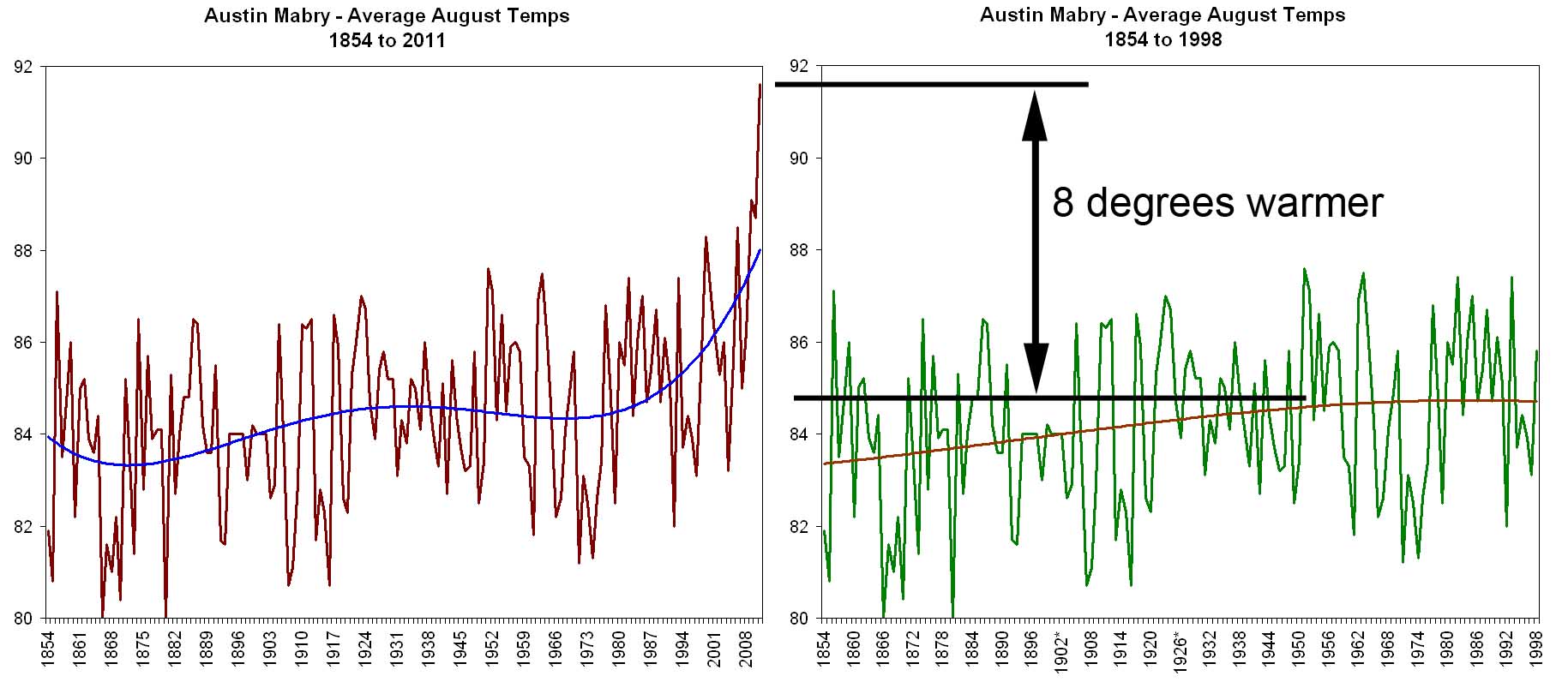 Texas
is in one of those areas that is changing most rapidly. If we look at 100
degree days before the year 2000, and not include 1923 and 1925 in this
evaluation, we see that the most 100 degree days we ever had before was 40.
The 1923 and 1925 records were 65 and 73 percent greater than the 3rd ranked
most extreme temperatures Texas has endured in the instrument record.
Texas
is in one of those areas that is changing most rapidly. If we look at 100
degree days before the year 2000, and not include 1923 and 1925 in this
evaluation, we see that the most 100 degree days we ever had before was 40.
The 1923 and 1925 records were 65 and 73 percent greater than the 3rd ranked
most extreme temperatures Texas has endured in the instrument record.
So if the State Climatologist says the 2011 record of 100 degree temps is an outlier, and the 21 days that the 2011 record exceeded the previous record of 69 is 30 percent greater than the previous record, why are the 1923 and 1925 records not outliers too? Prior to 2000, for 75 and 77 years, the 1923 and 1925 records were at least 66 and 73 percent greater than the third ranked record. This disparity is twice the difference that the State Climatologists says created an outlier in 2011.
For nearly 40 years, from 1925 to 1963, the top two records were double the
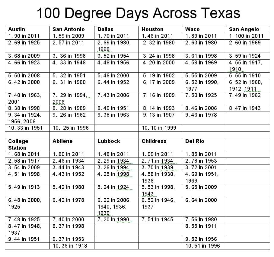 3rd ranked record. Then, it took almost another 40 years for that 1963
record to be broken. This is absolutely a sign that something is wrong with
those records. Any scientists or statistician can
tell that those two records are for some reason quite unreasonable. Do I give
most scientists too much credit? Likely not. Could it be that meteorologists
are not as proficient with statistics as they could be or is there another
reason for this "mistake"? The
1923 and 1925 records should have been discarded decades, if not generations
ago.
3rd ranked record. Then, it took almost another 40 years for that 1963
record to be broken. This is absolutely a sign that something is wrong with
those records. Any scientists or statistician can
tell that those two records are for some reason quite unreasonable. Do I give
most scientists too much credit? Likely not. Could it be that meteorologists
are not as proficient with statistics as they could be or is there another
reason for this "mistake"? The
1923 and 1925 records should have been discarded decades, if not generations
ago.
We have broken the 100 degree day record five times since 1998, including this year. In the 1990s we set one of the top ten records (That was the 1998 record); the 1980s we set one; the 70s - none; the 60s one; the 50s -- only one. This year's record is 125 percent great than what is most likely the true 100 degree day record for Austin -- prior to Earth transitioning into this abrupt climate change period that began shortly before the year 2000.
More evidence casting doubt on the 1923 and 1925 records is that 1922, 1923, 1925 and 1926 are incomplete -- they have missing data. These are the last years in the record to have missing data and there were no years for the previous 18 years that had missing data. Prior to 1903, years with missing data were much more common than after 1903 -- except for that period 1922 to 1926. Something is wrong with those records.
 Beyond
that entire period being questionable because of missing data, there are the
rainfall records that do not appear to be extreme enough to have created the
1923 and 1925 100 degree day records. Rainfall is an excellent indicator of extreme heat. The hotter it is, the
greater is the evaporation and the drier things get, allowing the
temperature to become even hotter because moisture in the air prevents the
temperature from going even higher. Looking at the chart "Mabry Average
Annual Rainfall", I have compared the rainfall records for three
periods this
century with extreme drought: 1919 though 1928, 1948 through1957 and 2002
through 2011.
Beyond
that entire period being questionable because of missing data, there are the
rainfall records that do not appear to be extreme enough to have created the
1923 and 1925 100 degree day records. Rainfall is an excellent indicator of extreme heat. The hotter it is, the
greater is the evaporation and the drier things get, allowing the
temperature to become even hotter because moisture in the air prevents the
temperature from going even higher. Looking at the chart "Mabry Average
Annual Rainfall", I have compared the rainfall records for three
periods this
century with extreme drought: 1919 though 1928, 1948 through1957 and 2002
through 2011.
Since last October, we have had 23 inch less rain than we are supposed to have. In other words, we have received a little over 11 inches of rain in the last 12 months. This has been the driest 12 month period ever recorded. The average rainfall in Austin is around 32.5 or 33.5 inches, depending on which 30-year record period one is looking at. Every ten years, the National Weather Service updates the average weather statistic data (temperature, rainfall, etc.) to reflect the most recent 30 year period. This is why the average annual rainfall differs slightly.
 Rainfall
makes a huge difference with summer temperatures. In 2008 we had 22 inches of
rain in May, June and July. That summer we only experienced three days of
100 degree heat in Austin. The simple reason was that there was so much
water in the ground, so many extra leaves on the trees and extra grass on
the ground, so much water in our lakes and rivers, that the humidity stayed
high almost all summer long. As a consequence we only had three 100 degree
days that year.
Rainfall
makes a huge difference with summer temperatures. In 2008 we had 22 inches of
rain in May, June and July. That summer we only experienced three days of
100 degree heat in Austin. The simple reason was that there was so much
water in the ground, so many extra leaves on the trees and extra grass on
the ground, so much water in our lakes and rivers, that the humidity stayed
high almost all summer long. As a consequence we only had three 100 degree
days that year.
To show how far off 1923 and 1925 are I have plotted the12-month running average rainfall for the three hottest/driest periods in the last 100 years. I used the 12-month running average for two reasons. The first is that an average smoothes out a lot of the chaos inherent in weather data. Using average numbers helps us to see trends and other things in data that mean something. It is simply difficult to see underlying information with wildly chaotic data. The other reason I used the 12-month running average is that we just broke the all time minimum rainfall record for a 12-month period. This was set in the great drought of the 1950s.
If 1923 and 1925 followed the normal laws of physics, and the 100 degree day records those years were valid, the rainfall during those periods would have been the lowest up until this year. But like data sometimes are, the results here are puzzling. The blue line in the plot shows rainfall during the 1919 to 1928 period. 1925 does show rainfall low enough to support extremely hot temperatures, but what happened in 1923? The average rainfall during 1923 was 51 inches. There is nothing exceptional about summer rainfall either. It was a little low, but July saw 150% of normal rainfall.
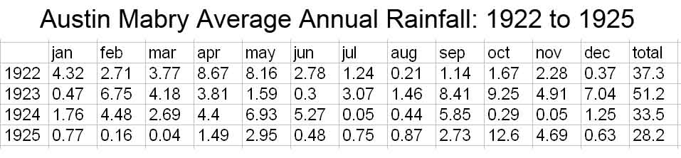
To summarize why the 1923 and 1925 records for 100 degree days are not valid: For 75 years, those two records were 67% and 73% beyond the 3rd ranked record. In the last 13 years, since our climate has started changing rapidly, the third ranked record has been surpassed five times. Of the top 10 records for 100 degree temperatures for nine of the major metro areas surrounding Austin, of the 90 records involved, only five were set in the 1920s--two of these were the 1923 and 1925 records in Austin. The 1920s records are full of missing data too. Finally, the State Climatologists says that 2011 is an outlier when it was only 30% greater than the previous record (the 1925 record of 69 days.) The 1969 record was 73% greater than the previous record.
Now for the excursion back to climate change reality:
Beginning in 2090, I know this is a long way
 off, but the projection is
sobering -- we will see 90 to 120 days a year, on average, of 100 degree plus
temperatures per year (USGCRP 2009). The Sonoran Desert Research Station, today, averages
87 days of 100 degree plus heat per year. Beginning in 2030 we will see average
conditions very similar to Dust Bowl conditions across much of the nation
(Dia 2011).
In the next ten years in Central Texas, we will see three to five heat waves as hot as, or more
extreme than the hottest period since 1950 (Diffenbaugh
and Ashfaq 2010). Average conditions in Austin are 12 days of 100 degree weather per summer.
For 150 years, up until the year 2000, the extremes were no more than 40
days per summer. This is double or triple (or more) of the average.
off, but the projection is
sobering -- we will see 90 to 120 days a year, on average, of 100 degree plus
temperatures per year (USGCRP 2009). The Sonoran Desert Research Station, today, averages
87 days of 100 degree plus heat per year. Beginning in 2030 we will see average
conditions very similar to Dust Bowl conditions across much of the nation
(Dia 2011).
In the next ten years in Central Texas, we will see three to five heat waves as hot as, or more
extreme than the hottest period since 1950 (Diffenbaugh
and Ashfaq 2010). Average conditions in Austin are 12 days of 100 degree weather per summer.
For 150 years, up until the year 2000, the extremes were no more than 40
days per summer. This is double or triple (or more) of the average.
The 12-month period October 2010 to September 2011 saw only 11.2 inches of rain in Austin. this was an record not seen in history of record keeping. Across half (or more) of Texas, less than ten inches of rain fell during this period.
The next graphic is a lot more scary, but significantly less meaningful.
Even though it less meaningful, it does show that about half of Texas is
20 inches of rain behind normal for the period October 2010 to September
2011. Regardless of how meaningful, being 20 inches behind is a
huge thing if you are a plant or animal living outdoors. Conditions like
this cause virtually all surface water to evaporate. The largest rivers
in Texas have been reduced to a trickle. The Colorado River above Lake
Buchanan stopped flowing. Ponds and tanks across agricultural
lands statewide are dry or nearly so.
Will we run out of water in 2012? Lake Travis is at 38 percent of normal and it appears that we are going back into another moderate (at least) La Nina, meaning that we will likely repeat conditions very similar to last year.
State Climatologist John Nielsen-Gammon http://blog.chron.com/climateabyss/2011/08/texas-drought-a-fingerprint/
Dai, Drought under global warming - a review, Wiley Interdisciplinary Reviews - Climate Change, p 45-65, January-February 2011
Diffenbaugh and Ashfaq, Intensification of hot extremes in the United States, Geophysical Research Letters, July 2010.
Global Climate Change Impacts in the United States, A State of Knowledge Report from the U.S. Global Change Research Program, 2009, page 90
September 5, 2011 The Blob Could Have Devastated Global
Ecologies the Last Time Climate Changed Anywhere Near as Fast as it is
Changing Today This one is stranger than strange.
scientists have long been puzzled by what looked like fungal bodies
that seem to cover many fossils of different kinds from what is called
the end-Permian. This "end-Permian" is how the end of the Permian Epoch
is described. It's also called Permian Triassic Extinction 251 million
years ago when 96 percent of ocean life forms and 70 percent of land
life forms went extinct. This extinction event has been called "The
Mother of All Extinction Events."
These fungi, or "filamentous organic-walled microfossils" were apparently very widespread. They seem to be closely related to current day soil fungal organisms called mycroesia and they were so widespread that the authors suspect that they may have had an influence on the extinction event.
They compare these ancient fungi fossils to modern fungi of the Rhizoctonia complex that that can thrive in both dead and living plant materials. The authors say that "their virulence is normally held in check by the immune system of healthy host organisms, but can accelerate when plants are physiologically weakened, causing root, stem, and foliar diseases of many herbaceous and woody plant species."
Modern Rhizoctonia are widespread opportunistic plant pathogens. They were discovered in 1815 by the French and their name means "root killer." Cotton root rot, for those of you who know, is a modern form that wreaks havoc on stressed trees and other plants in our lawns and home landscapes as well as agriculturally around the world.
Massive soil erosion at the end-Permian was supposedly caused by widespread loss of deeply rooted plants. This loss of deep rooted plants was the great forest die-of that played a pivotal role ;"in the great extinction. The paper says; "Considering a pathogenic potential for the soil fungi, proliferation of [these fungi] would be in harmony with patterns of present-day forest mortality. Forest decline must be understood as a complex cascade of causes and effects that may lead to a strongly increased susceptibility of trees to fungal disease."The authors continue "Initially, trees can become predisposed to mortality when they are weakened by periodic or chronic environmental stress factors such as drought, excessive temperatures, insect infestation, acidifying and toxic air and soil pollutants, and ionizing and ultraviolet radiation. Increasing propensity to disease then triggers lethal attacks by pests and opportunistic pathogens that successfully invade and colonize stress-weakened trees."
At the end-Permian, the massive Siberian Traps volcanic flows were believed to be the major cause of climate change. This came from extensive CO2 emissions from traps. But other theories tell us that clathrates released large quantities of methane at about this same time -- another outcome of abrupt warming. Ozone destruction could have occurred as well the resulting ultra violet radiation could have had impacts on shallow rooted trees.
The frightening reality of course is that today we are changing our climate significantly faster than any time in the past since there were green plants on land beginning 500 some-odd million years ago. the authors recognize this and draw parallels between ongoing forest die-off today and the greatest extinction event known on Earth at the end-Permian extinction event of 241 million years ago. the paper says: "By analogy with present-day forest decline, these findings suggest that fungal virulence may have been a significant contributing factor to widespread devastation of arboreal vegetation at the close of the Permian Period."
Abstract: Throughout the world, latest Permian records of organic-walled microfossils are characterized by the common presence of remains of filamentous organisms, usually referred to the palynomorph genus Reduviasporonites. Although generally regarded as indicators of global ecological crisis, fundamental controversy still exists over the biological and ecological identity of the remains. Both fungal and algal affinities have been proposed. We seek to resolve this enigma by demonstrating close morphological similarity of the microfossils to resting structures (monilioid hyphae, sclerotia) of Rhizoctonia, a modern complex of soil-borne filamentous fungi that includes ubiquitous plant pathogens. By analogy with present-day forest decline, these findings suggest that fungal virulence may have been a significant contributing factor to widespread devastation of arboreal vegetation at the close of the Permian Period.
Visscher et al., Fungal virulence at the timeofthe end-Permian biosphere crisis, Geology, August 2011. http://geology.gsapubs.org/content/39/9/883.abstract
August 5, 2011 Boreal Forest Health Across the North is Declining Rapidly, Fundamental Changes are Underway A broad spectrum of ecological indicators are all headed in a negative direction in the Great North. Warming has been identified as the culprit. The more it warms, the greater the impacts. The forests that have evolved with the climate in the North are not at all adapted to the climate up there now. Widespread warming of 5 to 7 degrees has pushed these ecosystems beyond their limits. As a consequence they are stressed and as we all know, stressed life forms tend to be unhealthy. Disease and insects are taking their toll. More, the warmth has brought dryness. Maybe not so much less rain and snow, but more warmth. Each little bit of warmth carries with it four times more evaporations than "cooler" times. this increased evaporation means that plants can be in drought stress with normal or even above normal rainfall. What's more, many of these plants vascular systems simply can not keep up with the warmer temperatures. They did not evolve with this warmth, and their plumbing is simply undersized. As a result, the forests of the north are dying and they are taking the wildlife with them. Permafrost is melting, lakes are forming, then drying out and forests are burning like never before in recorded history. The paper says changes in the North are unmatched in 6,000 years.
Abstract: "This paper assesses the resilience of Alaska’s boreal forest system to rapid climatic change. Recent warming is associated with reduced growth of dominant tree species, plant disease and insect outbreaks, warming and thawing of permafrost, drying of lakes, increased wildfire extent, increased post fire recruitment of deciduous trees, and reduced safety of hunters traveling on river ice. These changes have modified key structural features, feedbacks, and interactions in the boreal forest, including reduced effects of upland permafrost on regional hydrology, expansion of boreal forest into tundra, and amplification of climate warming because of reduced albedo (shorter winter season) and carbon release from wildfires. Other temperature-sensitive processes for which no trends have been detected include composition of plant and microbial communities, long-term landscape-scale change in carbon stocks, stream discharge, mammalian population dynamics, and river access and subsistence opportunities for rural indigenous communities. Projections of continued warming suggest that Alaska’s boreal forest will undergo significant functional and structural changes within the next few decades that are unprecedented in the last 6000 years. The impact of these social–ecological changes will depend in part on the extent of landscape reorganization between uplands and lowlands and on policies regulating subsistence opportunities for rural communities."
http://www.nrcresearchpress.com/doi/abs/10.1139/x10-074
August 4, 2011 Just a Reminder - The Alaskan Boreal Forest and the Amazon Have Both Flipped From Carbon Sinks to Carbon Sources ... See here February 28 and here February 4.
September 4, 2011 Unprecedented--In Time Frames that Matter: Whenever we have an extreme weather event, whether it be unprecedented in the historic record or not, the climate unchangers come out of the woodwork. They are at the ready with their cries of, "It's not unprecedented!" All the while, they appear to not be listening to what the scientists have to say. They are only concerned with the world knowing that the weather event in question is only a rerun of past weather events of similar proportions, be it in the historic or the prehistoric record.
The scientists, all the while, have known that these weather events have happened before--it is not important to the crisis at hand. It matters not if we had a super drought that was worse than our current drought in the 1300s, or the 1550s, or the 900s--really, it does not matter to our society today. There are 10 or 20 times more, or maybe even 100 times more people on the planet today then there were back then. We had a drought in the late 1800s that was worse than Dust Bowl by quite a bit, but do the climate scientists give a Hula-hoop? No they do not. At least, they realize that the past is irrelevant. Today we are burning our fossil fuels one million times faster than nature saved them for us. The implications for our society are much, much larger than the drought of the 1890s or the 1300s, or the 900s. Today we literally doing, in 100 years, what nature takes a million years to do. We are burning our fossil fuels one million times faster than nature saved them for us.
There were less than 1 billion people on Earth in 1880. Today there are nearly 7 billion. This is not the same planet. This drought that we are having in Texas today is totally extreme. Austin just experienced 32,000 acres of wildfires in two days that burned over 1600 homes to the ground. We had eighty, 100 degree days this year smashing the old record of 69 and we are just getting going with climate changes.
There is an even more important issue that needs to be considered with these new climate change impacts that are "surprising" us. It doesn't matter if there was a similar drought in the 1800s, our society of 7 billion people did not evolve then. Central Texas has never experienced these types of fires, this type of heat or this extreme of drought--in time frames that matter. When I say time frames that matter, I mean since we have become a mostly urban society. Our food is all grown on mega mechanical farms. 21,000 dozen eggs fit into one 18-wheeler. A hundred 18-wheelers leave a typical egg factory every day. Things were different when we each grew our own eggs, captured our own water and stored it in our own hand-built underground cisterns.
If the radical skeptics would only listen a minute--I think this is one of their main problem. They have preconceived notions that they are certain are correct. And they are - the drought in the lat 1800s was worse than the Dust Bowl--but it does not matter today.
Take this drought again: They bring up their "sit down and shut up" point about another drought of this strength happening in the 1880s. The climate scientists responds, yes you are correct, and in the 1500s there was a drought twice this extreme. It happened again in the 1300s and 900s. Twice as bad! But wait, there's more: two or three times (I can't remember) since the end of the last ice age, we have had megadroughts that saw only 10 to 15 percent of what we call "normal" rainfall, and this went on for 200 to 300 years.
No, I am not finished yet. All of this stuff above happened in the last 10,000 years--what we call an interglacial warm period. These interglacial warm periods are very stable warm periods, lasting usually only a couple of thousand years, each between 100,000 year long ice ages. These droughts and super droughts all happened during the interglacial warm periods. Droughts during the ice ages put super droughts and mega droughts completely to shame.
There was so much dust on the planet during the ice ages that this is the main way that annual ice layers are identified in polar ice cores. This dust blew all the way from the deserts of Siberia to the Greenland ice sheet where we use it to identify time spans. But who cares?
Climate change is about the normal weather that we have had for about two hundred years, where we have learned to make enough food, harvest enough fish, chop down enough trees to manage our society. A few degrees of change will mess all of this. The droughts and fires and tree kills that we are experiencing because of this series of droughts that we are experiencing in Texas is far beyond anything that we our society has experienced. Certainly, we have seen Texas transform itself from a forest to a desert. Our great oak forests were once border to border pine forests. Shifting sands once covered vast areas of the state.
In the last two hundred years though? Nothing of the sort. We have had a few droughts that were worse, or as bad as the Dust Bowl, but they happened when we had a global population of less than a million and we all grew our own eggs. What the radical propaganda believers can not hear is that it simply doesn't matter how similar that historical or prehistoric weather event was. What we are seeing today is only a prelude.
We have seen our CO2 concentration increase. We know that this causes warming. We have experienced some of this warming and we think we know where the rest is hiding because we still do not understands clouds and some feedback mechanisms very well. We know that the warming could not possibly be all caused by the sun or solar cycles. The sun cycles too quickly to be responsible for more than a teeny bit of warming and solar cycles cycle far too slowly to have an influence. We know that cosmic rays, even though we still don't know enough about clouds, have little effect on climate.
We know that we are doing relatively nothing to reduce greenhouse gas emissions and that because of this we can expect to see an additional 5 degrees of warming (about)--if we stopped emitting all greenhouse gases tomorrow. And we know that we are seeing some really big ecosystem changes already with only 1.4 degrees of average global change.
What the scientists see then, is that the relatively unprecedented nature of these extreme weather events that we are experiencing today will not be very big news in a decade or two. Instead of Texas breaking the all time 12 month minimum rainfall record (11.4 inches), and then things returning to normal (33 inches), we will simply not return to normal.
In the last five years, our drinking water supply, the Highland Lakes, has gone from being overfull to breaking a 60 year record for dryness--not once, but twice. This has happened because we are seeing a longer warm period because of warming. Evaporation has a nearly exponential function, which means that as it gets warmer, evaporation increase a lot, lot more for every little bit of warming. Drought can actually be perpetuated with normal rainfall if the warm season increases in length.
These climate change weather events are NOT unprecedented in time; They have happened in the past. the problem is--the future has not happened in the past. Seven billion people without water to send 15,000 dozen eggs pre 18- wheeler to market every day 100 times per egg farm .. what are we going to do with the water to raise those chickens?
Climate Discovery Chronicles Breaking News Archive August 4, 2011
Climate Discovery Chronicles Breaking News Archive February 10, 2010
Climate Discovery Chronicles Breaking News Archive March 29, 2009
Climate Discovery
Chronicles Breaking News
Archive December 11, 2008